How Motion Design Transforms SaaS Brands — and Why Most Are Underusing It
People don’t just use software. They experience it.
They log in, tap around, wait, scroll, make decisions.
And every one of those moments — no matter how small — adds up to a feeling.
In SaaS, that feeling is everything.
You can launch with the cleanest UI in the industry, the fastest load times, or the most feature-rich roadmap in your category. But if the experience feels static, awkward, or lifeless… users won’t stick around to appreciate any of it.
They won’t send feedback or file bug reports. They’ll just quietly close the tab — and move on.
And here’s the part most teams miss: that “flat” feeling doesn’t come from the wrong color or font.
It comes from what’s missing in between.
Most SaaS products treat motion as an afterthought:
- A few hover states here
- A loading spinner there
- Maybe a splash of animation — if there’s time left
It’s seen as decoration. Fluff. A “nice-to-have” saved for version 2.0 — once the “real product” is done.
But the truth? Motion is your product’s body language. It shows users where to look, what to do next, and whether something worked. It offers feedback without friction — and gives your software a sense of life.
Skip it, and your UX feels static. Awkward. Unclear. Hard to trust.
Use it well, and your product comes alive – without adding a single new feature.
And in a category where switching costs are low and competitors are just one click away, that feeling can quietly cost you growth – without a single complaint.
So let’s unpack this.
Why does motion get sidelined in SaaS?
Why do teams hesitate to use it — or overdo it when they try?
And what does it actually take to get it right?
Here’s how we see it.
Why Motion Is the Missing Layer of SaaS UX
In most SaaS design projects, the focus tends to lock onto two visible layers:
1. The interface layer — layout, colors, typography, spacing.
2. The functionality layer — product logic, user flows, dashboards, features.
These two layers are familiar. They’re easy to scope. Easy to review. Easy to ship.
But there’s a third layer that rarely gets the attention it deserves — even though it plays a vital role in how users experience your product:
Motion.
Why is motion so often missing?
It’s not because it’s unimportant. It’s because it’s misunderstood.
In our experience working with SaaS founders and product teams, there are three recurring reasons motion gets left out of early-stage design discussions:
1. Motion isn’t visible in the early wireframes
When your team is reviewing static mockups, motion isn’t there to be noticed — because it doesn’t exist yet.
It lives between states: how screens transition, how feedback is delivered, how the product responds. Without seeing these interactions upfront, it’s easy to forget they need to be designed at all.
2. It doesn’t clearly belong to one discipline
- Designers may visualize it.
- Developers may implement it.
But without clear ownership, motion falls into the cracks. It’s not something most teams assign responsibility for during early sprints — so it’s either ignored or crammed in post-launch, without proper alignment to UX.
3. It’s confused with aesthetics instead of function
This is the most common — and most damaging — misconception. Teams often treat motion as visual flair: something “nice to have” if time or budget allows.
In reality, motion is functional. It communicates status, confirms actions, reduces ambiguity, and helps users build mental models of your product. Ignoring it means leaving core UX opportunities on the table.
What happens without motion?
When motion is missing, your product doesn’t feel broken — it just feels incomplete.
The interface might look polished, and the user flows might be logical. But something’s off: the experience lacks feedback and flow — it doesn’t guide or respond, it just sits there.
That’s the subtle failure: not in how the product looks, but in how it moves.
Think about what users actually experience:
• They click a button – and pause, unsure if it worked.
• They switch between sections – and lose their sense of orientation.
• They finish an action – and feel no acknowledgment that anything happened.
No errors. No friction. Just… no reassurance.
The Emotional Side of SaaS Design (Yes, It Matters)
Once you notice the absence of motion, what you’re really noticing is the absence of emotional feedback.
Every click, scroll, and microinteraction is part of a bigger story:
- “Do I understand what’s happening?”
- “Is this doing what I expected?”
- “Do I feel in control here?”
Users don’t interact with SaaS products purely through logic — they respond to cues, rhythms, and moments of reassurance.
Even the most minimal movement, when timed well, can shape how intuitive or frustrating an experience feels. It’s not about delight or decoration. It’s about creating a product that reacts — and in doing so, earns trust.
This emotional layer is especially critical in complex flows. If users are updating billing, navigating health data, or setting up automation logic, they need more than clean UI — they need signals that confirm, guide, and calm.
Motion fills those gaps, not by adding visual noise, but by establishing a feedback loop users can feel.
Think of it like this:
• A subtle tab transition reinforces continuity. (“Yes, you’re still here — nothing broke.”)
• A gentle loading animation reduces perceived wait time. (“We’re working on it — hang tight.”)
• A hover state helps users preview their intent. (“You haven’t clicked yet, but we’re listening.”)
These aren’t embellishments. They’re emotional signals — and they’re just as critical as the interface itself.
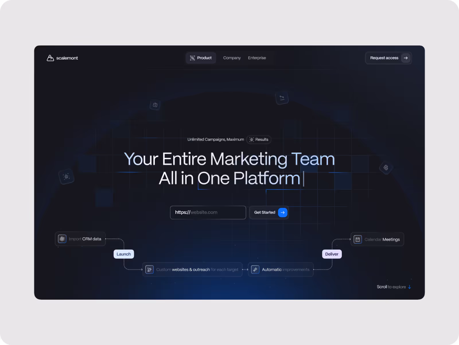
We saw this clearly in our work for Scalemont, an AI-powered SaaS platform that helps businesses grow their marketing faster and smarter. Every click matters in this complex system, and its users – busy professionals – need things to work quickly while feeling confident the platform won’t let them down.
By adding subtle tab transitions, smooth loading animations, and clear hover effects, we created an experience that feels calm and reliable at every step. It’s more than just clean design – it’s a quiet reassurance that says, “You’re in control.”
And that’s what sticks. People may not remember your font or your layout… but they’ll remember how your product made them feel.
So if your onboarding feels abrupt, your flows feel stiff, or your UI leaves users guessing — the answer isn’t necessarily more features. It might just be a better emotional design.
And most of the time? That starts with motion.
When Motion Is Used — But Still Doesn’t Work
Of course, recognizing the value of motion is one thing. Using it well is another.
Even among teams who do invest in motion, we’ve seen common patterns that hold products back — not from a lack of creativity, but from a lack of strategy.
Too often, motion is treated as a finishing touch or a visual flourish. When in reality, it should be treated the same way we treat layout, typography, or UX flows: with purpose, consistency, and system-wide logic.
Here’s where things usually go wrong:
- It’s added too late.
Motion gets bolted on at the end of a sprint or just before launch — a few microinteractions here, a spinner there — but by then, the system is already set. Instead of shaping the experience, motion becomes surface-level polish, unable to influence how users actually move through the product.
- It’s either overwhelming or nonexistent.
Some brands overload their interface with transitions that call too much attention to themselves. Others avoid motion entirely out of fear it’ll feel distracting. But the goal isn’t to be loud or invisible — it’s to be useful. Both extremes break that balance.
- It’s mistaken for aesthetics.
More often than not, motion gets framed as a “visual layer” — an opportunity to add charm, not clarity. But functional motion doesn’t demand attention. It reinforces expectations, strengthens perception and helps the interface speak without saying a word.
And here’s the part no one talks about: When motion works well, most users won’t even realize it’s there. They’ll just feel more confident, more in control — as if the product is quietly cooperating with them. That invisible clarity? That’s what makes great digital experiences feel effortless.
That’s why, in every branding and product engagement at Eloqwnt, we integrate motion strategy from the very beginning. Not as an add-on — but as infrastructure (which we’ll walk you through next).
How to Get Motion Right in SaaS — The Eloqwnt Way
Let’s be real: not all motion is good motion. Just like branding, it’s either intentional — or it’s noise in disguise.
At Eloqwnt, we define strategic motion by three principles:
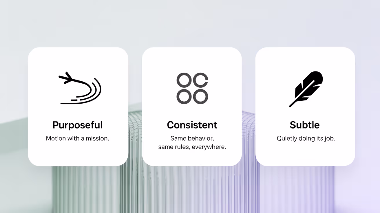
- Purposeful: Every animation has a job – guiding attention, confirming actions, or easing transitions. No dead weight.
- Consistent: Motion isn’t decoration. It’s part of a system – governed by timing, behavior, and repeatability.
- Subtle: The best motion doesn’t demand applause. It simply does what it needs to, then gets out of the way.
That philosophy becomes especially important in SaaS. You’re not designing a moment. You’re designing usage at scale. Dashboards. Modals. Settings. Reports. Flows that evolve over time. And if motion doesn’t hold that all together with clarity and care, the product falls apart fast.
So — how do we actually apply it?
Step 1: Identify Friction Points That Need Support
In every SaaS product, certain flows carry more weight than others — like onboarding sequences, billing setup, or error handling. These are moments where the user needs feedback, not just function. We start by mapping out those hotspots.
Whether it’s:
- a CRM where users jump between leads and pipelines,
- a healthcare dashboard switching between test results and prescriptions,
- or a productivity app where automations kick in unexpectedly,
…we ask:
- Where might users feel lost, hesitant, or overwhelmed?
- Where could a clear visual cue reduce uncertainty and speed up action?
We don’t guess. We observe real behaviors — often in user testing or product audits — to find opportunities where motion could provide clarity or calm without extra content.
Step 2: Match Motion to Purpose
Once those moments are identified, we don’t jump into design. We define what the motion is meant to do. For SaaS teams especially, this is where things usually go wrong — motion is requested as “something cool” instead of something useful.
So we ask:
- Should this motion signal success (e.g., a smooth checkmark after saving)?
- Should it create spatial continuity (e.g., sliding between dashboards)?
- Should it prevent disorientation (e.g., keeping filters visible during page transitions)?
In a SaaS tool like a learning platform, this might mean microinteractions for progress-tracking. In a FinTech dashboard, it could be animated transitions that show you how the data just changed.
Same principle, different role.
Every animation has a purpose — and we label it clearly from the start.
Step 3: Build a Motion System, Not One-Offs
SaaS platforms grow. Fast. New components, features, use cases. And if motion isn’t systemized from day one, it quickly becomes inconsistent — and worse, unreliable.
That’s why we define a motion system just like we’d define typography or color:
- Timing standards (e.g., how long should modals take to appear?)
- Easing types (should this feel snappy or smooth?)
- Reusable behaviors (e.g., hover states, slide-ins, confirmations)
In one B2B project, we even created a “motion token” library in the design system so the dev team could apply it across product modules with zero guesswork.
Think of it as choreography — not freestyle dancing.
Step 4: Prototype Inside Real Flows
Before anything gets shipped, we integrate motion into our early-stage prototypes — usually in Figma or Framer — and test it as part of real tasks.
This isn’t just about whether something looks smooth. It’s about:
- Does it interrupt the workflow or support it?
- Does it help users orient themselves in a complex UI?
- Does it still work for repeated use over time?
For example, we once tested a loading sequence in a SaaS analytics product. It looked elegant in the mockup — but in real use, users ran multiple queries back-to-back, and the motion started to feel laggy. So we tuned the duration down by milliseconds — and suddenly, it clicked.
Motion should scale with behavior — not just look good on Dribbble.
Step 5: Collaborate with Devs to Build Responsively
Great motion dies in handoff if it isn’t communicated well. That’s why we work closely with engineering teams to define not just what to build, but why it behaves the way it does.
We document:
- Motion intent (what problem is this solving?)
- Technical constraints (what’s doable with current architecture?)
- Priority levels (which animations are core vs. optional?)
Especially in SaaS, where performance is everything, we ensure animations are lightweight, GPU-friendly, and responsive across browsers and devices.
No heavy-handed animations. No mystery handoffs.
Step 6: Track What Users Feel — Then Tweak
Motion isn’t “done” after launch. SaaS products iterate constantly, and motion needs to keep up.
We revisit live flows to assess:
- Are animations still aligned with the product’s complexity?
- Do users still feel oriented and in control?
- Have new flows introduced friction motion could solve?
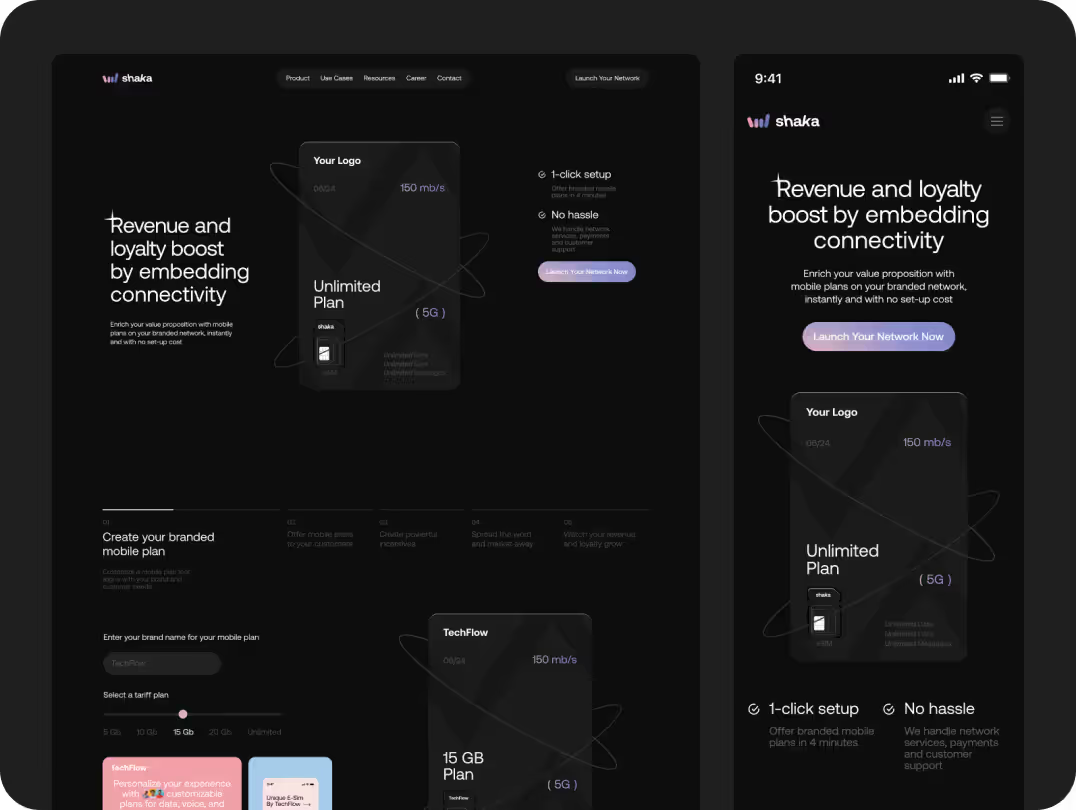
In platforms like Shaka, we’ve adjusted motion cues post-launch to respond to user behavior — for example, reducing animation on repeat actions or adding subtle confirmation states after successful clicks.
Motion isn’t just aesthetic. It’s operational. So we treat it like a living layer of the product.
The Payoff: Why Motion Design Drives Growth
Let’s talk outcomes. Because we don’t just believe in design for design’s sake — we believe in what it does.
When we’ve introduced motion systems into SaaS projects, we’ve seen:

• User retention goes up – especially after onboarding, when users feel more confident navigating on their own.
• Support tickets go down – because motion makes the logic of the interface more self-explanatory. No more “What do I do next?” moments.
• Activation rates increase – as clear transitions and guided interactions help users reach meaningful value faster.
• Session times grow – not because people are stuck, but because the product feels effortless to explore — so they stay longer and come back more often.
In short? Strategic motion makes SaaS easier to use — and harder to leave.
And that’s what makes it a growth lever.
Final Thoughts
If you’re a SaaS founder, product lead, or designer — here’s the takeaway:
Motion is not extra.
It’s not a “nice to have.”
It’s not about aesthetics.
It’s about communication.
Done well, it reduces friction, builds trust, and reinforces everything your brand stands for — without adding another line of copy or feature to your roadmap.
So don’t let it be an afterthought. Bake it in. Systemize it. Make it part of your product’s DNA.
Because the best SaaS products don’t just solve problems.
They move.
And if you want to make that possible – clearly, strategically, and at scale – your motion partner is right here.
Let’s build it together!