Two billboard ads on building facades show close-ups of diverse women with glowing skin, highlighting skincare. Text: "Science You Can Trust."

Script

About the work

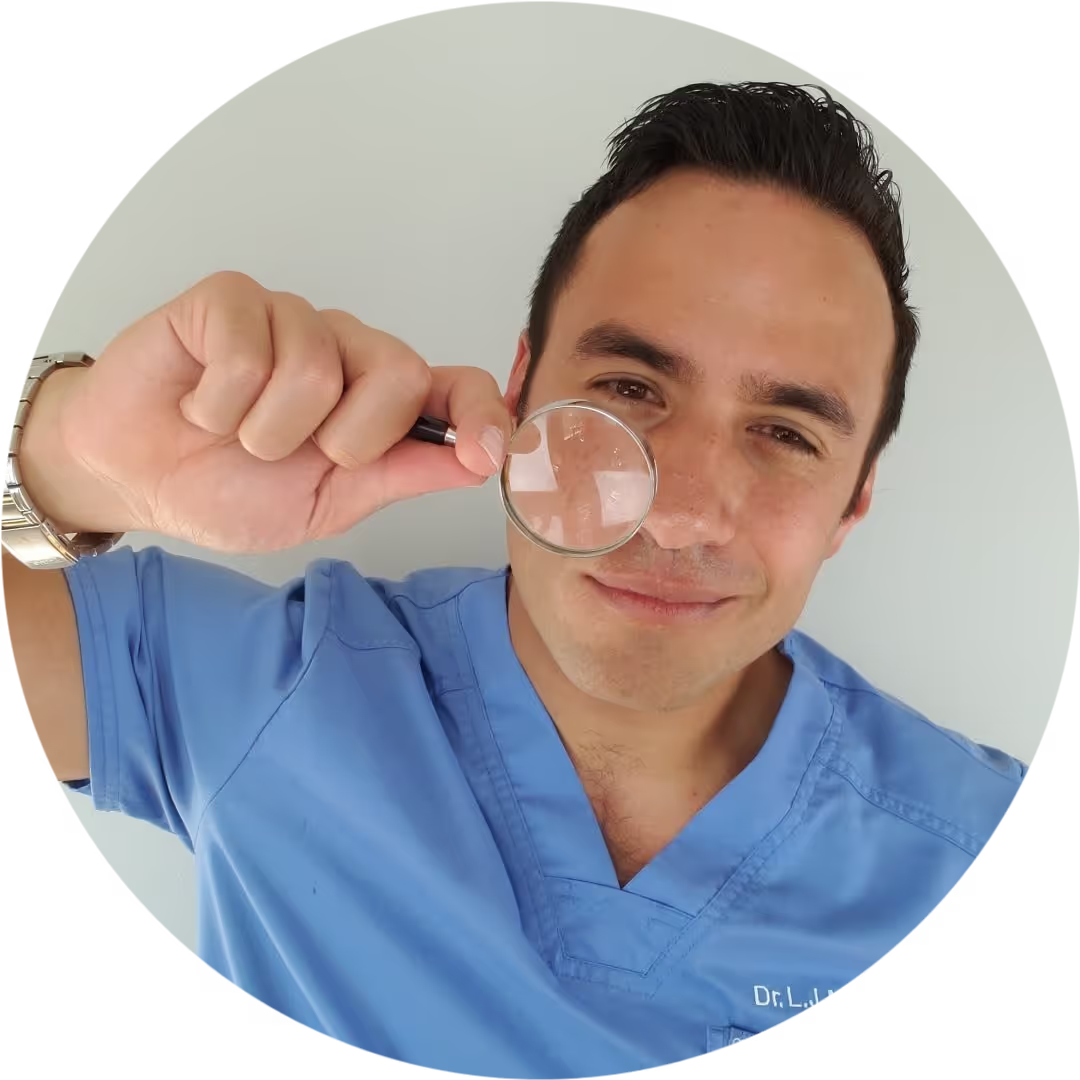
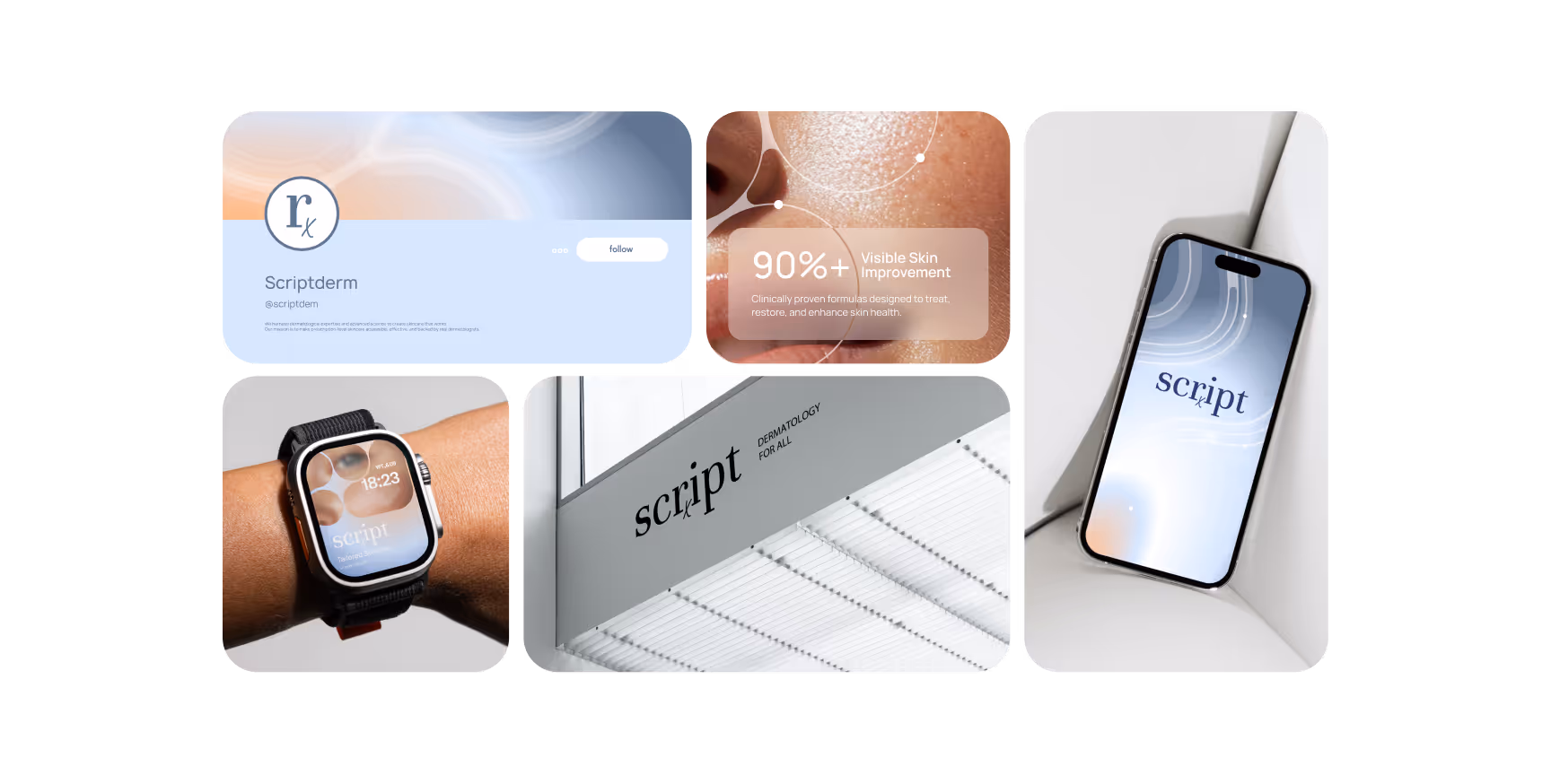
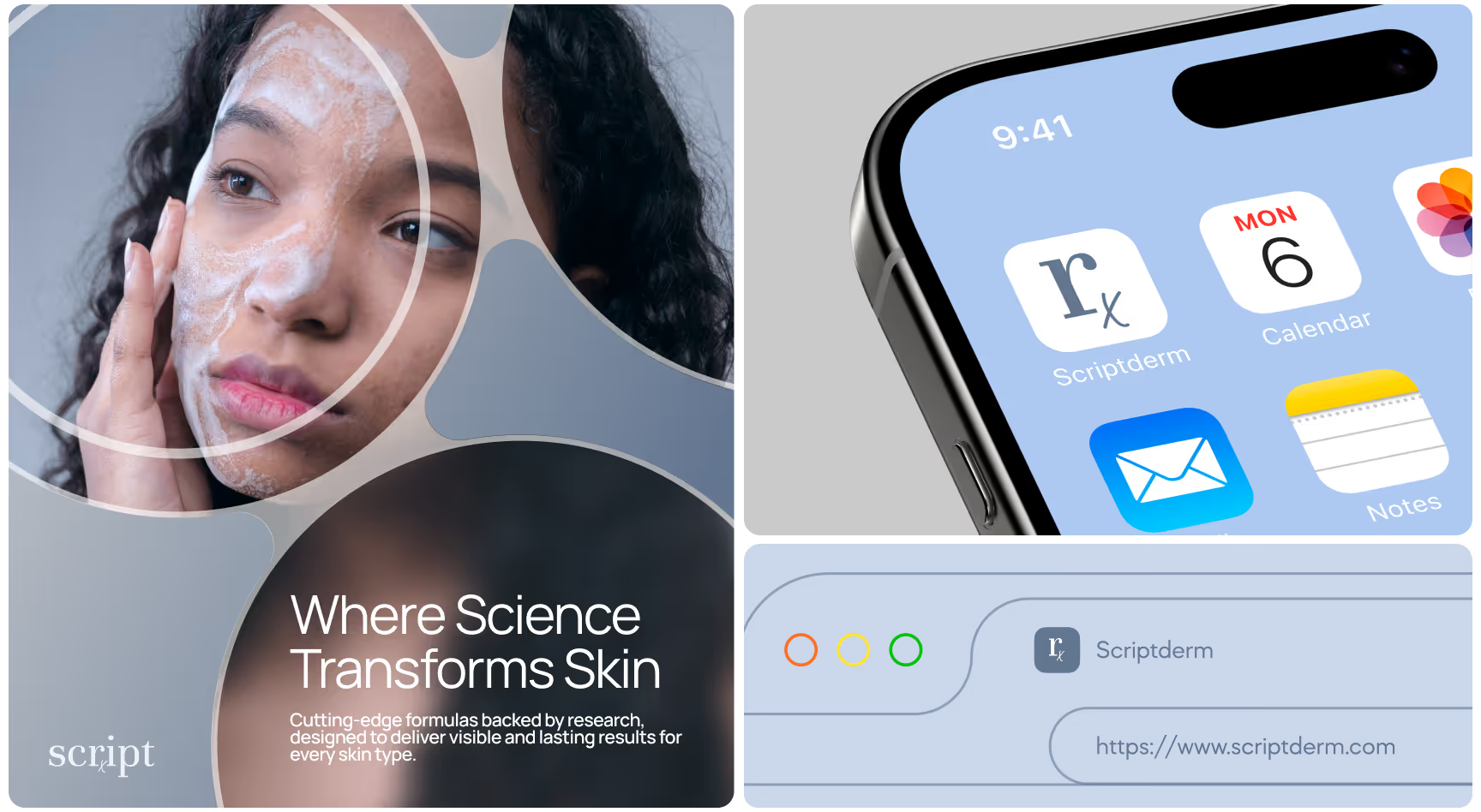
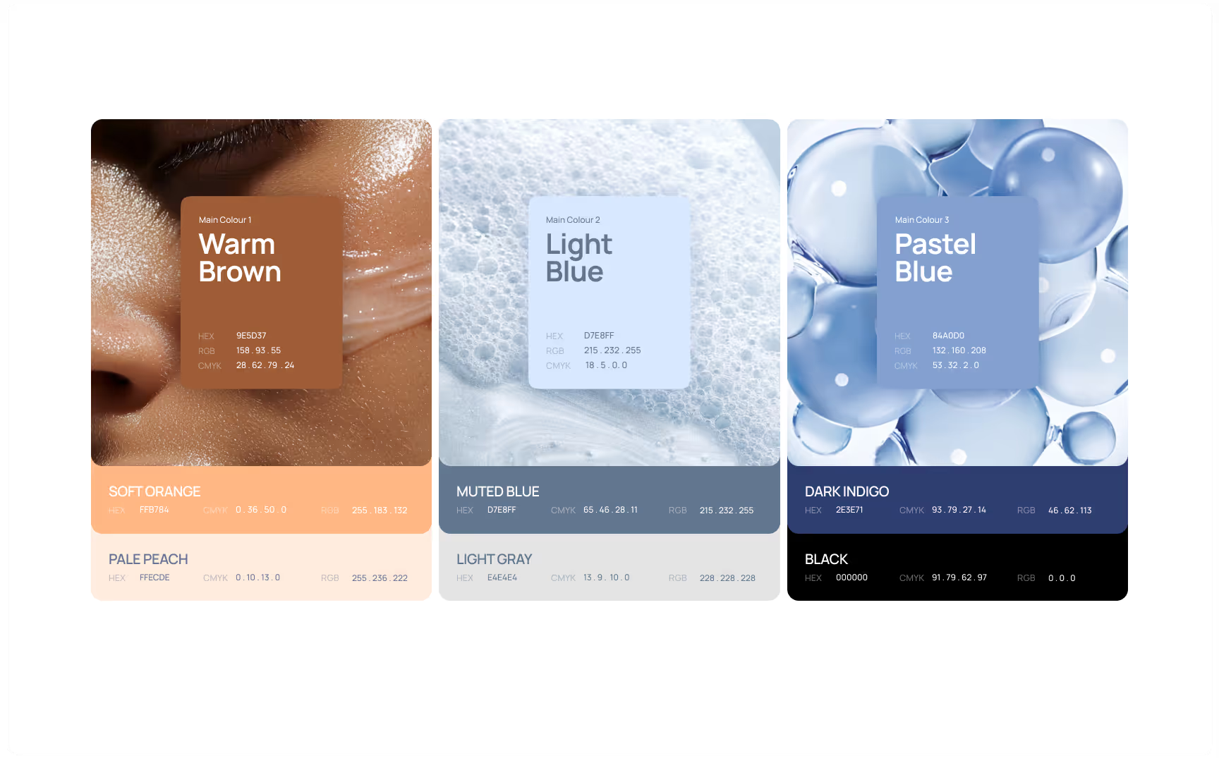
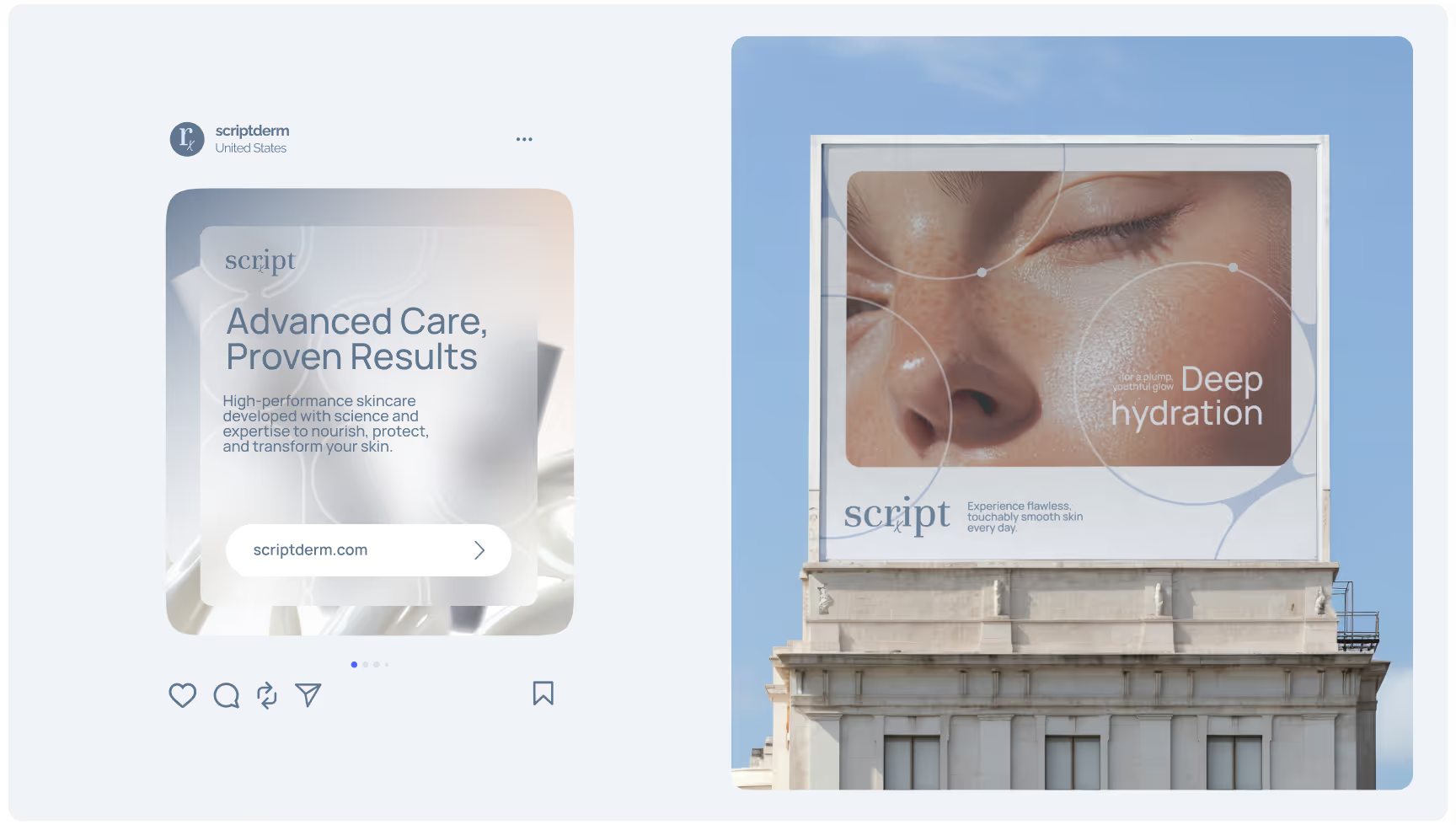
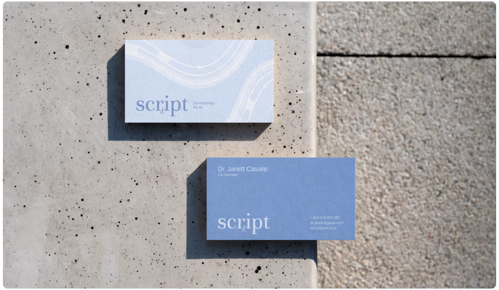
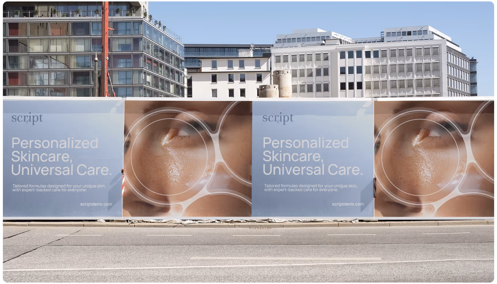
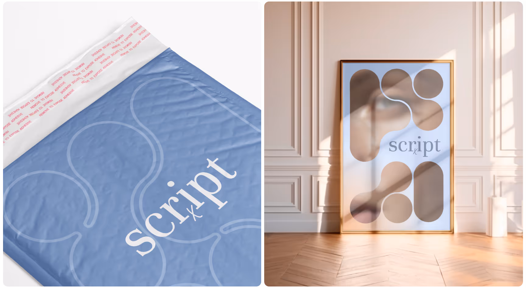
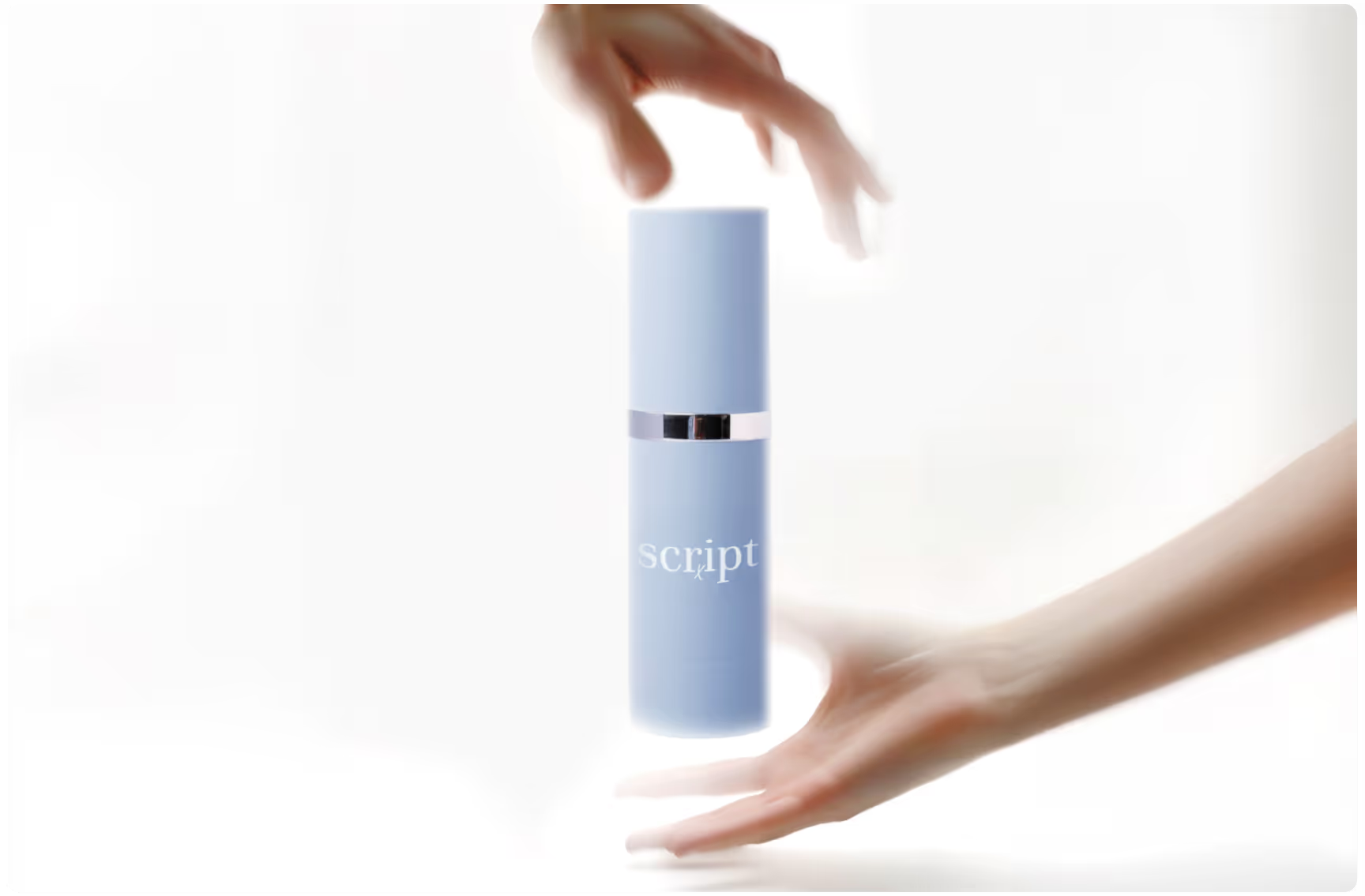
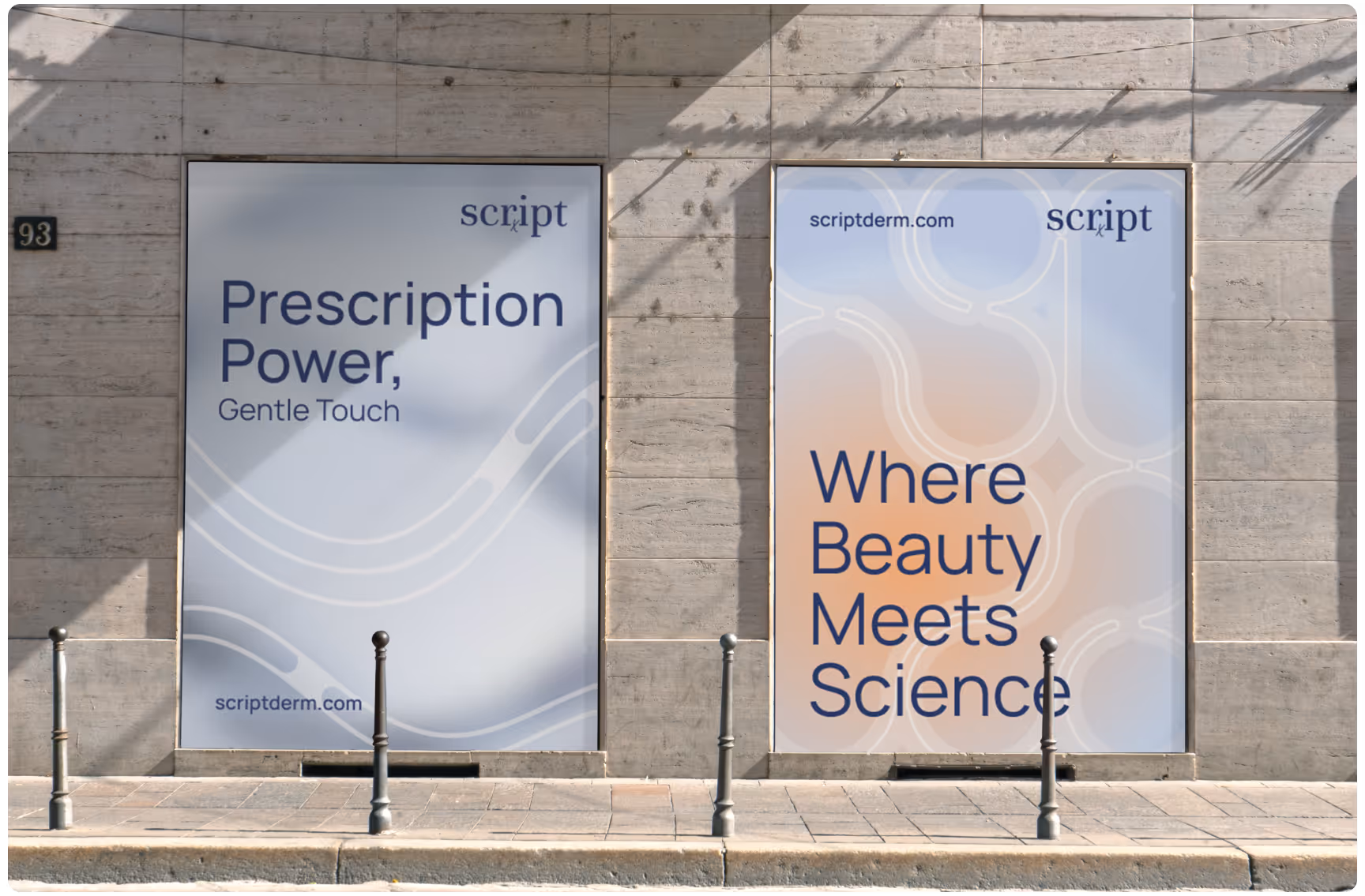
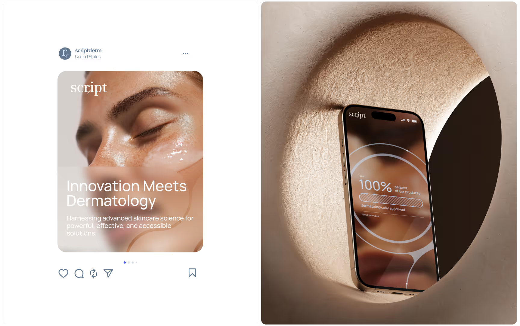
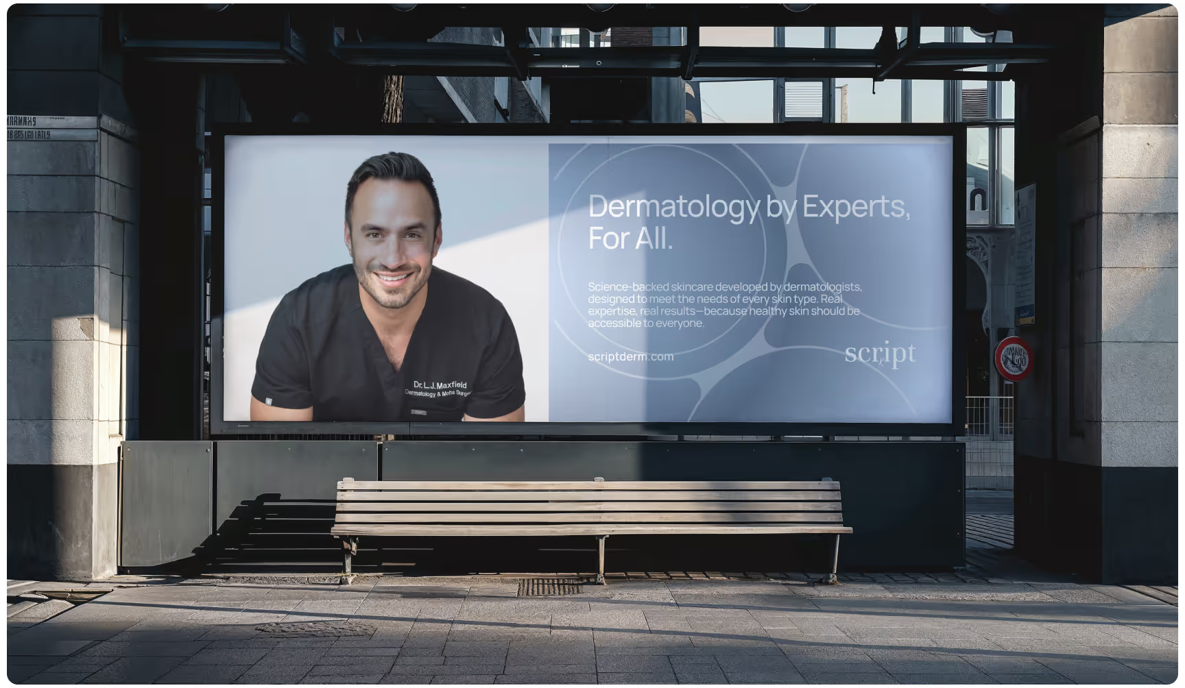
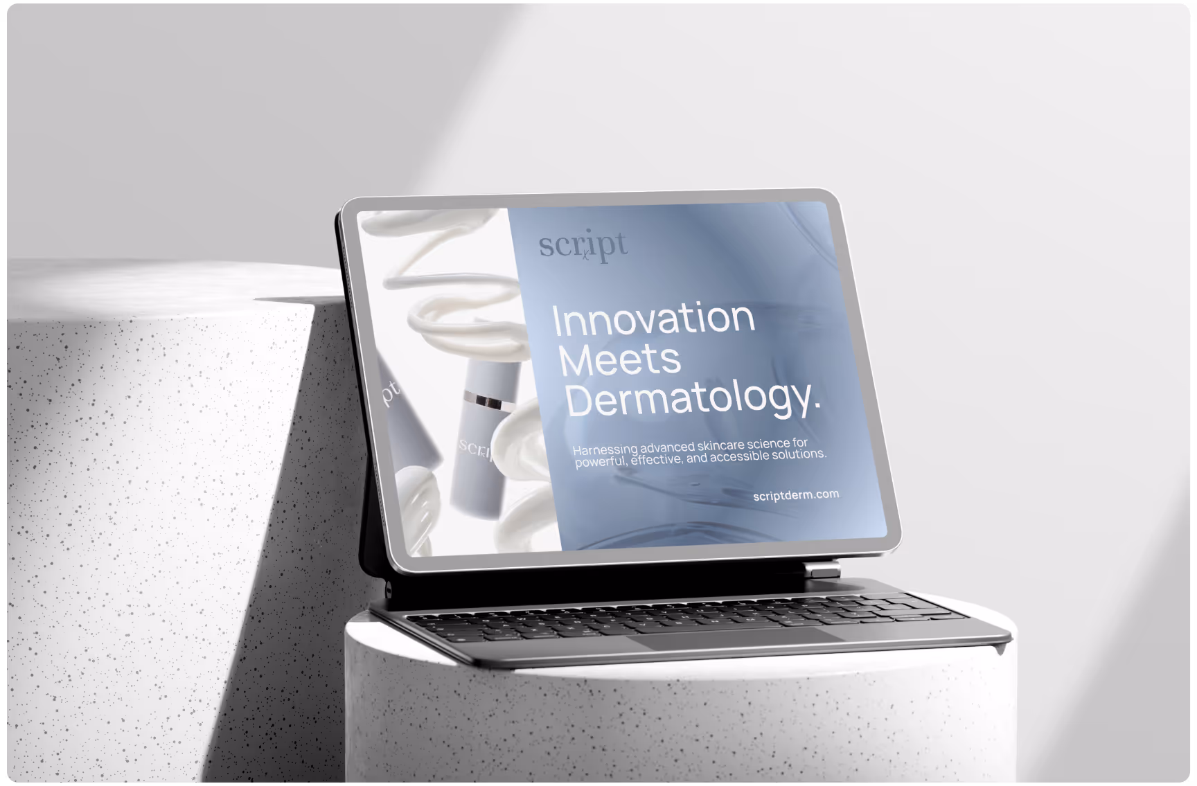
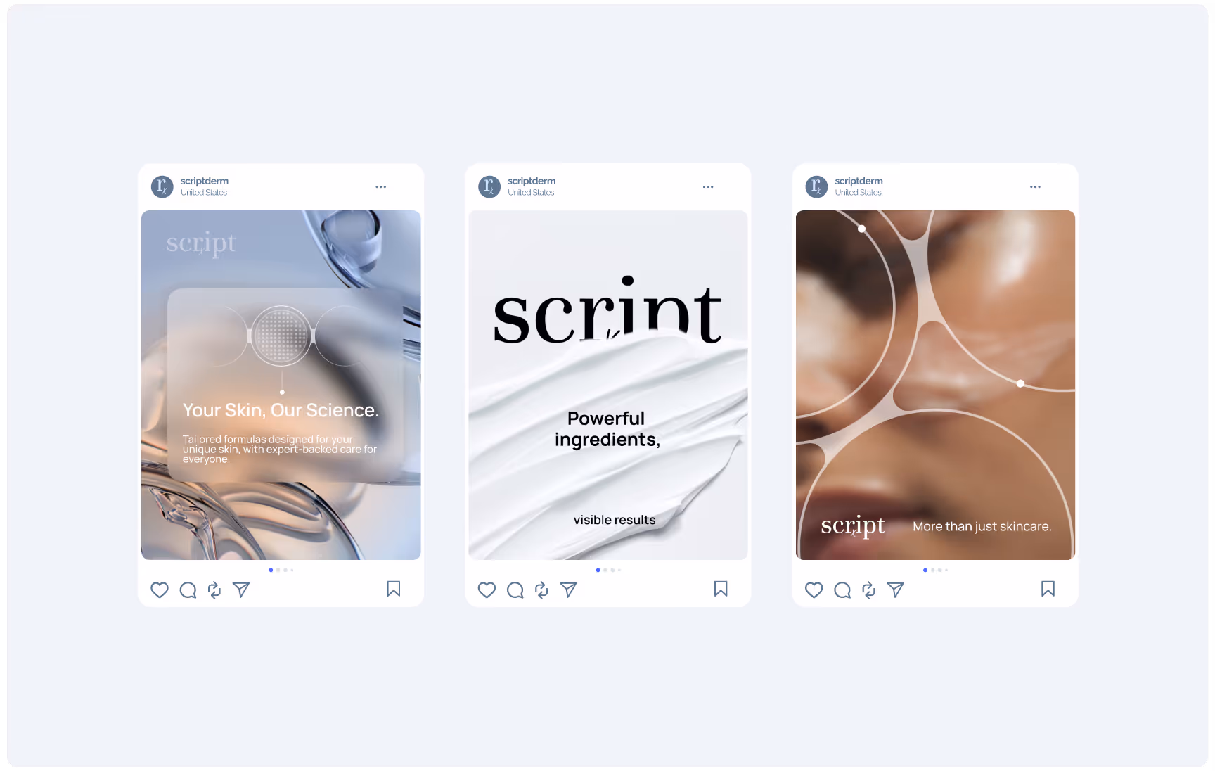
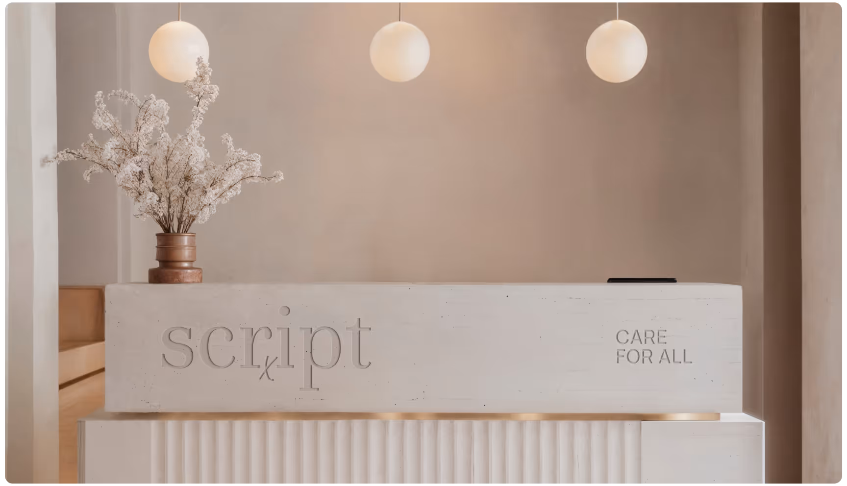
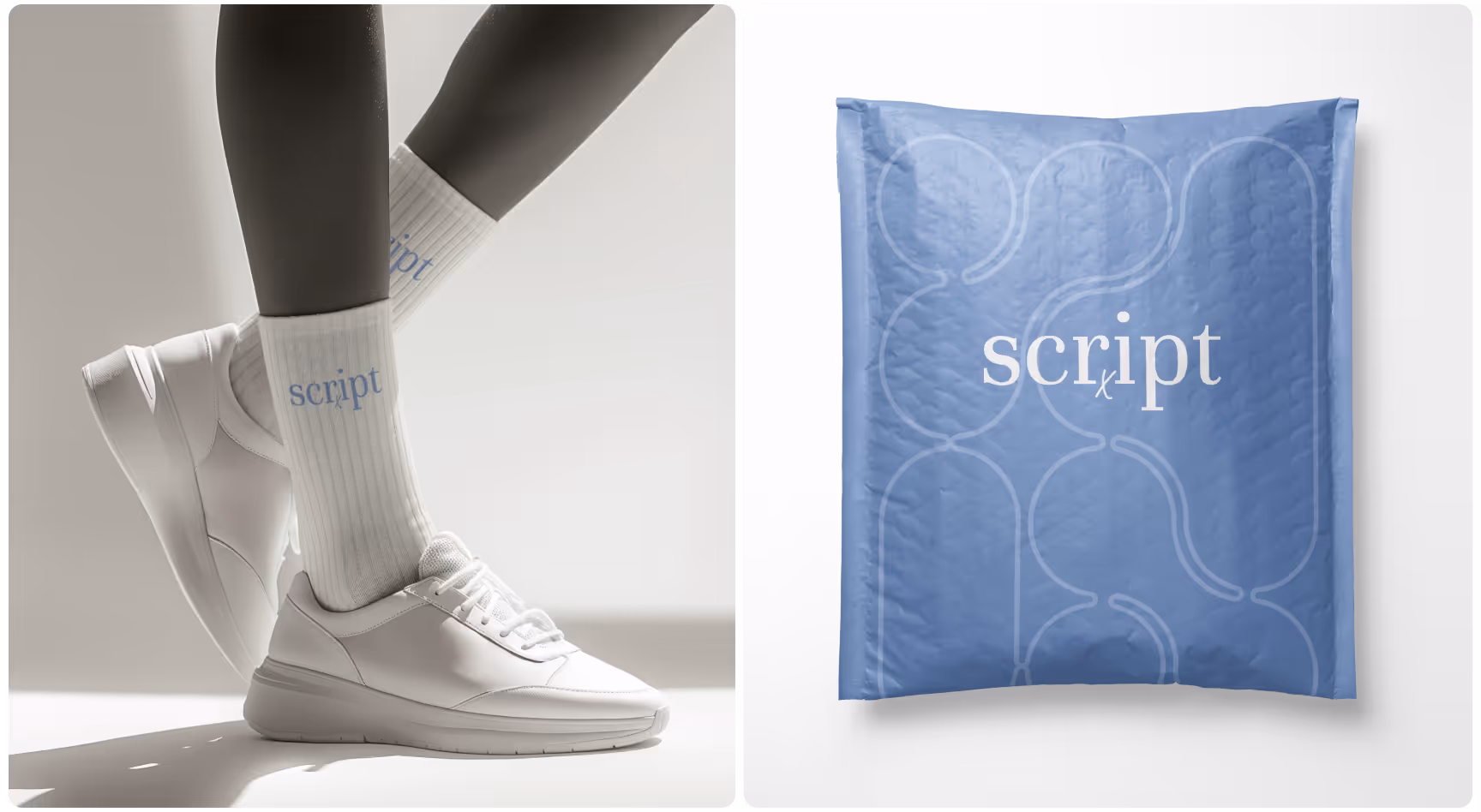
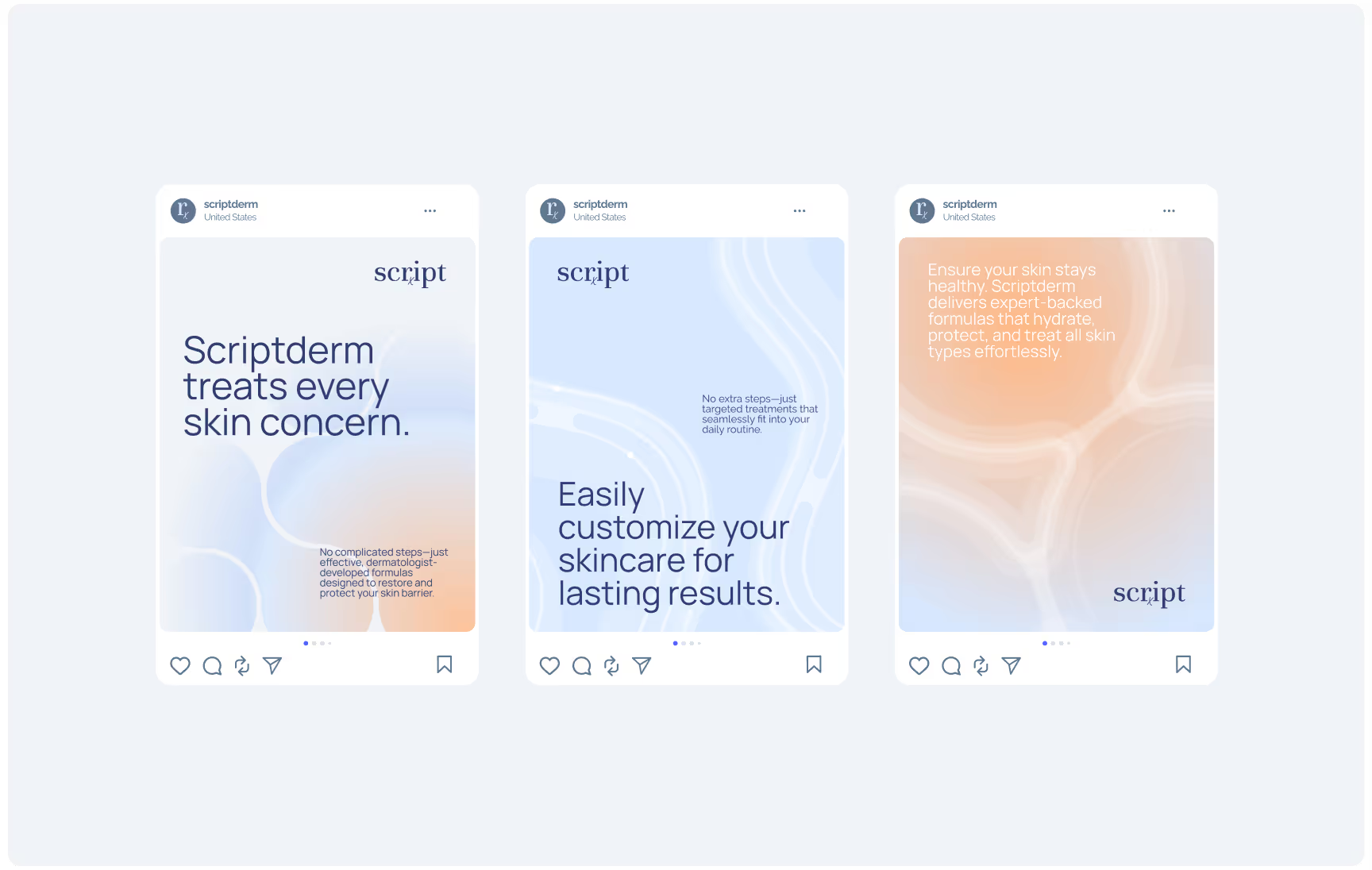
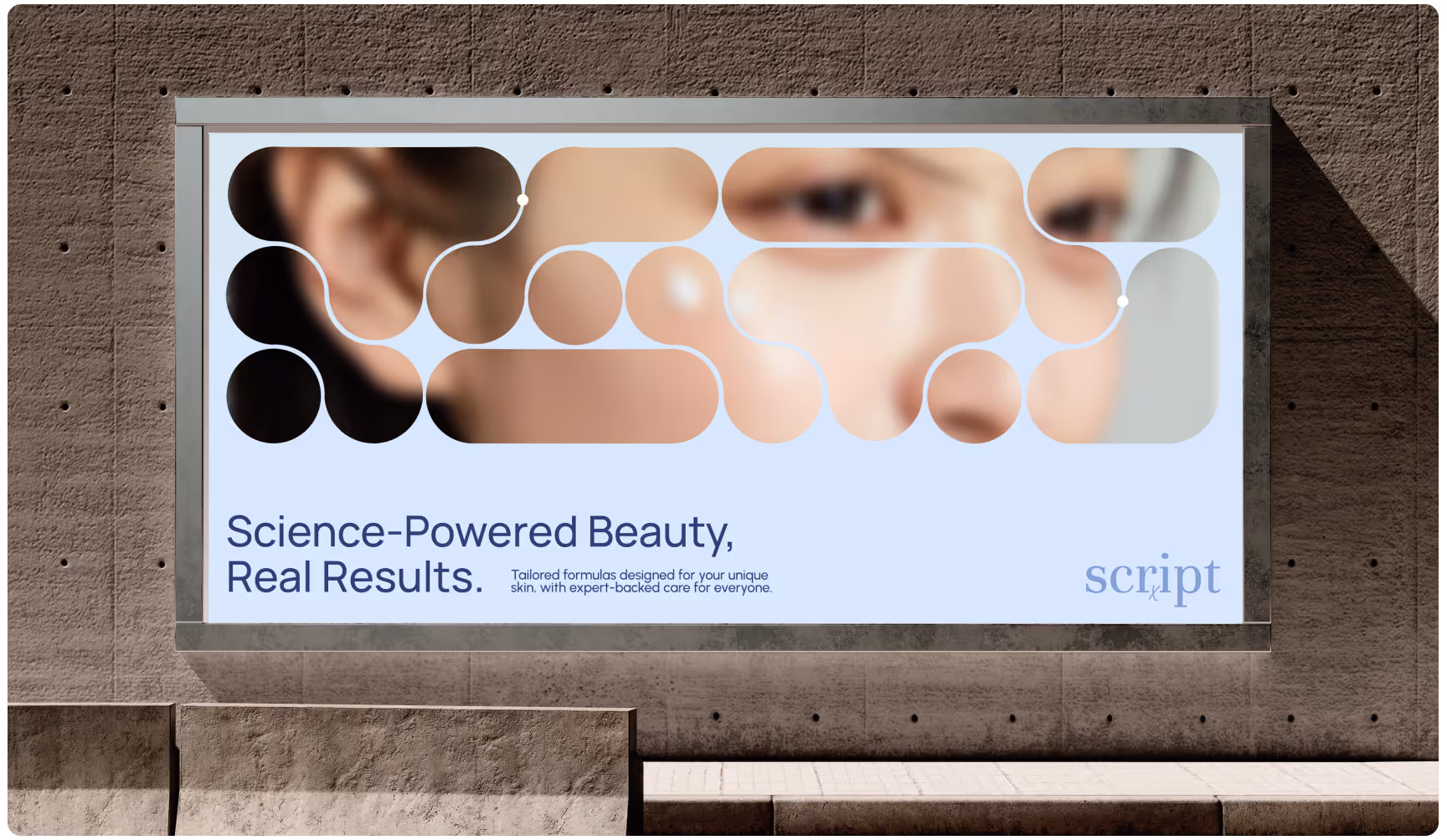
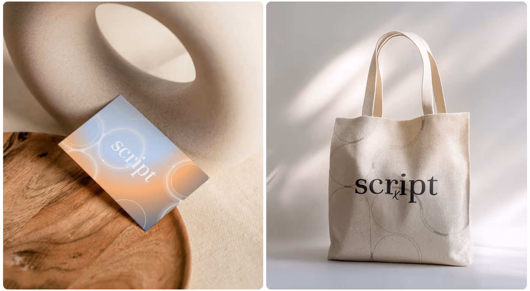
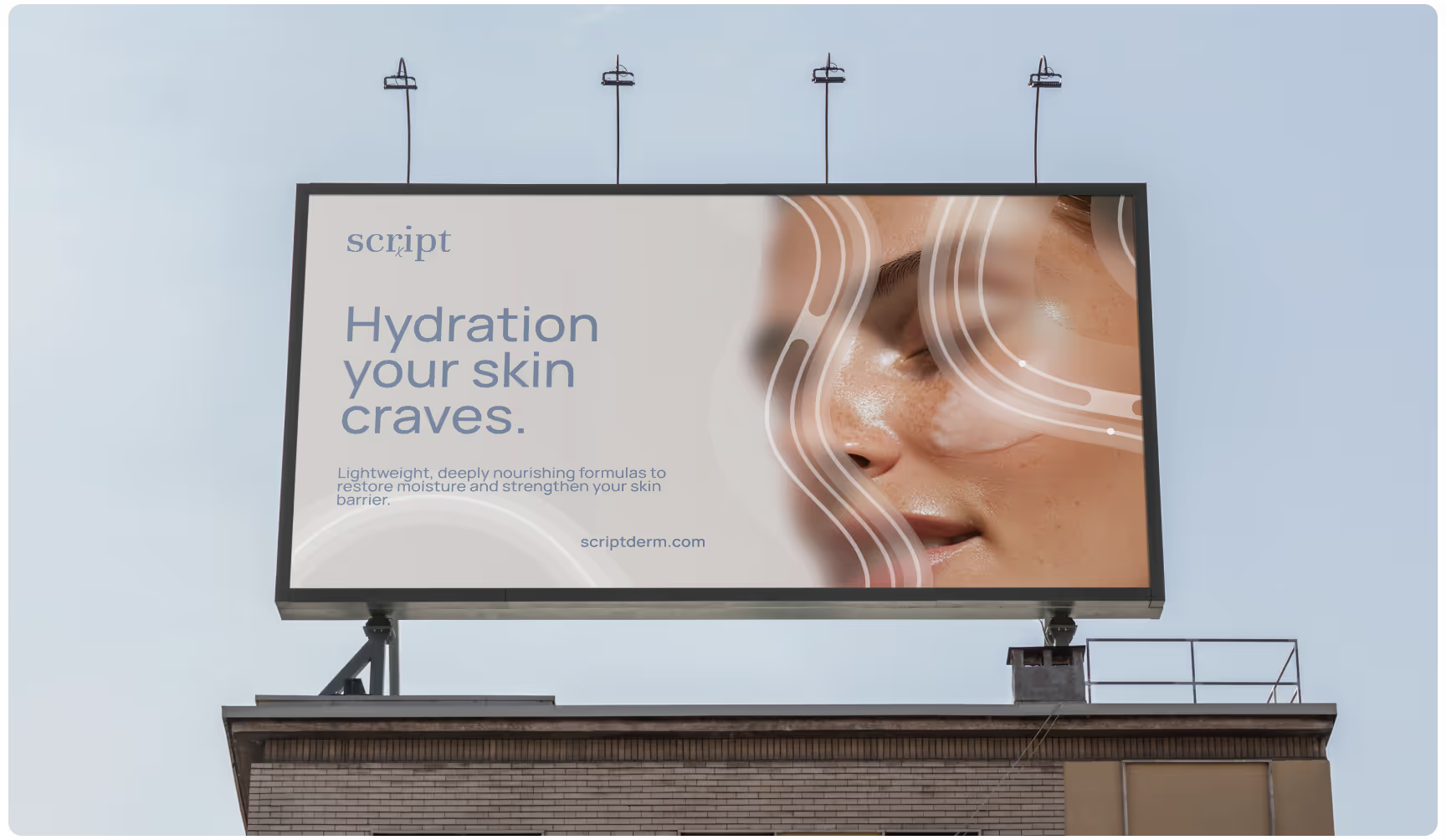
Scriptderm — a dermatology-led skincare platform making prescription-grade results accessible through a bold, clinical, and consumer-friendly experience. Its refreshed identity is engineered around medical authority, disruptive clarity, and a visual system that proves high-impact skincare doesn’t have to feel complicated.

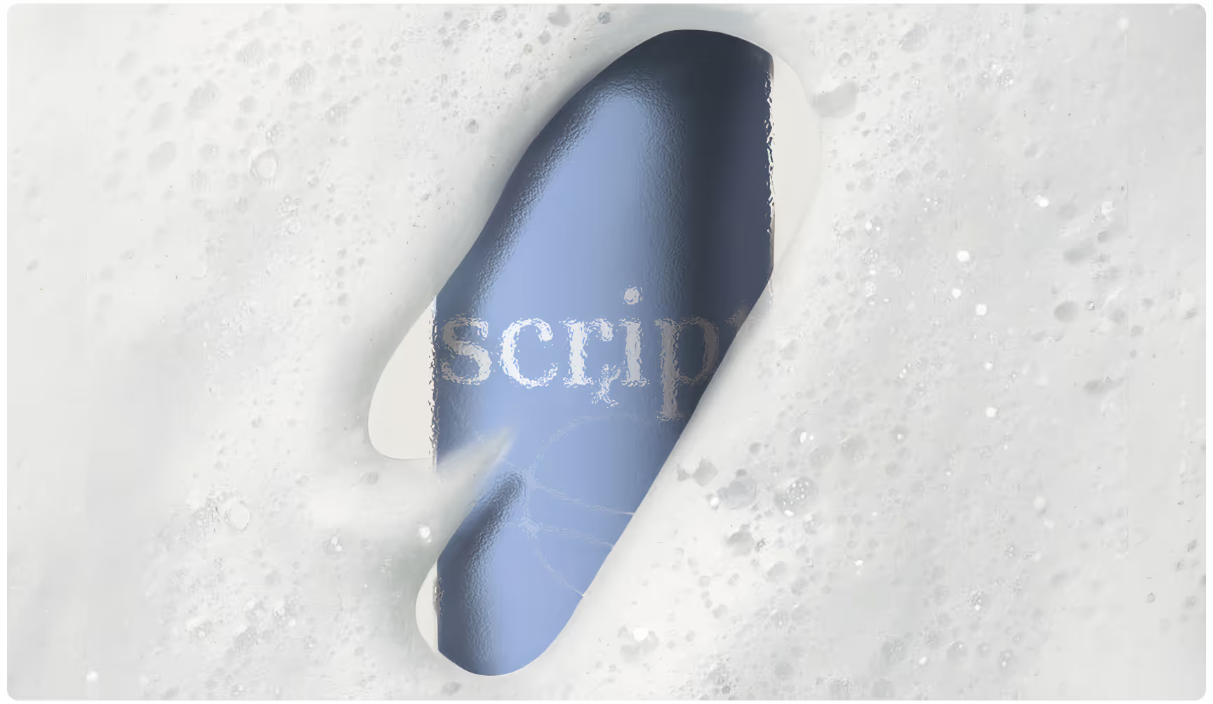
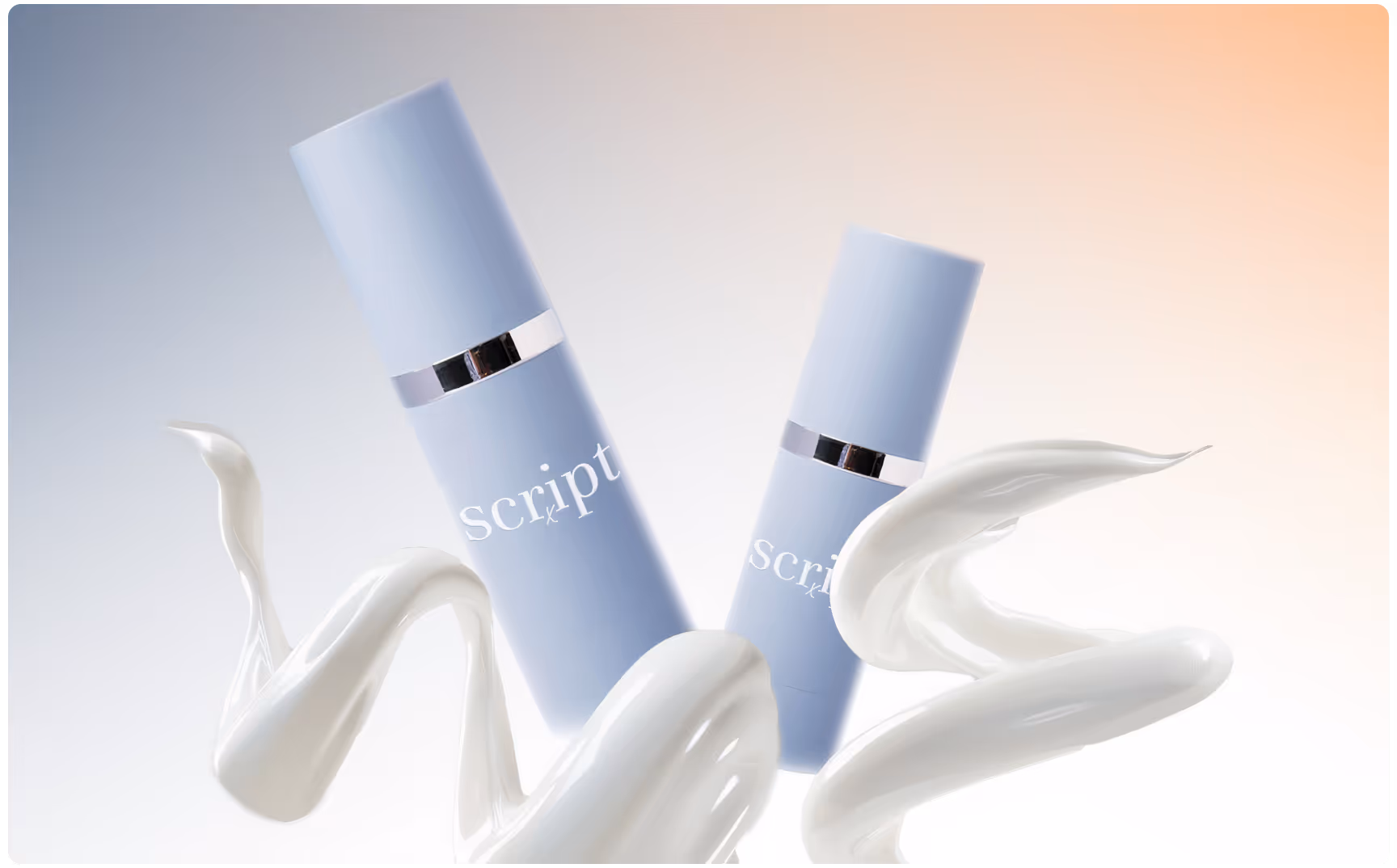
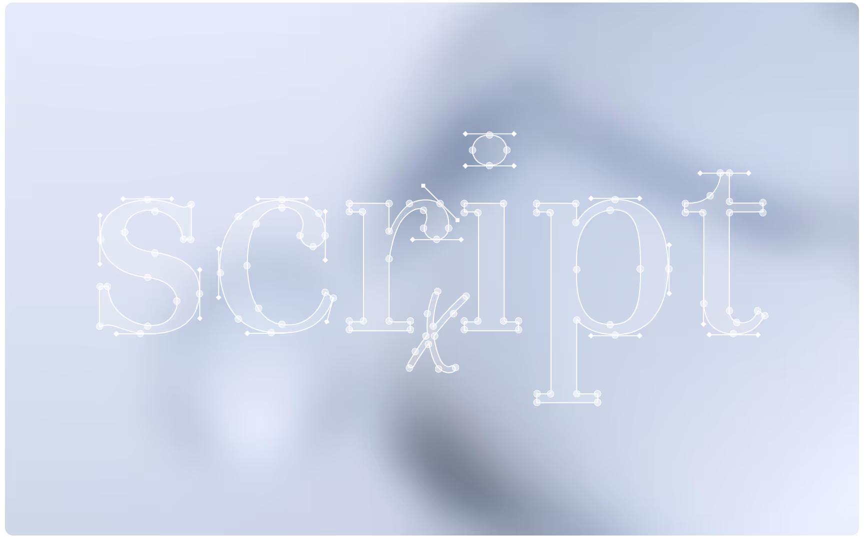
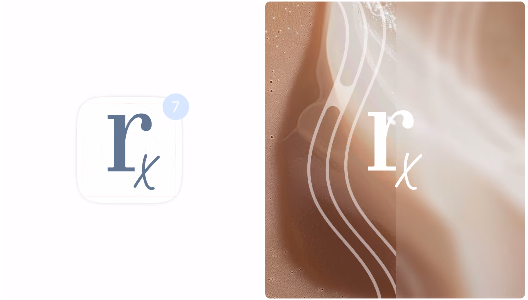
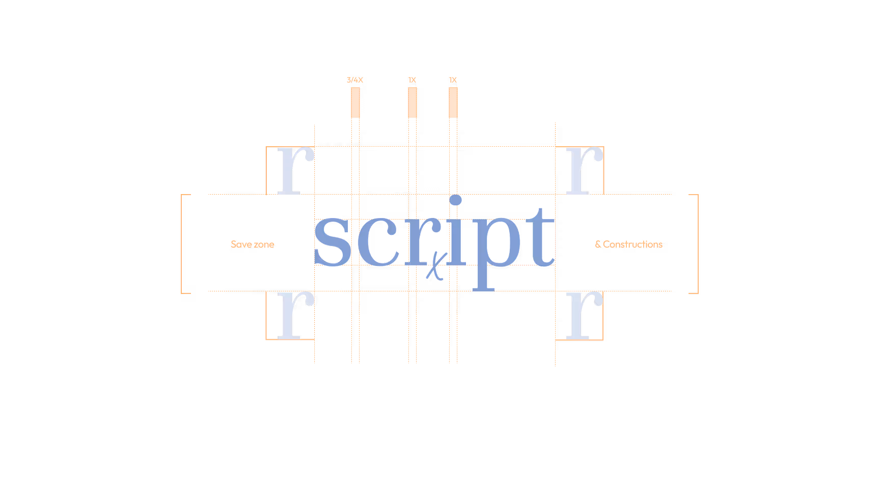
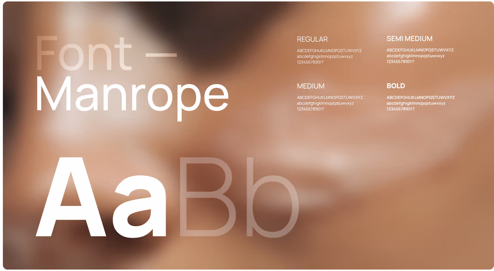
Our work with Scriptderm built a refined visual and verbal language rooted in precision and confidence: clean, edgy, and unmistakably modern. Every element — from the evolved logotype to the expanded palette, typography, and imagery — reinforces a brand that feels both clinical and courageous, elevating the direct-to-consumer journey with sharp storytelling and design made to stand out.

A close-up of a blue capsule partially submerged in white foamy bubbles. The word "script" is visible on the capsule's surface, suggesting a focus on medication or health.
A collage showcases skincare branding with a modern theme. It includes a smartphone and smartwatch displaying the brand "Script," a close-up of improved skin with text "90%+ visible improvement," and a sleek "Script" sign on a building.
Two blue cosmetic bottles with silver bands stand amid swirling white cream. The gradient background shifts from blue to orange, creating a fresh, luxurious feel.
The image features the word "script" in a thin, dotted white font against a soft, blurred gray background, conveying a minimalist, modern feel.
Split image showing an "r x" logo. Left: white background with a notification bubble showing "7"; Right: abstract brown texture with curvy white lines.
A stylized typographic design featuring the word 'script' in large light blue letters, with additional 'r' letters and grid lines indicating spacing and alignment on a black background.
A woman with smooth skin applies cream, showcasing skincare. Adjacent, a smartphone displays the Scriptderm app, calendar, and email icons, conveying innovation. Text reads, "Where Science Transforms Skin."
Three cards display color palettes: Warm Brown with a skin texture, Light Blue with soapy bubbles, and Pastel Blue with glass-like spheres. Each card shows main color, supporting tones, and corresponding color codes.
Manrope font styles displayed on a blurred brown background. Large 'Aa Bb' in white, regular, semi-medium, medium, bold font samples on right.
An Instagram post and large billboard for Script skincare. The post highlights "Advanced Care, Proven Results" on a soft background. The billboard shows a close-up of hydrated skin with "Deep hydration" text.
Two blue business cards on a textured concrete surface. One card shows abstract lines and "script" logo, the other lists a name and contact details. Minimalist and professional design.
Billboards on a city street display "Personalized Skincare, Universal Care" with a close-up of skin under a magnifying glass, against modern buildings.
A light blue cylindrical bottle with "script" written on it is suspended between two hands. The background is soft and white, creating a calming tone.
Two posters on a concrete wall. Left: "Prescription Power, Gentle Touch" in blue on a light abstract design. Right: "Where Beauty Meets Science" on a soft peach and blue background.
The left side shows a close-up of a woman's face with a shiny, moisturized texture and text: "Innovation Meets Dermatology." The right side depicts a smartphone with a brown screen displaying "100%." The phone is placed in a circular, textured niche.
Bus stop ad with a smiling man in black medical scrubs on the left. Text on the right reads, "Dermatology by Experts, For All." Urban background.
A laptop displays text: "Innovation Meets Dermatology" on a sleek design with minimal colors. The mood is modern and professional, emphasizing skincare innovation.
A modern reception desk with "script" and "CARE FOR ALL" engraved. Soft lighting, minimalist decor with white flowers in a vase, and three spherical lights above.
A pair of legs in white sneakers and "script" branded socks stand on the left. On the right, a blue package with "script" branding, creating a modern, minimalistic feel.
Three Instagram posts with pastel designs. Left: Blue and orange abstract with text "Scriptderm treats every skin concern." Center: Blue with "Easily customize your skincare for lasting results." Right: Orange with "Ensure your skin stays healthy with Scri
Billboard with abstract design featuring blurred close-up of a person's face. Text reads 'Science-Powered Beauty, Real Results.' Tone is modern and professional.
Business card with "script" logo rests on a wooden surface beside a ceramic sculpture. A beige tote bag with the same logo sits against a soft, light background.
Billboard featuring text "Hydration your skin craves" with close-up of a woman's face showing healthy skin. Soft curves overlay, promoting skincare brand.
No items found.

Summary

Industry
Healthcare
Duration
5
weeks

Working with Eloqwnt felt like having an extra strategic co-founder. They kept the medical credibility of Scriptderm, but wrapped it in a disruptive, consumer-friendly identity and a website that actually converts curious visitors into confident patients.

Luke Maxfield
Founder
Let’s chat
Contact us

The right partner at the right moment changes everything.

Start a conversation

Tell us about your next stage.

Our Testimonials:

Thank you for filling out the form! 
We will contact you ASAP

Cute minions saying yes sir
Oops! Something went wrong while submitting the form.
No items found.
Next branding

FeelTru

Eloqwnt helped us translate FeelTru’s clinical expertise into a brand that feels both authoritative and human. The new identity gives FeelTru the trust, warmth, and clarity needed to make medically guided weight management feel approachable, safe, and genuinely supportive from the very beginning of the patient journey.

Next branding
A woman with red hair and a peaceful expression holds a "FeelTru" bottle against a serene sky backdrop, suggesting relaxation and wellness.
Next branding

Beedew

Eloqwnt helped us translate our natural skincare philosophy into a brand that feels both ingredient-led and deeply inviting for the customers we nurture. The new identity gives Beedew the warmth and authenticity needed to connect with conscious beauty seekers at the very first touch of their skincare ritual.

Next branding
Elegant skincare products displayed on stone pedestals with soft, warm lighting. Surrounded by delicate pink flowers, conveying a serene, luxurious vibe.
Next branding

Kaladora Capital

Eloqwnt helped us translate our operator-led philosophy into a brand that feels both institutionally rigorous and genuinely trustworthy to the founders and businesses we partner with.

Next branding
A subway platform features a prominent advertisement by Kaladora Capital. It displays "$1B+" with text about investments. Two people walk past, creating a dynamic city atmosphere.
Next branding

ZIGChain

Eloqwnt helped us translate our decentralized infrastructure into a brand that feels both financially authoritative and genuinely accessible to builders, investors, and the broader ecosystem. The new identity gives ZIGChain the credibility and clarity needed to position on-chain asset management as the definitive foundation for the next era of wealth generation.

Next branding
A logo with the word "ZIGCHAIN" in bold white letters is centered on a dark background. Below, curved, ribbed patterns in orange and purple create a tech-inspired look.
Next branding

Next STEPS

Eloqwnt helped us translate our multidisciplinary expertise into a brand that feels both clinically trustworthy and deeply human for the individuals and families we serve. The new identity gives Next STEPS Worldwide the warmth and clarity needed to welcome people of every age through the most important steps of their wellbeing journey.

Next branding
A minimalist workspace with beige ceramics. A phone displays "Congratulations!" in green; papers and a business card read "Your next step starts here."
Next branding

Hybrid Mind

Eloqwnt helped us translate our AI and data expertise into a brand that feels both technically rigorous and genuinely accessible to the organisations we work with. The new identity gives Hybrid Mind the clarity and confidence needed to guide businesses through their most complex intelligence and transformation challenges.

Next branding
Sign in a modern office hallway reads "A hybrid approach to Data & AI." Text highlights experienced consultants and end-to-end MLOps. People converse nearby.
Next branding

Siwa

Eloqwnt helped us translate our investment philosophy into a brand that feels both credible and genuinely personal to the operators we back. The new identity gives Siwa Capital the clarity and conviction needed to connect with independent sponsors and entrepreneurs at the earliest stages of their acquisition journey.

Next branding
Futuristic, symmetrical hallway with soft lighting, curved vertical panels, and a circular opening in the floor. The word "SIWA" is centered in bold white letters.
Next branding

Vanquish

Eloqwnt helped us translate our advisory expertise into a brand that feels both authoritative and accessible to the businesses we serve. The new identity gives Vanquish Holdings the credibility and clarity needed to guide clients through their most critical capital and growth decisions.

Next branding
A small, shiny metallic letter "V" on a pitch-black background. The minimalist design and high contrast create a mysterious and futuristic tone.
Next branding

Vertus AI

Eloqwnt helped us translate our frontier research into a brand that feels both authoritative and legible to institutional decision-makers. The new identity gives Vertus AI the gravitas and precision needed to operate at the intersection of capital markets, scientific infrastructure, and machine intelligence.

Next branding
A hand holds a sleek, translucent device displaying text, "Complex Markets Move with Vertus," alongside pink clouds and abstract shapes. Modern and innovative tone.
Next branding

VSC

Eloqwnt rebuilt The Virtual Slimming Clinic into a brand that finally matches the clinical operation behind it. They didn't give us a louder weight-loss brand, they gave us a system, with four strategic pillars and a defined voice that the whole team now uses.

Next branding
A modern billboard shows a smiling person with a pill between their teeth, text reading "Becoming Me" directs attention to a purple circle, emphasizing transformation.
Next branding

Sophisticated Traders

Our partnership with Eloqwnt elevated Sophisticated Traders from a niche trading group to a professional, future-ready fintech brand.

Next branding
Silhouettes of a seated woman and standing man face a large screen with the text, "We are transforming the way people trade and invest," in a modern setting.
Next branding

Script

Working with Eloqwnt felt like having an extra strategic co-founder. They kept the medical credibility of Scriptderm, but wrapped it in a disruptive, consumer-friendly identity and a website that actually converts curious visitors into confident patients.

Next branding
Two billboard ads on building facades show close-ups of diverse women with glowing skin, highlighting skincare. Text: "Science You Can Trust."
Next branding

Liquid Meme

Eloqwnt team members had a lot of range, not just in their design capabilities but also in their knowledge of artistic influences that go into their designs, that was extremely impressive.

Next branding
Three floating keys on a dark background: a blue key with "LIQUID," an orange key with a heart icon, and a light blue key with "MEME." Vibrant and modern.
Next branding

Freeport Markets

We needed users to understand what we do just by looking at our website. We chose Eloqwnt based on their fintech work. As a result, we saw stronger interest from both customers and partners, along with an increase in website conversion.

Next branding
Logo of Freeport Markets on a textured black background. The logo features a stylized shield in white, conveying security and trust.
Next branding

Traders Hub

Eloqwnt team members had a lot of range, not just in their design capabilities but also in their knowledge of artistic influences that go into their designs, that was extremely impressive.

Next branding
The image shows two business cards balanced on dark rocks. The background features binary code and a gradient from teal to black, creating a tech-inspired tone.
Next branding

TitanX

Eloqwnt team members had a lot of range, not just in their design capabilities but also in their knowledge of artistic influences that go into their designs, that was extremely impressive.

Next branding
A bold "TITAN X" logo in white and red over a dynamic black and red dotted wave pattern. The design conveys innovation and energy.
Next branding

Vantir

Eloqwnt team members had a lot of range, not just in their design capabilities but also in their knowledge of artistic influences that go into their designs, that was extremely impressive.

Next branding
A person holds a smartphone displaying a sleek logo on a black screen, set against a warm, gradient background.
Next branding

Fractal

Eloqwnt team members had a lot of range, not just in their design capabilities but also in their knowledge of artistic influences that go into their designs, that was extremely impressive.

Next branding
Stylized word "Fractal" in teal text on a black background, partially obscured by abstract, transparent organic shapes, conveying a futuristic tone.
Next branding

Multicard

Eloqwnt team members had a lot of range, not just in their design capabilities but also in their knowledge of artistic influences that go into their designs, that was extremely impressive.

Next branding
Billboard shows a person holding a purple multicard with text "Your goals, our focus" and "Banking designed to grow with you and your goals." A cyclist passes by.
Next branding

Multikassa

Eloqwnt team members had a lot of range, not just in their design capabilities but also in their knowledge of artistic influences that go into their designs, that was extremely impressive.

Next branding
Digital display in a modern, indoor location with an orange geometric graphic and "Focus on efficiency" text, alongside the logo "multikassa."
Next branding

Multibank

Eloqwnt team members had a lot of range, not just in their design capabilities but also in their knowledge of artistic influences that go into their designs, that was extremely impressive.

Next branding
Three individuals smiling and holding Multibank cards in a modern setting with gray curtains. One shows a smartphone screen with a banking app.
Next branding

Get Talky

Eloqwnt team members had a lot of range, not just in their design capabilities but also in their knowledge of artistic influences that go into their designs, that was extremely impressive.

Next branding
Displays with "Get Talky" branding show AI-Enabled Patient Scheduling. Left: two smiling women viewing a phone, middle: a joyful doctor with colleagues, right: promotional text.
Next branding

Creators Studio

Eloqwnt team members had a lot of range, not just in their design capabilities but also in their knowledge of artistic influences that go into their designs, that was extremely impressive.

Next branding
Two people with vibrant hair and makeup are laughing joyfully against a purple background. "Creators Studio" text and logo are centered above.
Next branding

Amor Fati

Eloqwnt team members had a lot of range, not just in their design capabilities but also in their knowledge of artistic influences that go into their designs, that was extremely impressive.

Next branding
Text "AMOR FATI" is elegantly centered on a rich, dark wooden texture. The white lettering contrasts with the detailed wood grain.
Next branding

UzOman

Eloqwnt team members had a lot of range, not just in their design capabilities but also in their knowledge of artistic influences that go into their designs, that was extremely impressive.

Next branding
Abstract blue and black background with curved shapes and reflective surfaces. Centered white text reads "UzOman Investment Company."
Next branding

Zolve

Eloqwnt team members had a lot of range, not just in their design capabilities but also in their knowledge of artistic influences that go into their designs, that was extremely impressive.

Next branding
Stylized text "zolve" in gray on black background with a vibrant orange and purple swoosh design curving through the letters
Next branding

QDT

Eloqwnt team members had a lot of range, not just in their design capabilities but also in their knowledge of artistic influences that go into their designs, that was extremely impressive.

Next branding
Abstract teal background with a textured grid pattern, featuring "QDT" in large white letters. "Quantum Data Technologies" is written to the side.
Next branding

zk.Link

Eloqwnt team members had a lot of range, not just in their design capabilities but also in their knowledge of artistic influences that go into their designs, that was extremely impressive.

Next branding
Blue abstract digital network background with a geometric hexogonal logo on left and "zk.Link" text on right.
Next branding

Taraxa

Eloqwnt team members had a lot of range, not just in their design capabilities but also in their knowledge of artistic influences that go into their designs, that was extremely impressive.

Next branding
Futuristic digital circuit board design with the logo "TARAXA" in the center.
Next branding

Serenity

The whole branding went out to be amazing, I loved the work that Eloqwnt did. Our internal stakeholders also were happy with what we got. Highly appreciate the guys.

Next branding
Modern living room with one person lounging on a couch and another sitting in a chair, writing.
Next branding

Fractalized

I have been working with them for a while now, 3rd project to be exact. Always a great experience, very talented and responsive!

Next branding
Abstract blue and white metal shapes with the word "FRACTALIZED" displayed.
Next branding

Alpha Ledger

Their attention to detail and ability to balance sophistication with user-friendly design made all the difference.

Next branding
Black card with "AlphaLedger" text illuminated by a central light source creating a halo effect.