Silhouettes of a seated woman and standing man face a large screen with the text, "We are transforming the way people trade and invest," in a modern setting.

Sophisticated Traders

About the work

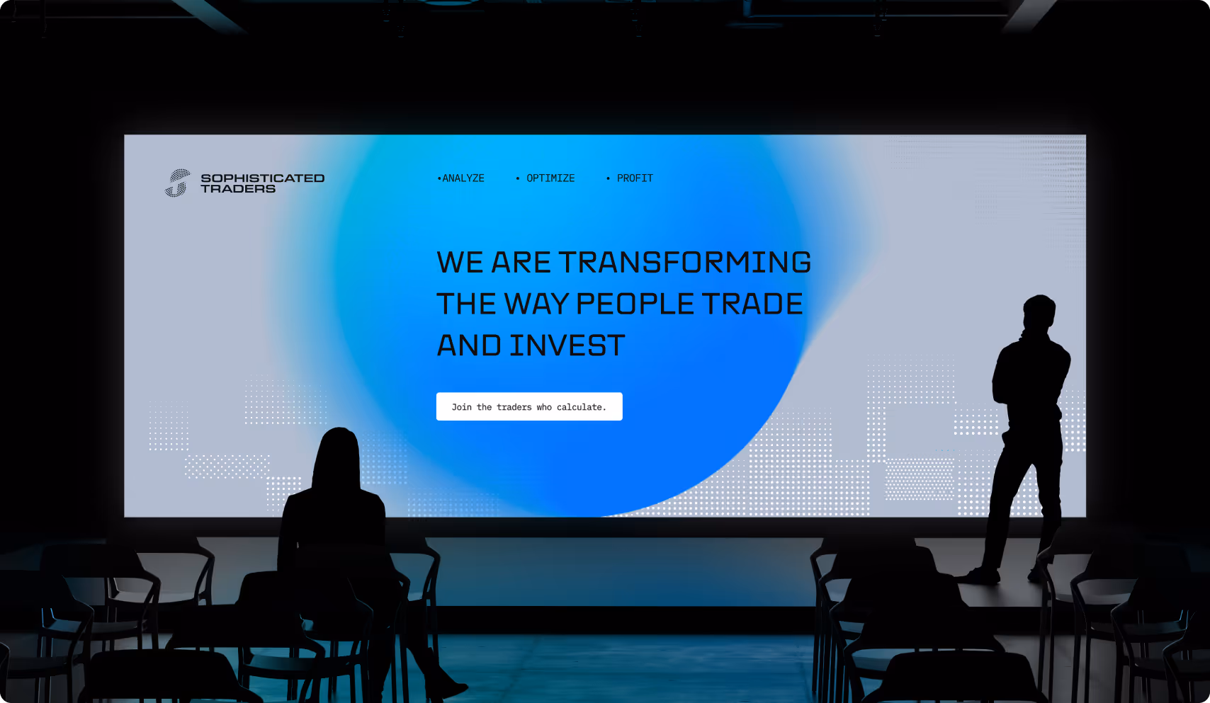
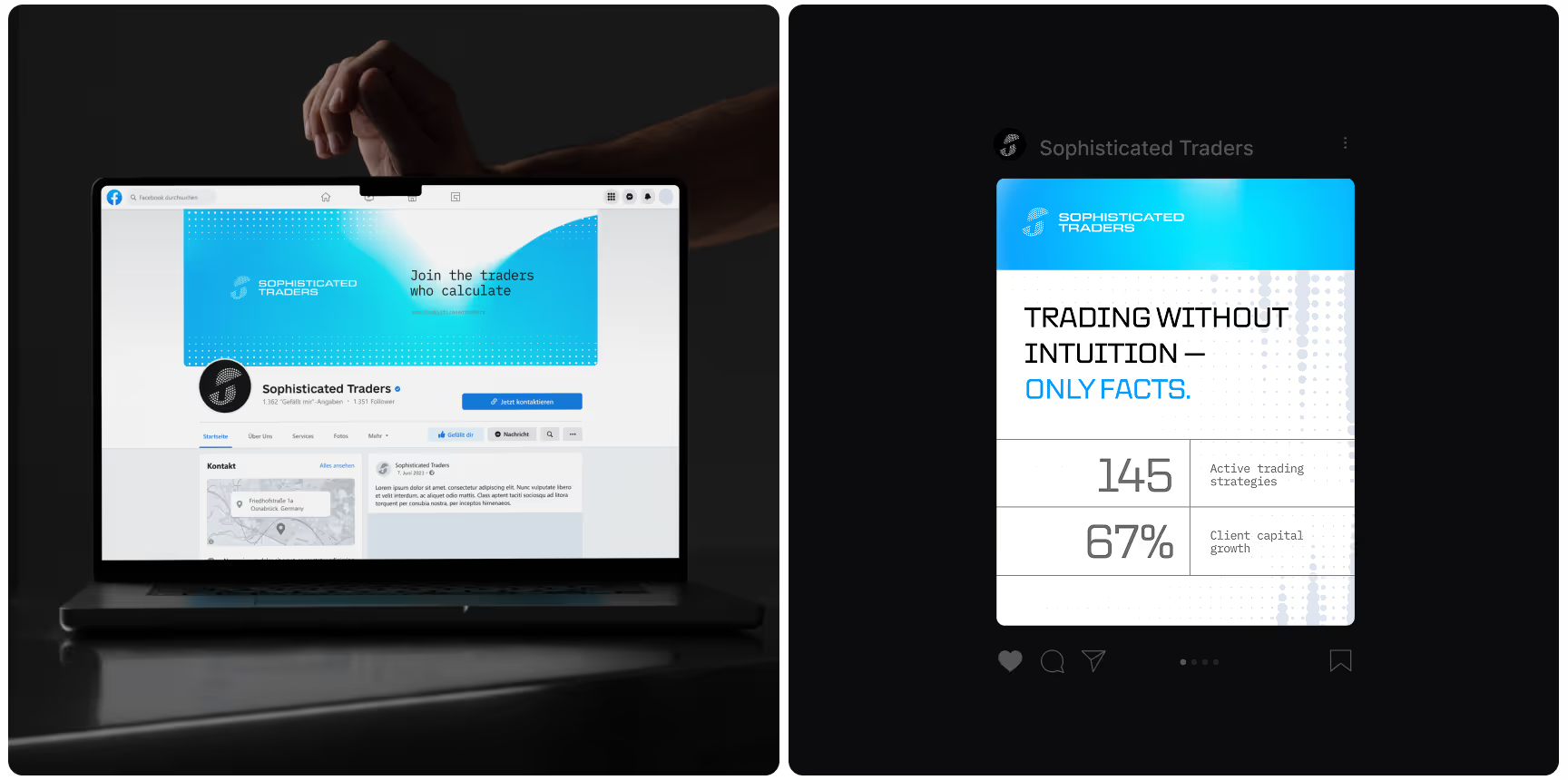
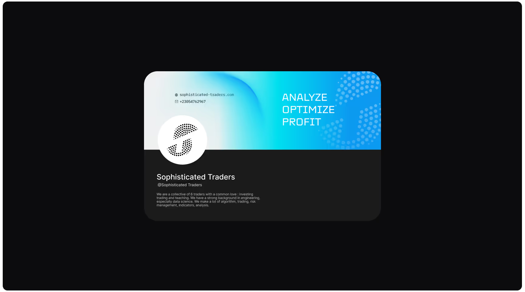
Sophisticated Traders is a proprietary trading and fintech collective that merges data science, education, and community to empower retail investors through actionable insights, algorithmic tools, and an engaging, social-first experience.

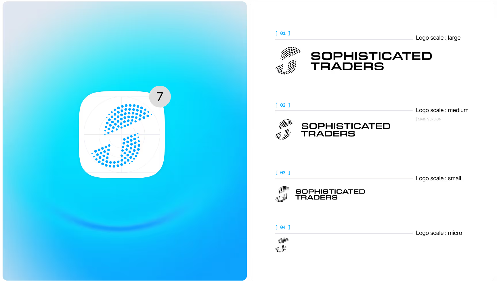
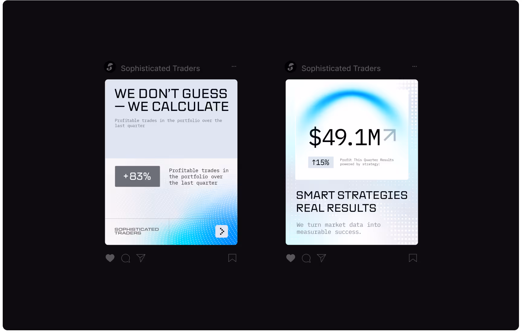
Our branding distilled the platform’s essence into a sharp, confident system — analytical in style, community-driven in spirit, and built to make smart trading feel intuitive, social, and empowering.

The image features a logo with a blue, curved design resembling an "S" followed by the words "SOPHISTICATED TRADERS" in bold black text on a white background.
A blue gradient background with a white app icon featuring a dotted "S" design and a notification bubble. Adjacent are four logo scales labeled large to micro.
A hand holds a business card against a clear blue sky. The card, labeled "Sophisticated Traders," conveys a professional and modern tone.
Text "Sophisticated Traders" appears in bold, outlined white font on a lined grid background. The design suggests precision and professionalism.
Abstract design featuring two grid-based patterns. The left shows the letter "S" in blue dots on a dark background. The right has a grey "T" on black. Sophisticated and modern.
Logo design for "Sophisticated Traders" on a black background. Text is white and bold, with a stylized "S" logo. Blue lines indicate safe zone spacing.
Hand holds a transparent square with a stylized "S" on the left. On the right, a blue digital UI with app icons and "Sophisticated Traders" text.
The image shows a typographic and color palette for a design project. The typeface section features uppercase "A" and lowercase "a" with descriptions. The color palette includes four square swatches with hex and CMYK codes: light gray (#DFE6EF), blue (#0DA
Digital kiosk in a dimly lit space displays an ad for "Sophisticated Traders." Text: "Trade with Confidence. We provide the resources—you deliver the results."
A laptop displaying a trading platform, "Sophisticated Traders," against a vivid blue background. The scene conveys a modern, professional tone.
A laptop displays a trading company webpage with a blue banner. Next to it, a digital ad highlights data-driven trading, showing statistics and promoting factual analysis.
Digital billboard with blue bar graph and upward trend, featuring text "Join the Traders Who Calculate" and "$83.85" with chart. Modern, analytical vibe.
Two Instagram posts from 'Sophisticated Traders' on a black background. Left post: 'We Don't Guess—We Calculate' with +83% profitable trades graphic. Right post: '$49.1M Smart Strategies Real Results' with a +15% profit increase indicator.
A business card for 'Sophisticated Traders' featuring a gradient blue design with the words 'ANALYZE, OPTIMIZE, PROFIT.' Contact details and a logo appear on the left.
A person in a gray coat carries a tote bag with "Sophisticated Traders" on it. Next to this is a digital ad with a blue pattern and the text "We provide the resources — you deliver the results."
No items found.

Summary

Industry
Web3

Our partnership with Eloqwnt elevated Sophisticated Traders from a niche trading group to a professional, future-ready fintech brand.

Thisma
Founder and CEO
Let’s chat
Contact us

The right partner at the right moment changes everything.

Start a conversation

Tell us about your next stage.

Our Testimonials:

Thank you for filling out the form! 
We will contact you ASAP

Cute minions saying yes sir
Oops! Something went wrong while submitting the form.
No items found.
Next branding

FeelTru

Eloqwnt helped us translate FeelTru’s clinical expertise into a brand that feels both authoritative and human. The new identity gives FeelTru the trust, warmth, and clarity needed to make medically guided weight management feel approachable, safe, and genuinely supportive from the very beginning of the patient journey.

Next branding
A woman with red hair and a peaceful expression holds a "FeelTru" bottle against a serene sky backdrop, suggesting relaxation and wellness.
Next branding

Beedew

Eloqwnt helped us translate our natural skincare philosophy into a brand that feels both ingredient-led and deeply inviting for the customers we nurture. The new identity gives Beedew the warmth and authenticity needed to connect with conscious beauty seekers at the very first touch of their skincare ritual.

Next branding
Elegant skincare products displayed on stone pedestals with soft, warm lighting. Surrounded by delicate pink flowers, conveying a serene, luxurious vibe.
Next branding

Kaladora Capital

Eloqwnt helped us translate our operator-led philosophy into a brand that feels both institutionally rigorous and genuinely trustworthy to the founders and businesses we partner with.

Next branding
A subway platform features a prominent advertisement by Kaladora Capital. It displays "$1B+" with text about investments. Two people walk past, creating a dynamic city atmosphere.
Next branding

ZIGChain

Eloqwnt helped us translate our decentralized infrastructure into a brand that feels both financially authoritative and genuinely accessible to builders, investors, and the broader ecosystem. The new identity gives ZIGChain the credibility and clarity needed to position on-chain asset management as the definitive foundation for the next era of wealth generation.

Next branding
A logo with the word "ZIGCHAIN" in bold white letters is centered on a dark background. Below, curved, ribbed patterns in orange and purple create a tech-inspired look.
Next branding

Next STEPS

Eloqwnt helped us translate our multidisciplinary expertise into a brand that feels both clinically trustworthy and deeply human for the individuals and families we serve. The new identity gives Next STEPS Worldwide the warmth and clarity needed to welcome people of every age through the most important steps of their wellbeing journey.

Next branding
A minimalist workspace with beige ceramics. A phone displays "Congratulations!" in green; papers and a business card read "Your next step starts here."
Next branding

Hybrid Mind

Eloqwnt helped us translate our AI and data expertise into a brand that feels both technically rigorous and genuinely accessible to the organisations we work with. The new identity gives Hybrid Mind the clarity and confidence needed to guide businesses through their most complex intelligence and transformation challenges.

Next branding
Sign in a modern office hallway reads "A hybrid approach to Data & AI." Text highlights experienced consultants and end-to-end MLOps. People converse nearby.
Next branding

Siwa

Eloqwnt helped us translate our investment philosophy into a brand that feels both credible and genuinely personal to the operators we back. The new identity gives Siwa Capital the clarity and conviction needed to connect with independent sponsors and entrepreneurs at the earliest stages of their acquisition journey.

Next branding
Futuristic, symmetrical hallway with soft lighting, curved vertical panels, and a circular opening in the floor. The word "SIWA" is centered in bold white letters.
Next branding

Vanquish

Eloqwnt helped us translate our advisory expertise into a brand that feels both authoritative and accessible to the businesses we serve. The new identity gives Vanquish Holdings the credibility and clarity needed to guide clients through their most critical capital and growth decisions.

Next branding
A small, shiny metallic letter "V" on a pitch-black background. The minimalist design and high contrast create a mysterious and futuristic tone.
Next branding

Vertus AI

Eloqwnt helped us translate our frontier research into a brand that feels both authoritative and legible to institutional decision-makers. The new identity gives Vertus AI the gravitas and precision needed to operate at the intersection of capital markets, scientific infrastructure, and machine intelligence.

Next branding
A hand holds a sleek, translucent device displaying text, "Complex Markets Move with Vertus," alongside pink clouds and abstract shapes. Modern and innovative tone.
Next branding

VSC

Eloqwnt rebuilt The Virtual Slimming Clinic into a brand that finally matches the clinical operation behind it. They didn't give us a louder weight-loss brand, they gave us a system, with four strategic pillars and a defined voice that the whole team now uses.

Next branding
A modern billboard shows a smiling person with a pill between their teeth, text reading "Becoming Me" directs attention to a purple circle, emphasizing transformation.
Next branding

Sophisticated Traders

Our partnership with Eloqwnt elevated Sophisticated Traders from a niche trading group to a professional, future-ready fintech brand.

Next branding
Silhouettes of a seated woman and standing man face a large screen with the text, "We are transforming the way people trade and invest," in a modern setting.
Next branding

Script

Working with Eloqwnt felt like having an extra strategic co-founder. They kept the medical credibility of Scriptderm, but wrapped it in a disruptive, consumer-friendly identity and a website that actually converts curious visitors into confident patients.

Next branding
Two billboard ads on building facades show close-ups of diverse women with glowing skin, highlighting skincare. Text: "Science You Can Trust."
Next branding

Liquid Meme

Eloqwnt team members had a lot of range, not just in their design capabilities but also in their knowledge of artistic influences that go into their designs, that was extremely impressive.

Next branding
Three floating keys on a dark background: a blue key with "LIQUID," an orange key with a heart icon, and a light blue key with "MEME." Vibrant and modern.
Next branding

Freeport Markets

We needed users to understand what we do just by looking at our website. We chose Eloqwnt based on their fintech work. As a result, we saw stronger interest from both customers and partners, along with an increase in website conversion.

Next branding
Logo of Freeport Markets on a textured black background. The logo features a stylized shield in white, conveying security and trust.
Next branding

Traders Hub

Eloqwnt team members had a lot of range, not just in their design capabilities but also in their knowledge of artistic influences that go into their designs, that was extremely impressive.

Next branding
The image shows two business cards balanced on dark rocks. The background features binary code and a gradient from teal to black, creating a tech-inspired tone.
Next branding

TitanX

Eloqwnt team members had a lot of range, not just in their design capabilities but also in their knowledge of artistic influences that go into their designs, that was extremely impressive.

Next branding
A bold "TITAN X" logo in white and red over a dynamic black and red dotted wave pattern. The design conveys innovation and energy.
Next branding

Vantir

Eloqwnt team members had a lot of range, not just in their design capabilities but also in their knowledge of artistic influences that go into their designs, that was extremely impressive.

Next branding
A person holds a smartphone displaying a sleek logo on a black screen, set against a warm, gradient background.
Next branding

Fractal

Eloqwnt team members had a lot of range, not just in their design capabilities but also in their knowledge of artistic influences that go into their designs, that was extremely impressive.

Next branding
Stylized word "Fractal" in teal text on a black background, partially obscured by abstract, transparent organic shapes, conveying a futuristic tone.
Next branding

Multicard

Eloqwnt team members had a lot of range, not just in their design capabilities but also in their knowledge of artistic influences that go into their designs, that was extremely impressive.

Next branding
Billboard shows a person holding a purple multicard with text "Your goals, our focus" and "Banking designed to grow with you and your goals." A cyclist passes by.
Next branding

Multikassa

Eloqwnt team members had a lot of range, not just in their design capabilities but also in their knowledge of artistic influences that go into their designs, that was extremely impressive.

Next branding
Digital display in a modern, indoor location with an orange geometric graphic and "Focus on efficiency" text, alongside the logo "multikassa."
Next branding

Multibank

Eloqwnt team members had a lot of range, not just in their design capabilities but also in their knowledge of artistic influences that go into their designs, that was extremely impressive.

Next branding
Three individuals smiling and holding Multibank cards in a modern setting with gray curtains. One shows a smartphone screen with a banking app.
Next branding

Get Talky

Eloqwnt team members had a lot of range, not just in their design capabilities but also in their knowledge of artistic influences that go into their designs, that was extremely impressive.

Next branding
Displays with "Get Talky" branding show AI-Enabled Patient Scheduling. Left: two smiling women viewing a phone, middle: a joyful doctor with colleagues, right: promotional text.
Next branding

Creators Studio

Eloqwnt team members had a lot of range, not just in their design capabilities but also in their knowledge of artistic influences that go into their designs, that was extremely impressive.

Next branding
Two people with vibrant hair and makeup are laughing joyfully against a purple background. "Creators Studio" text and logo are centered above.
Next branding

Amor Fati

Eloqwnt team members had a lot of range, not just in their design capabilities but also in their knowledge of artistic influences that go into their designs, that was extremely impressive.

Next branding
Text "AMOR FATI" is elegantly centered on a rich, dark wooden texture. The white lettering contrasts with the detailed wood grain.
Next branding

UzOman

Eloqwnt team members had a lot of range, not just in their design capabilities but also in their knowledge of artistic influences that go into their designs, that was extremely impressive.

Next branding
Abstract blue and black background with curved shapes and reflective surfaces. Centered white text reads "UzOman Investment Company."
Next branding

Zolve

Eloqwnt team members had a lot of range, not just in their design capabilities but also in their knowledge of artistic influences that go into their designs, that was extremely impressive.

Next branding
Stylized text "zolve" in gray on black background with a vibrant orange and purple swoosh design curving through the letters
Next branding

QDT

Eloqwnt team members had a lot of range, not just in their design capabilities but also in their knowledge of artistic influences that go into their designs, that was extremely impressive.

Next branding
Abstract teal background with a textured grid pattern, featuring "QDT" in large white letters. "Quantum Data Technologies" is written to the side.
Next branding

zk.Link

Eloqwnt team members had a lot of range, not just in their design capabilities but also in their knowledge of artistic influences that go into their designs, that was extremely impressive.

Next branding
Blue abstract digital network background with a geometric hexogonal logo on left and "zk.Link" text on right.
Next branding

Taraxa

Eloqwnt team members had a lot of range, not just in their design capabilities but also in their knowledge of artistic influences that go into their designs, that was extremely impressive.

Next branding
Futuristic digital circuit board design with the logo "TARAXA" in the center.
Next branding

Serenity

The whole branding went out to be amazing, I loved the work that Eloqwnt did. Our internal stakeholders also were happy with what we got. Highly appreciate the guys.

Next branding
Modern living room with one person lounging on a couch and another sitting in a chair, writing.
Next branding

Fractalized

I have been working with them for a while now, 3rd project to be exact. Always a great experience, very talented and responsive!

Next branding
Abstract blue and white metal shapes with the word "FRACTALIZED" displayed.
Next branding

Alpha Ledger

Their attention to detail and ability to balance sophistication with user-friendly design made all the difference.

Next branding
Black card with "AlphaLedger" text illuminated by a central light source creating a halo effect.