Big-Name Failed Rebrands and the Lessons They Teach

The High Stakes of Rebranding
Rebrands are high-stakes moves. When done right, they breathe new life into a company, spark growth, and open doors to audiences who may have never looked twice before.
When done wrong, they confuse loyal customers, waste millions, and sometimes become case studies in “what not to do.”
From studying the market, we know how even small shifts in messaging, visuals, or tone can ripple through a brand in unexpected ways. History is full of examples showing just how costly missteps can be.
That’s why today we’re exploring some of the most famous failed rebrands in recent history — not to shame the companies, but to uncover the lessons they offer. Every botched logo, tone-deaf campaign, or confusing identity shift has something to teach about strategy, timing, and execution.
If you’re thinking about a rebrand of your own, these stories are a roadmap for what to avoid — and how to get it right.
Why Do Rebrands Fail?
Looking across industries, one thing stands out: not every rebrand hits its intended goals.
The numbers highlight this trend:
• 40% of rebranding efforts fail to deliver a positive ROI – meaning the investment doesn’t generate the expected growth.
• Up to 20% of sales can drop after a poorly executed rebrand, as seen in some high-profile product overhauls.
• 60% of rebrands fail to strengthen customer loyalty, showing that a new look alone isn’t enough to keep people engaged.
[The sources behind these numbers can be found here.]
From our perspective, failures usually come down to a few recurring issues:
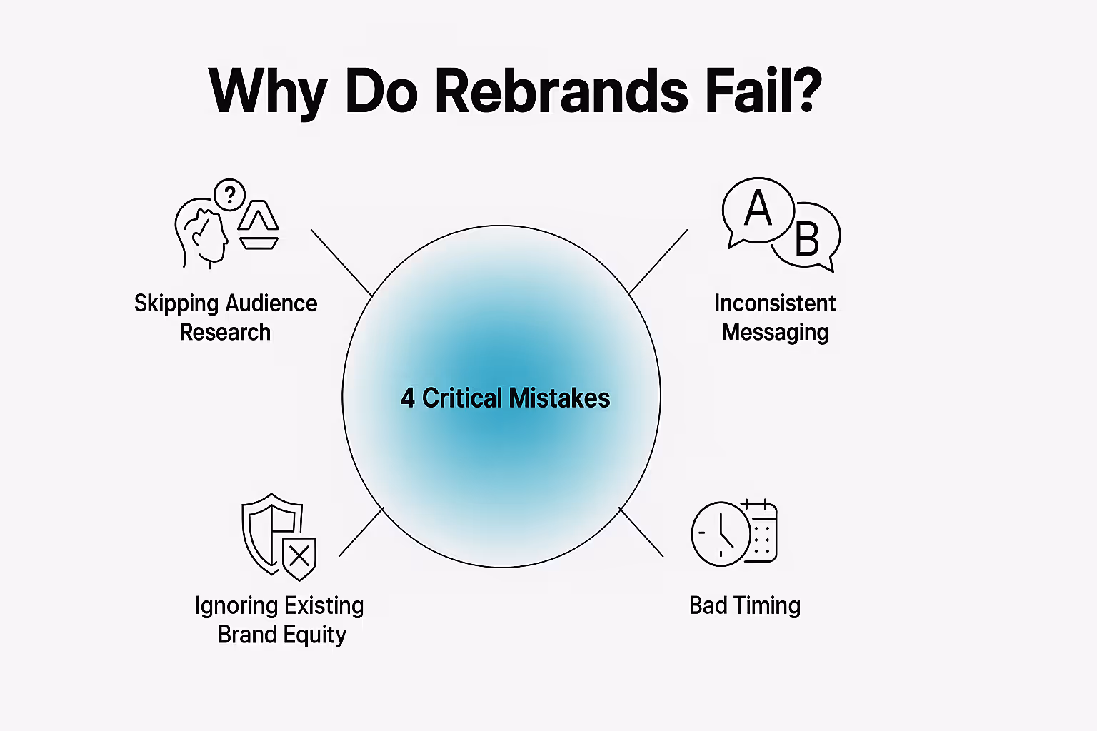
1. Skipping audience research: too often, companies rush from design sprint to logo reveal without asking the crucial question: what does our audience really expect? The result is an identity that may look polished but feels disconnected — and once you lose that emotional link, it’s hard to win back.
2. Inconsistent messaging: when visuals, tone, and experience don’t align, the brand loses coherence. A polished new look means little if the voice or customer interactions tell a different story, leaving audiences confused.
3. Ignoring existing brand equity: recognition and loyalty are built slowly over time, and they carry real commercial value. Yet some rebrands treat the past as baggage instead of an asset. Removing familiar logos, language, or visual cues risks erasing the emotional attachment customers have developed. When that equity is discarded too abruptly, the brand often loses more than it gains.
4. Bad timing: Context matters as much as the creative itself. Even the strongest identity work can stumble if launched at the wrong moment. A rebrand unveiled during an economic downturn, a cultural shift, or right after a competitor’s big move can land poorly.
5 Famous Examples of Rebranding Fails and Their Mistakes
The danger of these issues becomes even clearer when we look at how they unfolded in practice. Time and again, rebrands that ignored these fundamentals sparked backlash, confusion, and in some cases, complete reversals.
Here are five rebrands that prove just how costly it can be when the fundamentals are ignored:
1. GAP (2010)
➤ A $100 million rebrand that lasted just six days.
It began with a square. For decades, GAP’s navy-blue box wasn’t just a logo — it was shorthand for American casual wear, the promise of easy denim and everyday basics. By 2010, however, after years of slipping sales, the brand set out for reinvention.
The new identity arrived suddenly: Helvetica letters with a small gradient box floating above the “P.” Designed to look modern, it instead felt generic — as if the brand had erased its own character overnight.
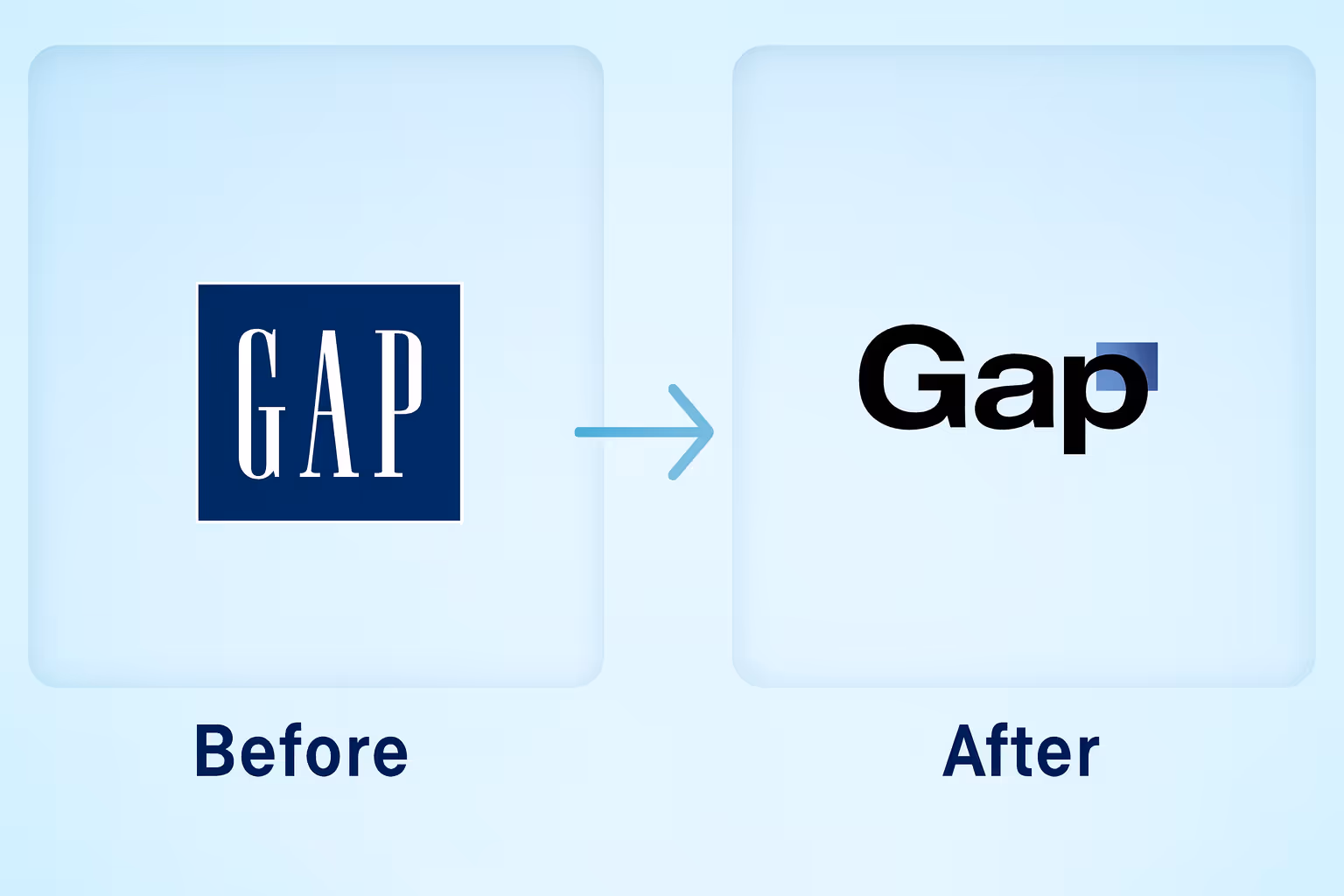
The reaction was immediate. Designers ridiculed it, loyal customers rejected it, and the backlash grew louder than the launch itself. Six days later, GAP retreated, restoring the old logo in what became one of retail’s most public reversals.
The most ironic part? The logo wasn’t the only problem. The real failure was strategic — no research, no story, no bridge between past and future. A $100 million lesson in how not to rebrand.
The Mistakes Made
→ Abrupt execution: launched with no context or consultation.
→ Discarded equity: erased decades of recognition overnight.
→ No narrative: gave customers no reason for the change.
→ Poor timing: tried reinvention without fixing deeper problems.
2. Tropicana (2009)
➤ A $30 million redesign that wiped 20% off sales.
In 2009, Tropicana decided to “freshen up” its cartons. Out went the iconic orange with a straw — an image so ingrained it practically defined breakfast tables. In its place came a minimal white box with a glass of juice and simplified typography.
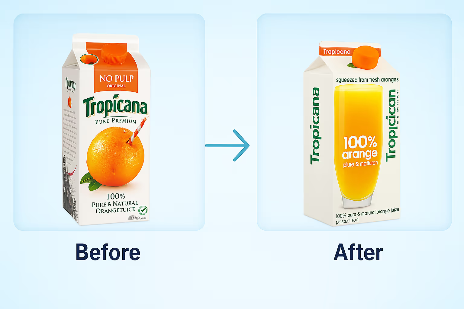
What was meant to signal modern clarity ended up creating only confusion. Shelves that once had instant recognition suddenly looked generic, and loyal shoppers struggled to even spot their favorite juice. Within two months, sales had dropped by 20% — a $30 million hit that forced Tropicana to scrap the redesign and bring back the orange.
What makes this even harder to swallow: the juice inside hadn’t changed. What failed was the brand’s ability to respect the emotional familiarity customers had built over decades. That’s the essence of emotional branding — the subtle cues that keep loyalty alive, even before the product is tasted.
The Mistakes Made
→ Stripped away recognition: removed the iconic orange-and-straw symbol.
→ Misjudged loyalty: ignored the emotional attachment built over decades.
→ Poor testing: no clear evidence the redesign resonated with core buyers.
→ Over-simplified: in aiming for “modern,” they erased what made them distinct.
3. Mastercard (2006)
➤ $1.5 million spent on a new look that failed to move hearts.
Some brands thrive on simplicity.
For decades, Mastercard’s two interlocking circles did the heavy lifting: a symbol of clarity, trust, and instant recognition in wallets worldwide.
But in 2006, the company tried to “upgrade” that simplicity. Out came a third translucent circle, gradients layered over the original colors, and a new label — shifting from “MasterCard International” to “MasterCard Worldwide.” The idea was to represent growth and complexity: a global network with multiple business arms.
The problem? Nobody asked for more circles. What was meant to signal expansion only muddied the design. The logo lost its balance, recognizability weakened, and the symbolism never really landed with audiences. To make matters worse, the new look appeared mostly in corporate communications, while credit cards in customers’ hands still carried the old logo — creating a split identity that only deepened the confusion.
A brand built on trust had just made itself harder to trust — not through scandal or failure of service, but through a poorly thought-out attempt to “look bigger.”
The Mistakes Made
→ Overcomplicating an icon: simplicity gave way to clutter.
→ No emotional testing: the symbolism was internal, not consumer-driven.
→ Inconsistent rollout: different faces of the brand told different stories.
→ Mixed messaging: “clarity” was the goal, but confusion was the outcome.
4. Twitter (2023)
➤ $44 billion change that cost its cultural weight.
For over a decade, Twitter’s blue bird wasn’t simply a logo. It became a cultural landmark — a symbol that carried protests, memes, and breaking news across the globe. One glance at that bird, and people instantly understood what it meant: conversation in motion.
In 2023, that icon disappeared almost overnight. Under Elon Musk’s ownership, Twitter was renamed “X,” its identity stripped down to a stark black-and-white lettermark. The move was meant to signal transformation, a step into something bigger than social media. Instead, it left millions of users disoriented, unsure what the platform now represented.
The transition felt rushed. The product hadn’t evolved to match the new identity, and there was no clear story tying the old to the new. Years of equity and cultural recognition — painstakingly built over 17 years — were cast aside in a single announcement.
The result was a rebrand that looked bold on the surface but hollow underneath. Without context, even the most recognized brands risk losing their meaning.
The Mistakes Made
→ Abrupt shift: erased an iconic symbol without transition.
→ Lost equity: discarded 17 years of cultural recognition.
→ No clear narrative: users were told what changed, but not why.
→ Disconnected experience: bold visuals without product evolution.
5. Yahoo (2013–2019)
➤ A $5 million expense on a logo that changed nothing.
Few internet brands defined the early 2000s like Yahoo. Its quirky purple wordmark and that famous exclamation point were part of web culture itself. But by the 2010s, with Google and others pulling ahead, Yahoo was desperate to signal relevance again.
In 2013, the company unveiled a peculiar campaign: 30 different logos released over 30 days, capped off with a final new design. What was meant to feel fun and dynamic instead came across as indecisive — like the brand couldn’t quite decide who it wanted to be.
The redesign itself wasn’t offensive, but it didn’t solve the real problem: Yahoo’s lack of focus as a company. While the logo changed, the user experience remained cluttered, and the brand message stayed vague. By 2019, another redesign followed, but by then, the audience had already moved on.
What Yahoo showed is that a logo refresh can’t cover for deeper issues. Without clarity of vision, even the boldest identity efforts ring hollow.
The Mistakes Made
→ Gimmick over strategy: 30 logos in 30 days diluted the impact.
→ No substance: identity changes without real product evolution.
→ Lost coherence: multiple shifts left audiences unsure what Yahoo stood for.
→ Ignored deeper issues: branding became a distraction, not a solution.
The Lessons These Mistakes Leave Behind
Looking back at these stories, each failure leaves behind a lesson that’s bigger than a single logo or packaging change. Together, they reveal what’s truly at stake when a rebrand misses the mark:
- Trust can vanish overnight. GAP proved that decades of equity can be undone in just six days if audiences feel blindsided.
- Familiarity is powerful. Tropicana showed how even subtle visual shifts can strip away recognition and loyalty, no matter how modern they look.
- Minimalism isn’t always clarity. Mastercard’s stripped-down approach revealed the danger of going too far: a cleaner look can end up generic if it erases the depth and emotion people once attached to the brand.
- A logo isn’t a cure. Yahoo’s redesigns underlined the truth: you can’t fix strategic drift with cosmetic polish.
- Cultural symbols are irreplaceable. Twitter demonstrated that when a brand identity becomes part of everyday language, changing it means rewriting culture — and that comes with enormous cost.
Taken together, these rebrands teach us a simple but sobering truth: branding isn’t decoration – it’s direction. Lose sight of that, and no budget, however massive, can shield you from the consequences.
Frequently Asked Questions on Rebranding
What is the biggest reason rebrands fail?
Most rebrands fail because they treat design as decoration, not direction. A shiny new logo without strategic clarity is like repainting a house with cracks in the foundation — it hides the problem, but doesn’t solve it. At Eloqwnt, we’ve seen time and again that branding only works when it’s rooted in strategy, not aesthetics alone.
How much should a rebrand cost?
Costs vary depending on scope and rollout. But the real question isn’t “how much” — it’s what are you investing in? A $50k rebrand with strategic depth can drive more long-term value than a $5M redesign done without alignment. The price tag matters less than the clarity and trust it delivers.
How do I know if my company needs a rebrand?
The red flags are clear: your brand feels dated, your audience no longer connects, or your identity creates confusion. Sometimes the need shows up as declining relevance; sometimes it’s expansion into new markets. If your brand feels more like a barrier than a springboard, it might be time to act — check out our guide on the signs it’s time to amplify your brand.
Can a small business afford rebranding?
Yes — and often they can’t afford not to. Smaller businesses benefit from sharper positioning, faster pivots, and stronger differentiation. At Eloqwnt, we’ve helped startups use lean but strategic branding to attract investors, customers, and credibility without overextending budgets.
Does rebranding always mean changing the logo?
Not at all. In many cases, the logo is the least important piece. Rebranding can focus on voice, story, or customer experience. Twitter’s $4B shift proves that when you change a cultural symbol without a deeper strategy, you risk breaking trust instead of building it.
How can companies avoid rebranding fails?
Successful rebrands start with understanding your audience and uncovering real insights. Build a clear strategy before touching visuals, test changes with real users, and keep the brand elements that your customers already trust. This approach turns a rebrand into growth rather than risk.
If you’re ready to elevate your brand with clarity and impact, we’ll be your partner every step of the way!
Discover our services, dive into SuperDesign templates, or contact us to build a fully custom rebrand from scratch.