

How to Boost Fintech Conversions with Strategic UX/UI Design | Proven Tips & Examples

Money is emotional.
Yet the fintech space often forgets that.
We live in an age where sending $10,000 overseas is faster than mailing a postcard — and where the real disruption isn’t just about blockchain, AI underwriting, or automated KYC checks.
It’s about trust.
Because behind every transfer, trade, or investment, there’s a human decision:
“Do I feel safe putting my money here?”
Fintech founders know this instinctively. They build secure infrastructures, add compliance layers, and highlight encryption on every investor slide deck.
They launch new dashboards, aggregate data feeds, and design product roadmaps filled with features meant to “differentiate” from competitors.
Yet despite billions spent on engineering and marketing, conversion rates often disappoint.
Bounce rates stay stubbornly high.
Activation rates lag behind acquisition.
First‑time users create an account… but don’t stick around.
It’s a paradox: the technology becomes smarter — but the user stays skeptical.
And this isn’t just a problem for early-stage startups. Even mature fintech products with strong funding, solid teams, and impressive roadmaps can struggle to turn visitors into loyal users.
If you’ve ever asked yourself:
- Why do users drop off halfway through onboarding?
- Why do pricing pages repel more than they convert?
- Why do our dashboards look beautiful… but feel cold?
You’re not alone.
But before we talk about solutions — or even why UX/UI matters — let’s understand what makes fintech uniquely hard to convert.
Because unlike SaaS or e‑commerce, fintech isn’t selling a product.
It’s asking users to hand over something deeply personal: trust with their money.
And that’s where the story really begins.
Why fintech conversions are uniquely fragile
Ask anyone in SaaS why users convert, and you’ll hear: product‑market fit, clear value proposition, pricing, and features.
In fintech? Those still matter — but they’re not enough.
Because fintech lives at the intersection of three invisible forces:
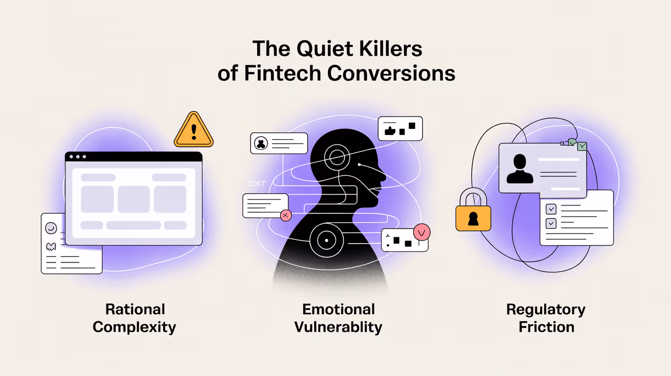
1. Rational complexity disguised as clarity
On the surface, your interface might look clean.
But users aren’t just seeing pretty charts — they’re silently asking:
- “Am I about to make a mistake?”
- “Will I really understand what happens next?”
Fintech products live in the world of acronyms (APY, ETF, AML) and disclaimers in fine print.
What feels “clear enough” to a founder or product team often feels like a legal minefield to users — and that cognitive load quietly kills momentum.
Even small friction points add up:
- Overly technical copy that makes users question if they’re qualified
- Hidden fees that trigger doubt mid‑flow
- Dashboards that overwhelm instead of reassure
Because clarity isn’t just about “less clutter.”
It’s about reducing decision anxiety — the fear of getting it wrong when real money’s on the line.
2. Emotional vulnerability hidden behind numbers
Money is never just numbers on a screen.
It’s security. Freedom. Even status.
A cold, transactional interface may look “professional” — but to users, it feels indifferent.
And indifference feels unsafe.
In research we’ve done for fintech products, people rarely frame it as “I don’t trust the math.”
What slips out instead:
- “It feels too complex for someone like me.”
- “I’m afraid I’ll make a mistake I can’t fix.”
- “It seems built for experts, not people like me.”
These small phrases reveal the real force at play: users don’t only see dashboards and data; they carry a hidden fear of making the wrong move — and being left alone to face the consequences.
That silent emotional load sits behind every scroll, click, and hesitation.
And it’s powerful enough to stop conversions before they even start.
3. Regulatory friction that feels like punishment
Every fintech product must navigate a maze of compliance:
• KYC verification
• ID uploads
• Multi‑factor authentication
• Disclaimers and consent screens
All essential for security and regulation — yet each is a potential dropout point.
For users, these aren’t just “extra steps.”
They can feel like a test they’re doomed to fail — or worse, a sign the brand doesn’t fully trust them.
And unlike in other industries, these steps touch the most sensitive user contexts: identity, legal responsibility, and financial risk.
The process often feels rigid, cold, and mandatory — shifting the emotional tone from “welcome” to “prove yourself.”
What makes this force especially powerful is its silent message: “You’re under scrutiny. You might get rejected.”
That quiet anxiety can turn even the most motivated new user into someone who clicks away — simply to avoid feeling judged.
Why smarter UX/UI matters in fintech — from this point forward
Having peeled back the surface, we now see the real friction points aren’t what product teams usually measure. Which raises the question: why is more strategic UX/UI the lever that can actually shift these silent forces?
Because UX/UI isn’t just what users see — it’s what they feel. And in fintech, what they feel often decides whether they trust or hesitate.
It’s the difference between a product that simply “works” and a product people feel confident enough to act on:
→ Clear hierarchy that makes risk feel manageable
→ Language that guides without overwhelming
→ Visual cues that signal safety, even during steps like KYC or consent screens
It might sound subtle — but in fintech, that subtlety is everything.
It’s strategy made visible and felt — a practical, emotional, and behavioral system that:
- simplifies the complex,
- humanizes the cold, and
- makes every next step feel clear, safe, and worth taking.
So before we get into the practical — let’s anchor in this idea:
In fintech, UX/UI is often the first — and sometimes the only — conversation your product has with users.
It’s not just what they notice.
It’s what earns enough trust for them to stay.
A practical guide: how to design fintech UX/UI that converts
We’ve seen firsthand at Eloqwnt: the real shift happens when UX/UI stops being treated as polish and starts working as proof of trust.
So what does that look like in practice?
Here’s a step‑by‑step approach, shaped by real fintech projects where strategy became results:
Step 1: Map moments of doubt in user journey
Most fintech teams start by drawing neat linear journeys: homepage → pricing → signup → dashboard.
But real user journeys aren’t lines — they’re layered with invisible pauses, hesitations, and quiet second‑guessing.
That’s why instead of just plotting screens, it works better to map what really slows people down: the silent, emotional drop‑offs hidden between clicks.
Building journeys this way means thinking beyond “Where do they go?” to “What do they feel right before they go?”
And then designing for those feelings — not after, but in advance.
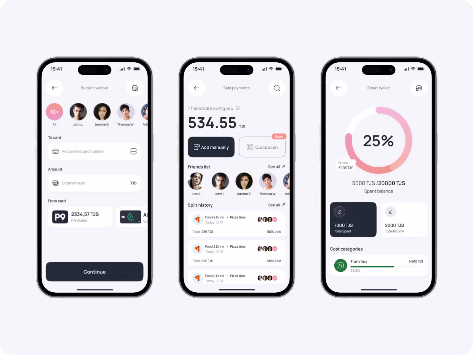
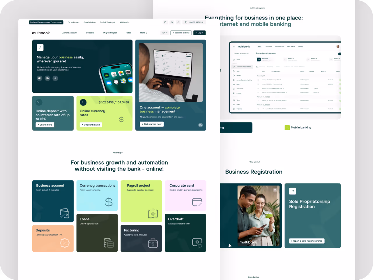
For example, when we worked on Multibank, the product had incredible power on paper: multi‑currency accounts, instant transfers, savings tools.
And instead of adding more features or just polishing the UI, we stepped back to map the emotional journey behind each decision:
– Placing plain‑language explainers exactly where hesitation naturally creeps in
– Surfacing essential info before users even feel the need to search for it
– Stripping out jargon that weighed flows down and silently undermined confidence
The goal wasn’t just to clean up screens — it was to design around the quiet doubts that slow real people down.
To move from a product that looked capable… to one that quietly felt intuitive, approachable, and ready to be trusted.
Because ultimately, designing for fintech isn’t about what’s displayed on the screen — it’s Aabout making sure users never have to pause and wonder what’s behind it.
Step 2: Simplify complexity with clear hierarchy
Fintech will always be complex. There’s data, disclaimers, and decisions users can’t skip — and trying to hide them only breeds mistrust.
The real design challenge isn’t making everything look simple, it’s making complexity feel understandable.
That’s where hierarchy quietly does the heavy lifting.
A strong visual and content hierarchy answers silent questions users may not even realize they’re asking:
• What should I read first?
• What can wait?
• What’s the single most important action here?
When you structure flows this way, you’re not dumbing things down — you’re giving users a map.
You’re telling them: here’s what to focus on now, and here’s why the rest matters later.
This isn’t about adding flashy hero sections or more icons.
It’s about using:
1. Clear headings that anchor the eye
2. Scannable summaries before deep details
3. Visual grouping to show what belongs together
4. Subtle cues that move the eye forward rather than letting it drift
Because in fintech, trust is built as much by what you de‑emphasize as by what you highlight.
When complexity is organized instead of dumped on the user, the product feels not only smarter — but safer, calmer, and purpose‑built.
That difference — from a flat wall of features to a guided pathway — often decides whether users feel confident enough to take the next step.
Step 3: Design with empathy and calm
It’s a common trap in fintech: aiming to look “professional,” teams strip away the human layer — ending up with dashboards that feel clinical rather than confident.
But professionalism isn’t about looking cold. It’s about guiding users through complexity without adding to their stress.
True design calm is built on:
- Visual rhythms that slow down decision fatigue
- Language that feels direct but never severe
- Layouts that anticipate what users worry about next, so they don’t have to search
When we worked on Multicard, this difference mattered. The product itself was powerful — multi-currency control, instant expense tracking, built for teams that needed clarity fast.
But raw features alone don’t build trust.
So instead of just polishing UI elements, we focused on the user’s mental state at every step:
- Introduced softer highlight tones that catch the eye gently, rather than forcing it
- Rewrote microcopy to sound reassuring yet precise — telling users what’s happening and why it matters
- Organized dashboards around real decision points, so users felt in control, not overwhelmed
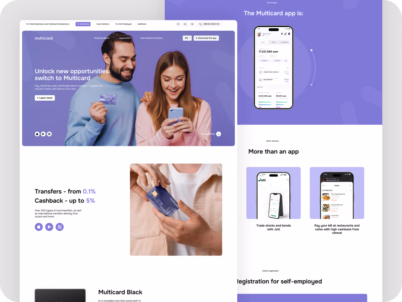
The result wasn’t louder design. It was design that quietly built confidence:
Flows that feel steady rather than rushed. Interfaces that guide attention naturally.
And most importantly, a product that feels solid enough to rely on — even in the moments when money decisions carry extra weight.
Because in fintech, calm isn’t just an aesthetic. It’s a competitive edge — turning complex products into experiences users trust, remember, and come back to.
Step 4: Turn compliance into reassurance
Here’s a counter‑intuitive insight: the screens users fear most can actually become the screens that build the most trust.
How? By treating compliance not as a cold obligation, but as part of your brand voice and experience:
1. Explain, don’t just request. A short, human line like “We ask for this to keep your money safe” does more than three paragraphs of legal copy.
2. Guide with warmth. Micro‑copy can quietly reassure users they’re not alone — turning ID uploads and consent boxes from friction points into moments of shared intent.
3. Show progress. Simple visual cues — a step indicator, a friendly confirmation — help users see they’re moving forward, not getting stuck.
4. Keep the brand visible. Bring in your tone, color, and motion so compliance screens feel like part of the journey, not a sudden bureaucratic detour.
Done right, these moments stop feeling like tests — and start acting as living proof that your product doesn’t just protect data, it protects people.
Step 5: Test your brand’s feel before and after
Here’s a quick experiment we run at Eloqwnt (and you can, too):
Take your product screens. Strip out the copy. Strip out the headlines that say “secure,” “trusted,” “easy.”
What’s left?
Does the design alone still feel credible?
Does the layout feel balanced, the rhythm calm, the hierarchy intuitive?
Or does it suddenly feel chaotic, rushed, or unfinished?
The insight is simple but powerful: trust shouldn’t have to be read.
It should be felt — through the quiet signals your brand sends before users process a single word.
In fintech, that difference is everything. Because real credibility isn’t what you claim.
It’s what users sense — even when the screen is silent.
So your last tip is: test your brand’s feel before and after — see if trust still holds when words disappear, letting design quietly do the talking (and winning you conversions).
Final thought
Every chart, rate, or feature in fintech can be copied. What can’t be copied? The quiet confidence your brand inspires.
It’s not the splashiest redesign or the cleverest headline that keeps users.
It’s the feeling that your product just makes sense — even in moments of friction.
That, over time, is what compounds into real momentum: lower drop‑offs, faster adoption, and a brand that still feels trustworthy five product updates later.
Because in fintech, design isn’t a finish line. It’s an ongoing conversation — steady, human, and quietly persuasive.
If that’s the kind of trust you want to build — trust that lasts, not just launches,
We’d love to help design it with you!
.avif)

.avif)


