

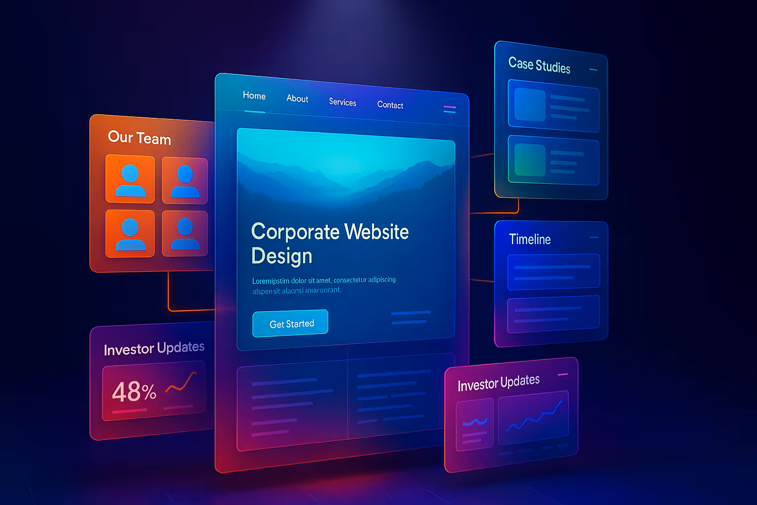
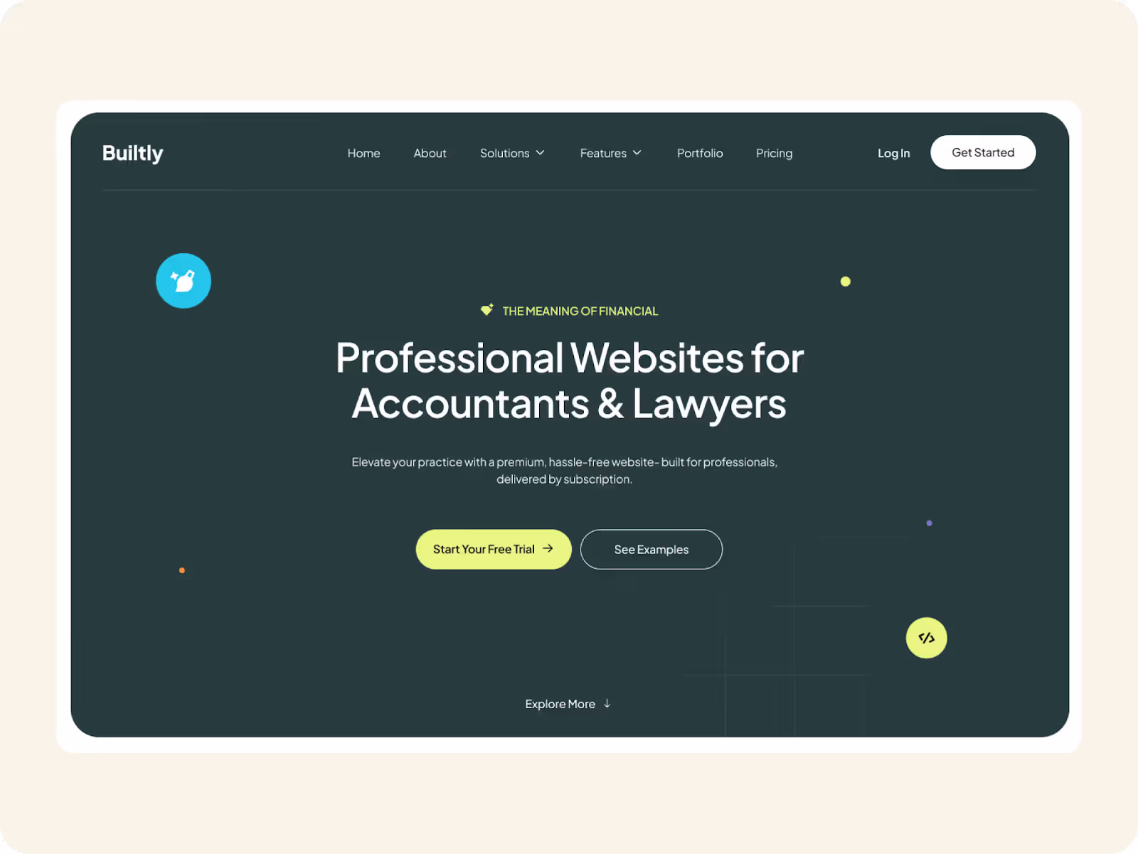
Corporate Website Guide (2025): What It Is & How to Design One That Performs
Before the Call → Comes the Click
Picture this:
An investor googles your company after hearing your name in a meeting.
A potential partner taps the link you shared on LinkedIn.
A candidate checks your homepage before deciding to apply.
Before a single call or email, your brand has already spoken.
Not in words, but in pixels, typography, and the quiet authority (or hesitation) your design projects.
That’s the real power of a corporate website today: It’s less about saying “we exist” — and more about silently answering, “are we worth trusting?”
Most people still see a corporate website as just an online brochure:
✔️ Logo
✔️ About page
✔️ Contact form
But the companies winning in 2025 know better.
A well‑designed corporate website doesn’t just list services — it:
- Moves visitors from curiosity to confidence
- Translates complex offerings into clarity
- And becomes a quiet growth engine: nurturing investors, closing deals, attracting top talent
We’ve seen it firsthand in projects for investment firms, green energy companies, and SaaS brands: Sharper visuals and smarter UX aren’t cosmetic — they quietly turn first impressions into long‑term credibility.
So what actually is a corporate website in 2025?
How is it different from a landing page, a startup splash site, or a digital product?
And more importantly:
What makes it work?
In this guide, we’ll unpack:
- The real definition of a corporate website (and why it’s evolved)
- Design principles that go beyond “looking professional”
- Real project examples showing these ideas in practice
- And how to make sure your site isn’t just a digital business card, but an asset that compounds trust over time
Because if your website is the first handshake your brand offers…
Why not make it the strongest one?
What is a Corporate Website? (And Why It’s Evolved in 2025)
Once upon a time, a corporate website’s job was simple: prove you exist.
A homepage with a slogan, an About page listing your team, and a Contact form somewhere near the footer. Done.
But 2025 tells a different story.
Today, a corporate website isn’t just a static brochure — it’s your brand’s quiet proof of seriousness.
It shows up when your sales team is sleeping. It backs up every pitch deck, LinkedIn post, or investor meeting. And it quietly answers the questions visitors rarely say out loud:
“Is this company real?”
“Do they look big enough, stable enough, modern enough?”
“Can I trust them with my money, data, or reputation?”
That’s why modern corporate websites don’t just tell what you do — they show how you think.
For instance:
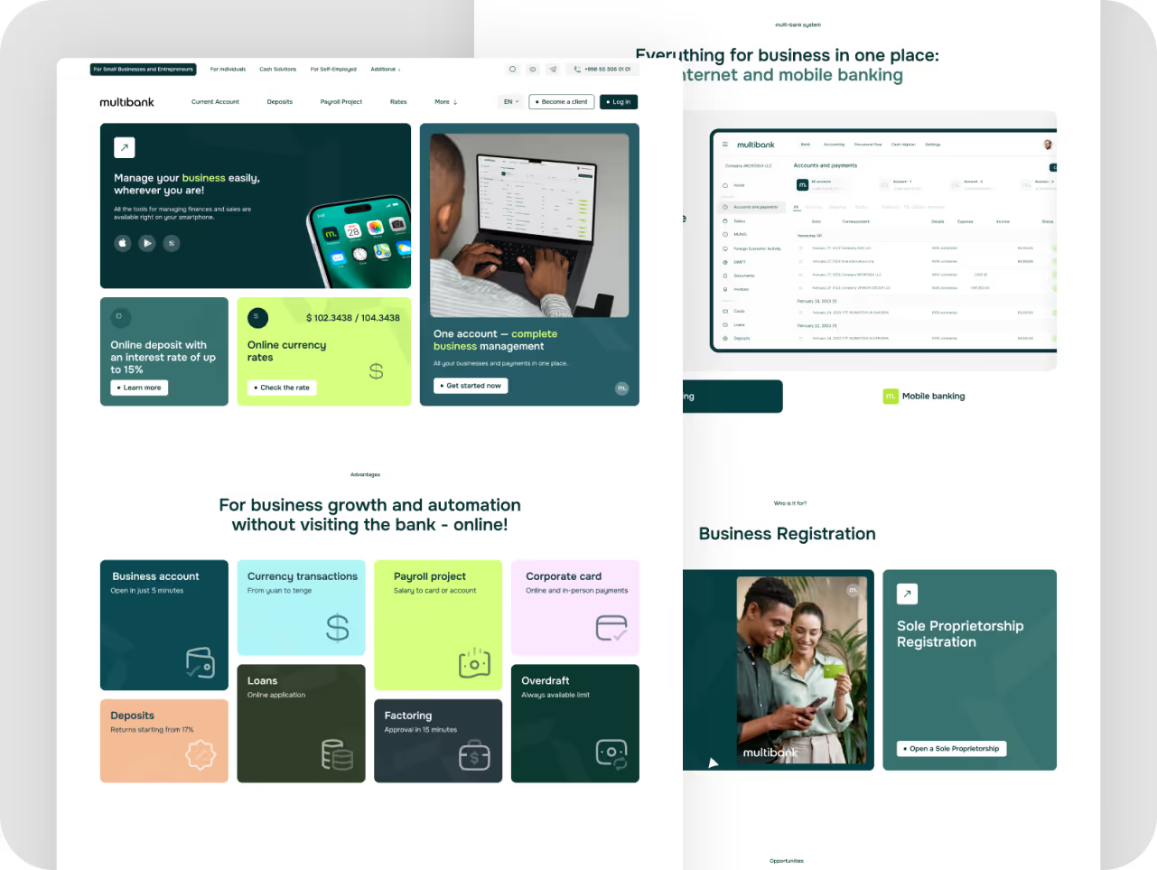
▸ Multibank’s rebranded site doesn’t just list services — it wraps them in calm, premium visuals that feel steady and established.
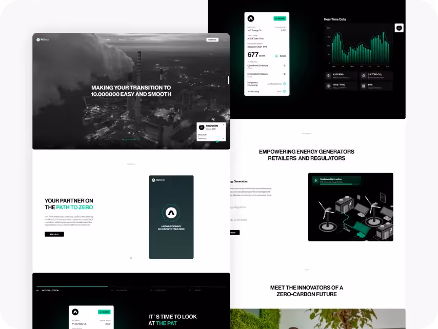
▸ PATtech’s green energy platform uses spacious layouts and refined typography to communicate innovation and credibility.
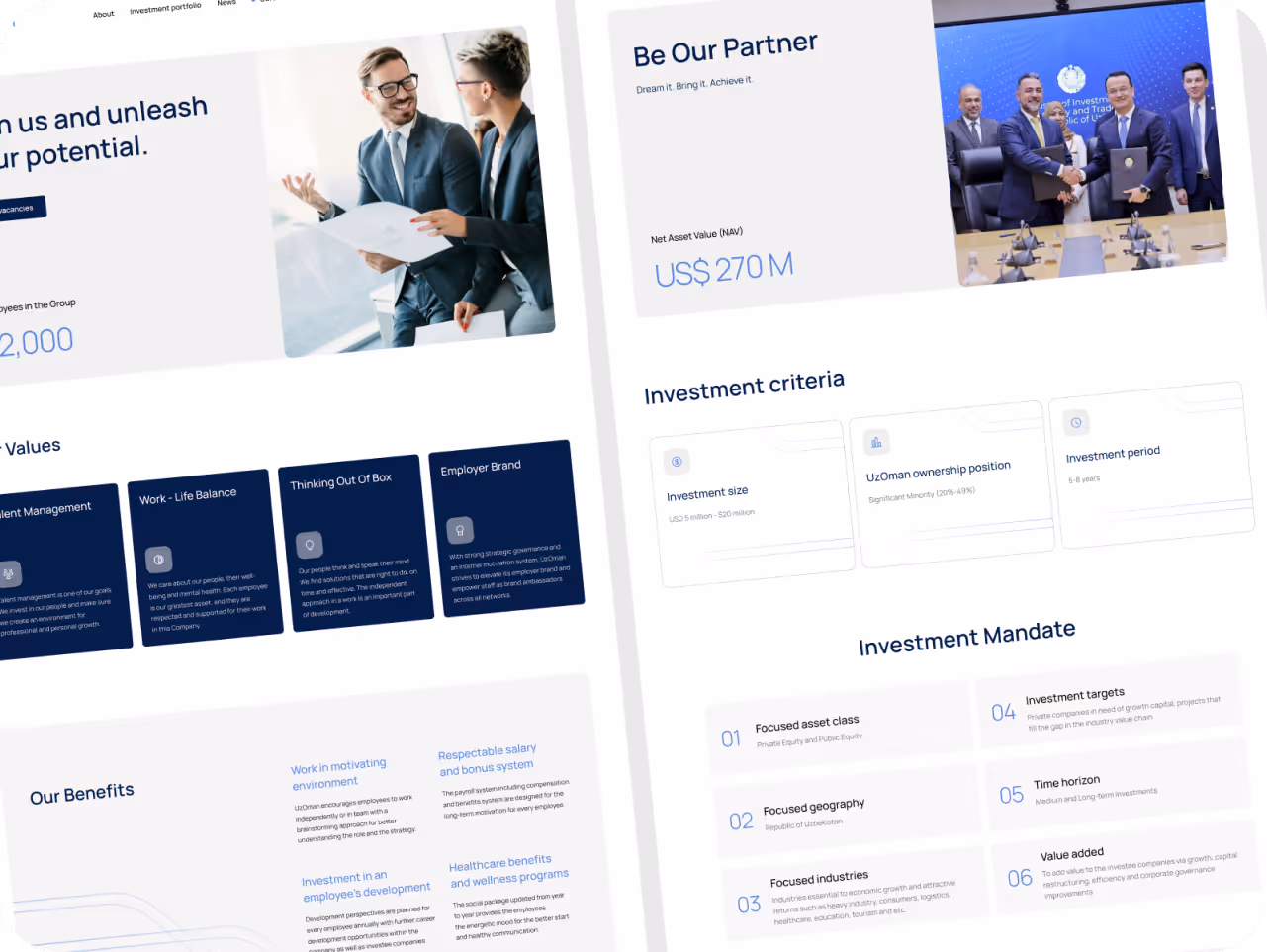
▸ UzOman’s corporate platform blends investment data with bold design language — showing transparency and ambition side by side.
(Each one shaped by our own team — proving design can speak for itself.)
What do they all share?
They move beyond “nice design” to deliver something deeper:
1. A story of scale: milestones, partnerships, team bios, press mentions.
2. Visual signals of trust: premium typography, balanced color palettes, confident white space.
3. Content built for long-consideration audiences — investors, partners, journalists, regulators.
And this isn’t accidental.
Because in 2025, your corporate website does what your sales deck alone never could:
- It’s always on — discoverable by anyone who Googles you.
- It makes your value proposition feel inevitable — before a word is spoken.
- It filters out doubt, so by the time real conversations start, trust is already compounding.
That’s what makes it different from a landing page or campaign site:
▸ A landing page pushes for quick signups.
▸ A corporate website builds slow, deep conviction that you’re the right partner.
And in an age where trust is the hardest currency, that quiet conviction is worth more than any headline or slogan could ever say.
How Design Builds Real Corporate Trust
In corporate design, the most powerful signals are often the quietest.
Not bold claims or flashy features — but the ease of navigation, the calm of the layout, the feeling that everything is exactly where it should be.
Because before a conversation begins — before a pitch is read — the design has already said a lot.
Here’s how that credibility gets built — not through decoration, but through intent:
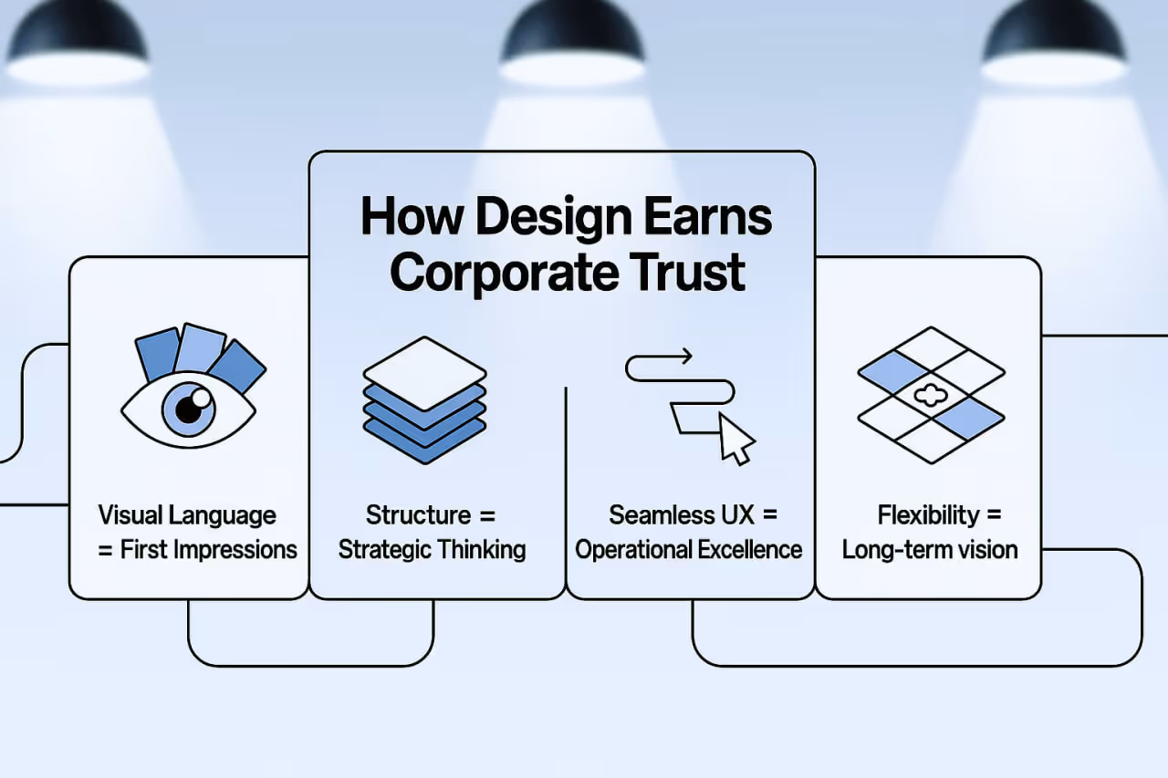
1. Visual Language Signals Who You Are
Before a word is read, people are already interpreting.
Design acts as a silent spokesperson — shaping perception in the first few seconds:
Typography that feels deliberate.
Color palettes that suggest maturity over hype.
Layout choices that reflect order, not chaos.
When done right, these elements communicate alignment: “This is a business that understands who it’s speaking to — and what matters here.”
For investors, partners, and press alike, credibility begins not with what you say, but how your site feels the moment they land.
2. Structure Reflects Strategic Thinking
Corporate audiences don’t browse — they evaluate. So the way content is structured becomes part of your proof.
Not just what’s said, but how it’s prioritized:
- A growth timeline placed where due diligence expects it.
- A leadership section that looks thoughtfully curated.
- A mission that reads more like a roadmap than a slogan.
Smart information architecture sends a message: “We think clearly. We plan for scale. We know what you’re here to find.”
That kind of order isn’t just helpful — it’s reassuring.
3. Seamless UX Signals Operational Excellence
A polished design might catch attention — but it’s the flawless flow that earns confidence.
When everything just works — the navigation, the pacing, the logic behind each click — it quietly tells a bigger story:
This company runs tight systems.
They don’t just talk about efficiency — they live it.
Because credibility isn’t claimed. It’s felt. In the calm of a well-structured page. In the absence of friction.
In the sense that nothing here was rushed or left to chance.
Great UX isn’t just user-friendly. It’s reputation at work — one seamless interaction at a time.
4. Flexibility Hints at Long-Term Vision
Design shouldn’t just reflect who you are — it should accommodate who you’re becoming.
A credible brand looks like it’s ready for what’s next:
- Layouts that scale as teams expand.
- Systems that allow case studies, insights, and geographies to grow without chaos.
- A design language that holds together as the business evolves.
What people feel when they navigate such a system is confidence — that the brand isn’t just present, but prepared.
This ability to grow in public — without growing disjointed — is one of design’s most underappreciated signals of legitimacy.
Real‑World Corporate Website Examples
(And what they quietly prove about trust, clarity, and growth)
It’s one thing to say “design builds credibility.”
It’s another to show what that actually looks like — across sectors that are often seen as dry, dense, or high-stakes.
Here are five ways we’ve used design not to decorate, but to reinforce business value:
Fractalized – Maritime Investment Platform
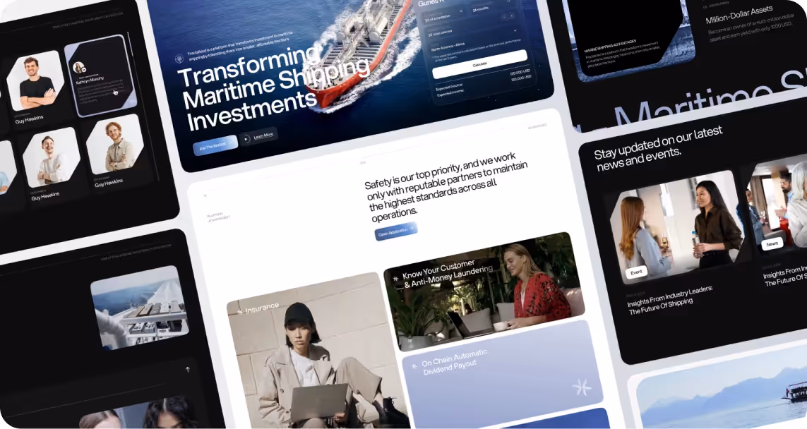
Maritime investment isn’t light reading — especially when it involves blockchain and fractional asset models. But the design doesn’t just explain the product. It makes it feel trustworthy, grounded, and ready to scale.
Here’s how the experience builds belief from the first interaction:
- Fleet visuals upfront → Establish real-world scale before a word is read
- Digestible content hierarchy → Breaks financial and technical concepts into clear, guided sections
- Subtle, precise motion → Keeps the platform feeling modern without overwhelming credibility
The result? A website that doesn’t just say “we’re legitimate” — it shows it, every pixel of the way.
→ Watch the live preview on Dribbble
Pie Assets – Decentralized Real Estate Platform
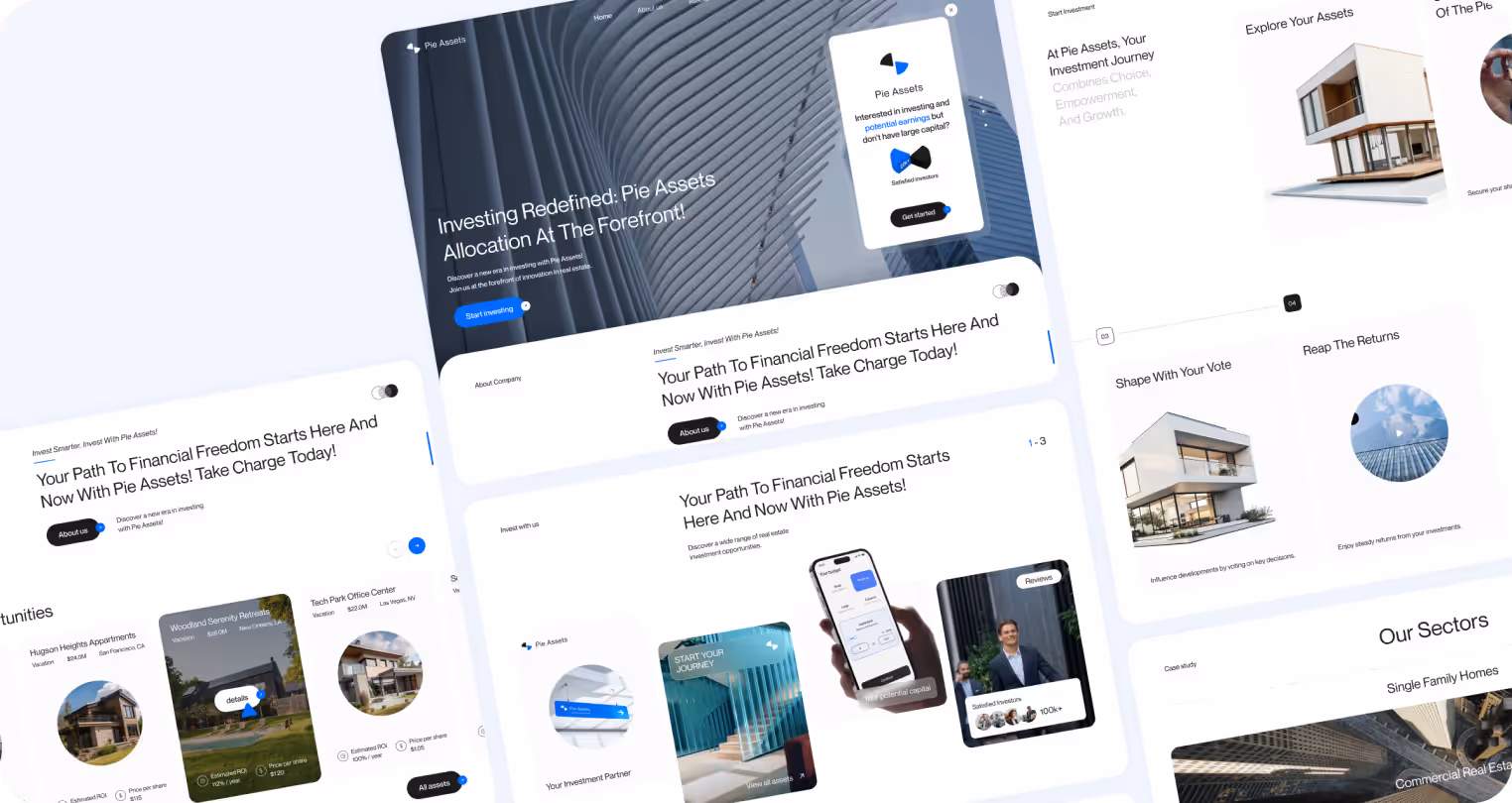
Tokenized property ownership is revolutionary — but without clarity, it can feel abstract or risky. The Pie Assets site bridges that gap by combining credibility with usability from the first scroll.
Here’s how the design builds user confidence in a complex investment model:
- Dynamic hero layout → Grounds a futuristic idea with real-world visuals and authority
- Dark/light mode toggles → Reinforces transparency and user control
- Live data dashboards → Make performance feel real, not theoretical
It frames the offering not as a pitch, but as something already in motion — grounded, real, and trustworthy.
→ Watch the live preview on Dribbble
HCG – Investment & SaaS Ecosystem
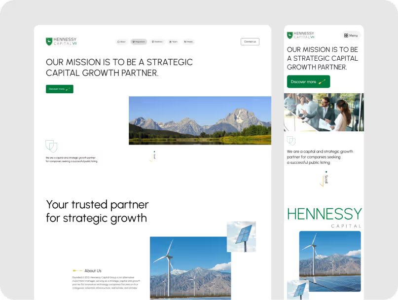
With offerings that span venture capital, SaaS, and advisory services, HCG needed a design system that could unify without flattening. Each product had to feel distinct — but still part of one confident brand.
Here’s how our design brought it together:
- Clear, modular layout → Gives every business unit space to breathe without losing cohesion
- Refined typography and color logic → Deliver a sense of structure and sophistication
- Fast, responsive build → Communicates operational excellence behind the scenes
Built to signal long-term vision, not just aesthetics — every element works together to express growth, clarity, and intent.
→ Watch the live preview on Dribbble
How to Create a Corporate Website That Works
A corporate website shouldn’t shout — it should signal. Signal confidence. Signal clarity. Signal that you’re built to last.
That’s why at Eloqwnt, we don’t just design for attention. We design for alignment — between what your brand promises and how your site performs. Because credibility isn’t declared. It’s designed in.
So instead of sharing best practices, here’s what we actually practice — when helping ambitious companies prove they’re serious, sophisticated, and built for the long game:
1. Align before you design
A corporate website isn’t just a showcase — it’s a signal. One that tells investors, partners, and: “We know who we are, and we know what we’re doing.”
You can’t design what you don’t understand. So we start by getting sharp on the message:
- What’s the core message behind the business?
- Who are we trying to earn trust from?
- And how do we say the right thing, the right way?
This isn’t guesswork. We run internal interviews, study sales calls, review investor decks — anything that reveals the real business story, not just the marketing version.
Because your homepage shouldn’t sound like a brochure.
It should sound like conviction — translated into pixels.
✦ Real-world tips you can use:
- Audit alignment. Take your homepage, sales deck, and “About” page. Do they sound like the same company? If not, you’re leaking trust.
- Define what trust looks like. For your audience, is it clean data? Confident headlines? Legal credibility? Design for that, not trends.
- Prioritize message over aesthetic. The best-looking site in the world won’t convert if it’s vague, generic, or trying to be clever.
If this resonates, you’ll probably find this guide on building a trusted brand identity helpful — it unpacks the deeper strategy behind how credibility is earned, not assumed.
2. Shape content for decision velocity
Corporate websites aren’t brochures — they’re deal tools.
Buyers arrive with intent. They’re weighing risks, reviewing proof, and scanning for clarity that builds confidence.
That’s why we design for decision velocity: the ability to move a prospect from interest to action without friction.
Instead of long scrolls of content, we focus on:
- Sharp subheads that signal meaning instantly
- Layouts that guide attention, not compete for it
- Micro-moments of reassurance baked into every touchpoint
Because every click, skim, and scroll should pull them closer to yes.
✦ Tip: Treat your site like a pre-sales narrative. Break sections with strategic headlines that give each block a purpose — not just a label.
3. Systemize how your brand feels
At Eloqwnt, we believe credibility starts before anyone reads a word. That’s why we don’t design pages — we design systems:
- Typography that signals confidence, not clutter
- Layouts that guide the eye and give it space to breathe
- Motion that supports meaning, not distracts from it
- Performance that’s invisible (because speed earns trust)
It’s about creating a brand presence you can feel in one scroll — and repeat in ten more.
✦ Real-world tips you can use:
1. Build your UI on an 8pt grid – remember: visual sloppiness = brand sloppiness
Consistent spacing creates invisible harmony — the kind users don’t notice, but instantly trust. It’s how you make complexity feel effortless.
2. Define motion tokens and stick to them
Think “fade-up 200ms” = subtle reveal, not a Vegas show.
Motion should guide, not distract. By defining a few simple rules (duration, easing, purpose), you make movement feel intentional — not ornamental.
3. Use a type scale with roles baked in
Think of your type like a pitch team:
→ H1s walk into the room first — confident, clear, impossible to miss
→ H3s back them up — steady, supportive, setting the tone
→ Body copy handles the details — calm, competent, doing the real work
Because when each element knows its role, your message lands without trying too hard.
4. Test your site with tools like SpeedVitals
SpeedVitals is a free tool that lets you measure how fast your site feels to real users — not just how fast it technically loads.
Why it matters:
Even if your site loads in 1 second, if it feels sluggish, clunky, or jumpy — people won’t trust it. Perception > perfection.
Smoother = smarter.
4. Build with content that scales
Content shouldn’t be hardcoded to a moment in time. As the business evolves, so should the messaging — without reinventing every page.
• Blocks are grouped by trust type — proof, clarity, urgency, social proof — making it easier to assemble narratives that convert.
• Modular zones in the CMS let teams drag, drop, and update without relying on developers.
• Clear usage guidelines ensure each block is used with intention — from how many per page to when to test variations.
✦ Tip to remember: Map each content block to a trust goal — clarity, credibility, urgency, or emotion — so every section supports a purpose.
5. Future-proof the foundation
Brands evolve. Offers shift. Teams grow.
That’s why great sites aren’t built for launch day — they’re built for what comes next.
A strong foundation means:
• Design systems that flex with new stories
• CMS structures that scale with growing teams
• Information architecture that adapts to new audiences, products, or GTM motions
When the groundwork is solid, growth doesn’t break it — it builds on it.
So set up the system first, not just the pages. That’s the difference between constant catch-up… and scaling without friction. And if it’s starting to feel like a lot to untangle, that’s often the moment a strong partner makes all the difference.
Not just to build what’s needed today, but to set the foundation for everything still to come.
At Eloqwnt, we design with change in mind — crafting corporate websites that evolve as fast as your business does.
If your team’s gearing up for growth, we’d love to help you build what’s next!


