

How Webflow Empowers Fintech Website Growth — and What It Takes to Do It Well

Imagine this:
A user lands on your fintech platform for the very first time. They haven’t seen your pitch deck. They don’t know your roadmap.
All they see is what’s on the screen right now: rates, buttons, brand cues — the quiet signals whispering “yes, you can trust us with your money.”
And in fintech, that first silent conversation is everything.
But here’s the catch: fintech sites can’t just look sharp once.
They need to keep pace when:
– Regulations shift overnight
– Product teams roll out new features at speed
– Marketing needs campaigns live by tomorrow
– User growth doubles and content demands triple
Most platforms buckle under that pressure. They get slower, messier, riskier — and ironically, less trustworthy as they scale.
At Eloqwnt, we’ve helped fintech teams break that cycle: building sites that stay as agile as the products they support. And after designing for banks, wallets, and payment tools, we’ve seen Webflow do something most stacks can’t.
Not by stacking plugins or patchwork fixes — but by treating the website itself as part of the product.
In this guide, we’ll break down why that matters — and share exactly how to build it right from the start.
Why Scalable Website Growth Really Matters in Fintech
In fintech, growth rarely happens in a straight line.
One month it’s a new product vertical; the next, it’s an urgent compliance update or an acquisition campaign that can’t wait.
And while brand teams move fast, most sites don’t.
What starts as a sleek launch site often becomes a bottleneck the minute real momentum hits — updates slow down, consistency cracks, and user trust takes the hit.
That’s why scalable growth isn’t just a technical ambition. It’s the difference between a website that keeps up and a website that quietly holds you back when it matters most.
And in practice, scalability in fintech isn’t about bigger servers or more pages. It’s about three very human‑centered needs that surface the moment your brand takes off:
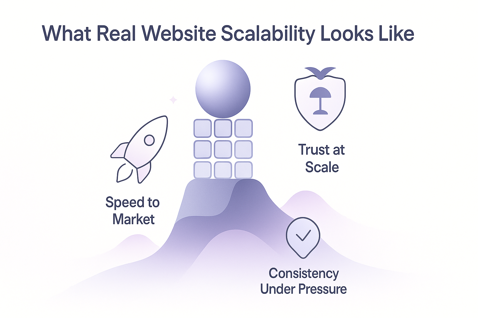
- Speed to market — so teams can ship campaigns, update rates, or launch new products without waiting weeks.
- Consistency under pressure — so every new page or feature feels cohesive, not cobbled together.
- Trust at scale — so design systems and content structures reinforce credibility, even as the site triples in size.
Through real projects, we’ve seen again and again: brands that invest in these foundations early don’t just grow faster — they convert, retain, and expand more confidently.
And that’s where the right platform makes all the difference — because real scalability has to be built in, not bolted on.
How Webflow Enables Growth for Fintech
Most people see Webflow and think:
| “No-code, faster edits, prettier sites.”
Useful — but surface level.
What really moves the needle in fintech isn’t the editing itself.
It’s the shift Webflow creates behind the scenes: turning your website into something living, scalable, and fully aligned with the pace of your product.
Let’s unpack exactly how.
1. Faster launches, without developer roadblocks
In fintech, timing matters. New product features, updated APRs, limited‑time offers — they only work if they go live at the right moment.
With Webflow:
- Marketing teams can build, test, and publish landing pages same‑day
- Rate or feature updates can be edited directly in the CMS, without opening a ticket
- A/B tests become part of everyday workflow, not quarterly projects
Instead of waiting on dev sprints, product and marketing teams stay in step — which means your brand reacts faster to market shifts, competitor moves, or user feedback.
And it isn’t just about speed. It’s about relevance: your site stops being a static asset and becomes a live, responsive part of your product strategy.
2. Design systems that scale (and keep trust intact)
Fintech growth often means dozens — sometimes hundreds — of new pages over time:
→ regional product variations
→ evolving FAQs
→ legally required disclosures
→ fast-turn campaign landing pages
And here’s the silent risk: with every new page, subtle drift sneaks in — a shifted margin here, an off‑brand font there.
Small details users rarely notice consciously… but together, they slowly erode the trust you’ve worked so hard to build.
Webflow helps teams fight drift before it starts:
- Modular components — think cards, buttons, disclaimers — built once and reused everywhere
- Global design tokens that lock in your brand’s color, typography, and spacing
- Living systems that don’t just look consistent at launch, but stay consistent as new content rolls out
So instead of growth diluting your design integrity, it reinforces it. Every new page feels deliberate, unified, and credible — no matter how quickly your product roadmap evolves.
3. Compliance that keeps up
In fintech, growth only works if trust keeps pace.
Webflow makes that possible — not by adding more red tape, but by baking governance into the workflow itself:
- Roles and permissions ensure only the right people can edit or approve content
- Built-in review flows keep compliance teams connected without endless back‑and‑forth
- Version history and audit trails turn every update into an accountable, trackable change
So updates don’t get stuck in legal limbo — and your brand keeps shipping fast and safe, without missing a beat.
4. Testing as an everyday workflow
Most teams say they want to test.
But when every tweak needs dev time, tests end up on the “later” list.
Webflow removes that friction:
• Want to try a new headline? Change it in seconds.
• Need a special landing page for high‑value users? Clone, customize, and publish before lunch.
• Track what works, iterate tomorrow.
Over time, this builds a culture where experiments aren’t quarterly projects, they’re daily habits — which compounds into real conversion gains.
5. Foundations that grow as you do
Growth doesn’t always follow the plan:
• Maybe you expand into a new country
• Maybe compliance changes force new disclosures
• Maybe marketing launches a new sub‑brand
With traditional stacks, every pivot risks breaking the design, duplicating effort, or slowing time‑to‑market.
But Webflow’s modular architecture changes that dynamic completely.
Instead of hardcoding pages that lock you in, you’re creating flexible systems of components and CMS structures — so when growth hits:
- You add, adjust, or localize content without tearing everything apart
- Visual consistency holds across new products, regions, or verticals
- Teams stay empowered to act quickly, without waiting on dev hand‑offs
What emerges isn’t just a website that “can get bigger.” It’s a living digital ecosystem: one that absorbs change, keeps the brand coherent, and scales organically — so your growth story isn’t stalled by your own tools.
Our Case Studies: What Success Looks Like with Webflow
It’s one thing to talk about modular design systems, governance, and scalable foundations — but it’s another to see them in action.
Through real fintech (and adjacent) projects, we’ve watched what happens when websites aren’t just built to launch, but built to keep growing.
Not by adding layers of complexity — but by making smart design systems, content structures, and workflows do the heavy lifting.
Here’s how that looks in practice:
Alpha Ledger
The challenge:
Alpha Ledger needed a sophisticated brand identity and a visually engaging web experience — one that connects traders and investors to real-time analytics and new opportunities, while making complex data feel intuitive. The goal was to balance professional trust and clarity with modern, dynamic storytelling that doesn’t overwhelm, but guides users seamlessly through rich content.
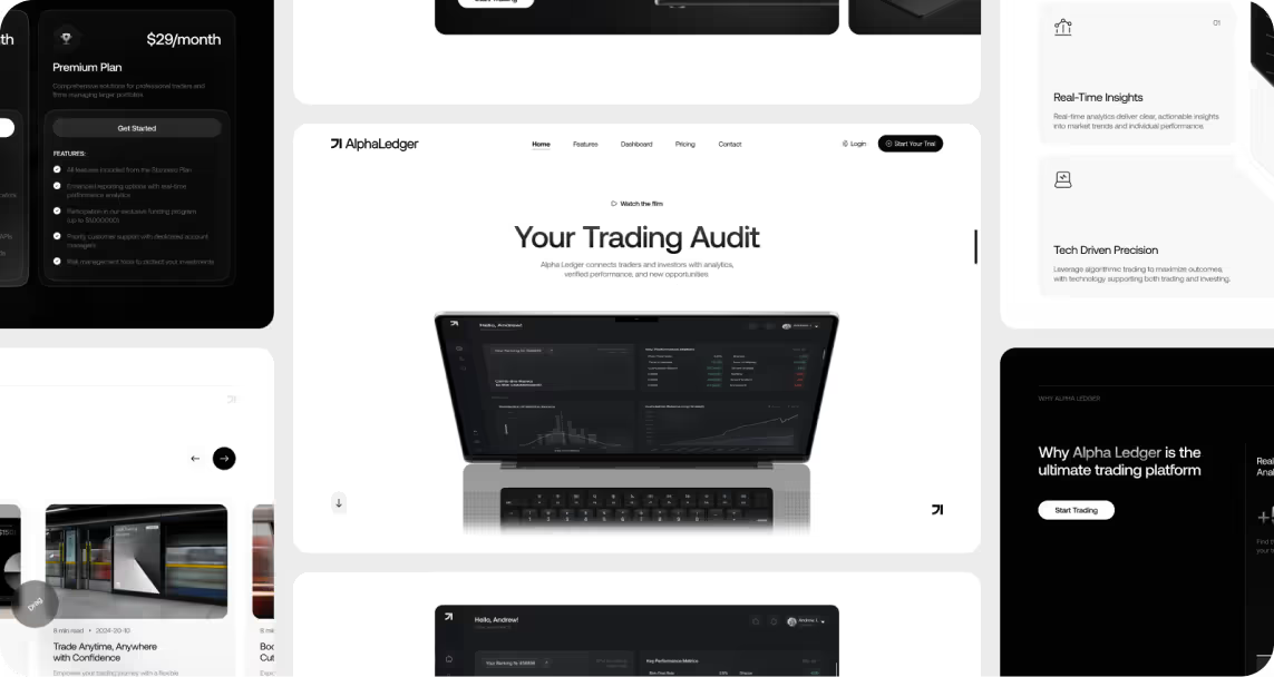
Why Webflow worked:
We built a custom CMS that makes it easy to add or update bond offerings and thought-leadership content without dev tickets. The design system balances institutional gravitas (for financial stakeholders) with clean, contemporary visuals that nod to tech-forward innovation — all while staying responsive and lightweight for performance.
The result:
• A brand presence that reassures cautious investors while signalling fintech credibility
• Smooth, dynamic user journeys that keep complex features intuitive
• A flexible CMS structure, so new analytics pages, case studies, or content rollouts happen quickly — without compromising the site’s visual coherence
Pie Assets
The challenge:
Pie Assets is a real estate investment firm offering diverse strategies for property acquisition and renovation — with a focus on transparency and accessibility. They needed to simplify the investment process so it felt intuitive even for newcomers, while building an identity strong enough to stand out in a crowded, trust‑sensitive market.
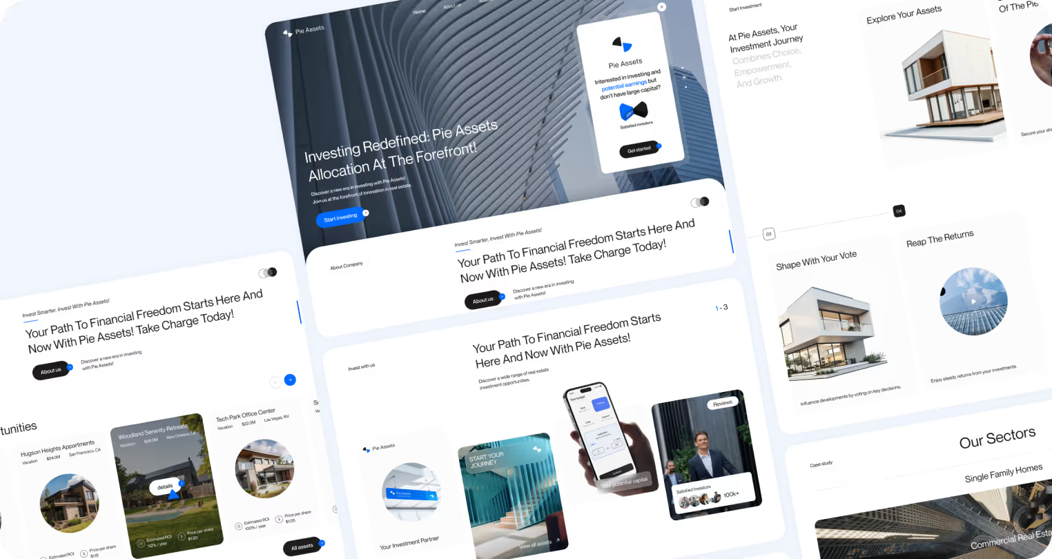
Why Webflow worked:
By designing a clean, modular CMS, we made it easy for the team to add new use cases, product updates, and documents without clutter. A balanced design language — institutional yet modern — kept credibility front and center. And Webflow’s architecture means even if they add new asset classes or features, visual consistency holds.
The result:
• An interactive ROI calculator that makes investment potential immediately clear
• A simpler, clearer digital experience aligned with Pie’s promise of transparency
• Faster updates without backend rebuilds — so the site scales as the platform expands, without sacrificing trust
Vanquish
The challenge:
Vanquish Holdings is a UK-based firm that provides capital and innovative solutions to help businesses scale. They needed more than a typical corporate website: they wanted a digital experience that tells a compelling brand story and a platform interface that feels as advanced and professional as the services they offer.
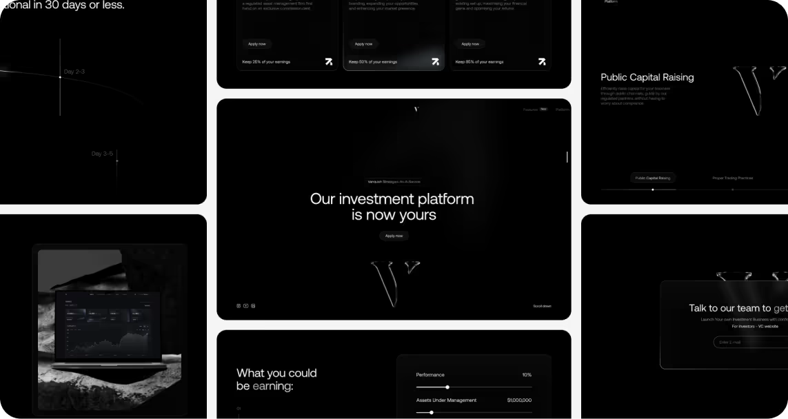
Why Webflow worked:
By building on Webflow, we paired a visually rich site — complete with dynamic 3D elements and a scrolling narrative — with an intuitive CMS so the team can evolve their messaging over time. The dashboard redesign used sleek visuals and modern layouts to deliver both sophistication and usability, while keeping everything coherent under one system.
The result:
• A seamless web journey that engages visitors through interactive storytelling
• A next‑level dashboard interface that feels as polished as Vanquish’s promise
• The flexibility to refine content and messaging without starting from scratch
How to Build It Right from Day One
Choosing Webflow is a powerful first move — but tools don’t create scalability on their own. What turns “a website” into a living, growth-ready platform is the strategy you build into it.
Here’s how we approach it in real fintech projects, so your website can stay as agile and credible as your product roadmap:
Step 1: Think in systems — not screens
Most teams start by sketching out pages.
But high‑growth fintech brands do the opposite: they design a system first.
Imagine your website like a kit of well‑crafted parts: hero sections, product grids, disclaimers, tables, CTA banners.
Each part knows how it should look, behave, and scale — so when marketing or product teams need something new, they’re building with the same language, not reinventing the wheel.
Why it matters:
- Consistency: Trust isn’t built by “one perfect page” — it’s kept alive across every new page and micro‑update.
- Speed: Instead of building each new feature from scratch, you just assemble and customize.
- Flexibility: New regions, new products, or campaign pages slot in seamlessly.
What starts as “design once” becomes “design to scale.”
Step 2: Architect around change — not around today’s sitemap
Your sitemap on launch day is just a snapshot in time.
Real fintech growth looks like: new asset classes, evolving compliance language, regional sub‑brands, rapid campaigns.
So instead of freezing your CMS around what content you currently have, map the kinds of future changes that could come:
- Legal disclaimers that shift quarterly
- Regional product variations
- New service lines or target audiences
Then, design dynamic CMS collections and modular templates for those change points.
It’s like pre‑building flexible shelves rather than hard‑welding everything together.
The payoff: when growth hits, you’re not re‑platforming — you’re adding, localizing, or re‑ordering content within an architecture that already knows how to stretch.
Step 3: Build compliance into the heartbeat of publishing
In fintech, trust and speed don’t have to be rivals — if your workflow makes compliance part of the rhythm, not an afterthought.
Here’s how:
- Use role‑based permissions so content creators can draft freely, but only compliance/legal can approve publishing.
- Staging environments allow teams to preview changes exactly as they’ll look live — before signing off.
- Keep an audit trail so you always know who changed what, and when.
Instead of legal being the team that “slows us down,” they become integrated reviewers who keep momentum and protect credibility.
Step 4: Design now for tomorrow’s scale
Growth often surprises you: a new investor segment, an unexpected partnership, or a pivot in the roadmap.
To avoid emergency rebuilds:
- Create shared design tokens (colors, spacing, typography) so even brand expansions stay cohesive.
- Build modular components rather than page‑specific hacks, so new layouts use the same backbone.
- Plan CMS structures to handle new content types, not just current ones.
When growth comes, your team isn’t stuck patching holes — you’re confidently expanding on a strong spine.
Step 5: Make micro‑tests part of daily life
The fastest‑moving fintech teams aren’t just shipping pages — they’re always learning from them.
With Webflow:
- Change a headline or CTA instantly, without a ticket.
- Clone a landing page to test messaging for a niche audience.
- Monitor analytics, iterate tomorrow.
This makes testing a habit, not a special project. Over time, these dozens of tiny, low‑cost experiments compound into real conversion lifts — without ever freezing your roadmap for “the big redesign.”
Final thought
Behind every fintech site that feels simple is a system that’s anything but.
It’s not the pixels on the screen that make growth sustainable — it’s the architecture, workflows, and design logic humming quietly beneath.
That hidden craft keeps your message clear when the roadmap changes, keeps your team fast when the market shifts, and keeps user trust steady when everything else speeds up.
And that’s the real difference: a site built not just to launch, but to adapt, evolve, and quietly power growth behind the scenes.
If you see your website as more than pages — as a living system that supports your next product, campaign, and market move — we’d love to help bring that vision to life!
.avif)


