7 SaaS Website Design Trends Driving Growth in 2026
Introduction
Open any fast-growing SaaS brand’s website today, and you’ll notice something: they don’t just present their product. They design the entire experience to make you feel like you’re already using it. Navigation feels effortless, demos launch without a sales call, and every element — from typography to motion — feels considered.
This isn’t by accident. In 2026, the SaaS website has become a growth engine, not a digital brochure.
What once lived in slide decks and product walkthroughs now lives on the homepage. And design is doing the heavy lifting with three key things:
→ building trust before a single conversation
→ guiding users into product flows
→ shaping the decision to sign up or switch
The only question is — what’s actually working right now? From our projects at Eloqwnt, we know the answer lives in the design trends steering SaaS forward.
Keep reading as we share them with real-world insights.
Why SaaS Website Design Matters for Growth
For SaaS companies, the website is more than a first impression — it’s often the core of the buying journey.
- Signups happen here. For many SaaS products, the website is the acquisition engine. If navigation feels clunky or the visuals look outdated, nearly 40% of visitors leave before even meeting the product.
- Trust is decided here. Prospects scan for subtle cues — recognizable logos, social proof, security signals — and, above all, whether the site feels modern and credible. With 94% of first impressions tied to design, users judge presentation before they judge features.
- Differentiation starts here. In a market where competitors are only a tab away, design is what makes your brand stick in the mind — long before side-by-side comparisons begin.

We’ve seen this play out in practice. For one SaaS client, we refined the signup journey and simplified the interface, leading to a 38% increase in conversions.
Check out the practical case study we broke down to show exactly how strategic branding and web design decisions drove this growth.
The 7 Modern SaaS Web Design Trends to Follow
1. Minimalism With a Purpose
Minimalism in 2026 goes beyond empty space and clean lines. SaaS brands are using it to highlight what truly matters — the product, its value, and the path to action.
Instead of overwhelming users with every feature, look for layouts that:
- Direct attention with clean, open structures toward key CTAs
- Use short, impactful copy paired with strong visuals
- Leverage space to create calm, making content easier to digest
The goal isn’t aesthetic minimalism — it’s strategic minimalism. Think of it like a spotlight on what truly matters, illuminating the path for your users. Every element earns its place because it moves the user closer to action.
2. AI-Driven Personalization
Artificial intelligence is quietly transforming SaaS websites. Tasks that once required manual A/B testing are now adaptive in real time.
Think:
- Landing pages that adjust headlines based on user intent
- Feature spotlights that change depending on visitor segment
- Content recommendations tailored to industry or company size
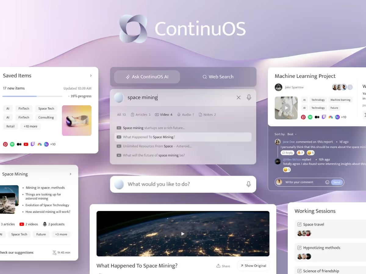
This approach turns your website into a dynamic product experience, just like it did for ContinuOS — an AI-powered operating system that adapts to how users navigate the web, showing each visitor the content most relevant to them.
3. Interactive Product Demos
Static screenshots don’t sell SaaS anymore. Users want to see — and ideally try — how the product works before signing up.
That’s why interactive demos and guided tours are becoming standard:
- Clickable product walkthroughs embedded directly on the homepage
- “Sandbox” experiences where prospects can test functionality
- Guided feature tours triggered by scroll or interaction
This shift not only lowers friction but also changes the sales dynamic. Instead of waiting for a demo call, users experience the product on their terms — which often accelerates conversions.
4. Bold Typography & Dark Mode
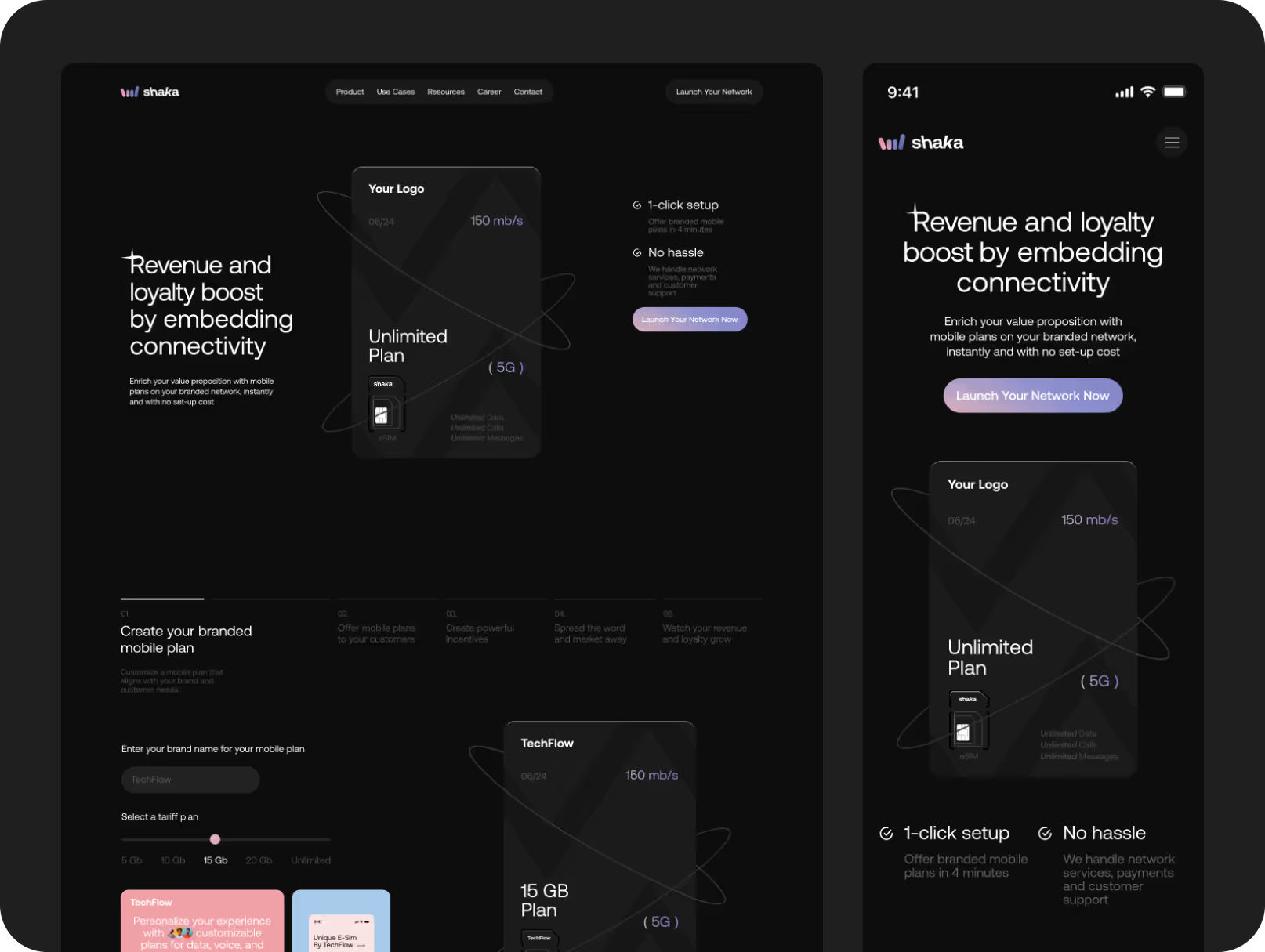
Typography is no longer a supporting role — in 2026, it’s the headline act. SaaS brands are using oversized, assertive fonts to establish hierarchy and confidence at first glance. Combine that with dark mode, and the result is a modern, striking aesthetic that speaks directly to design-aware audiences.
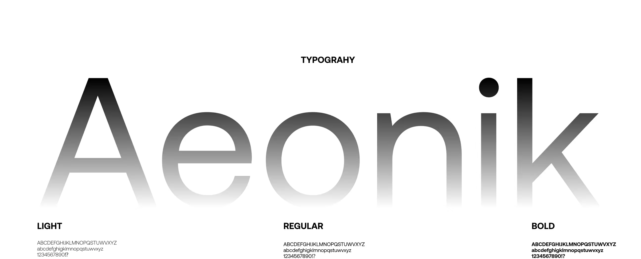
At Eloqwnt, we’ve applied this approach across multiple SaaS projects — experimenting with different typographic weights, scales, and contrasts alongside tailored dark palettes.
Each choice was strategic, aimed at amplifying clarity, confidence, and brand authority. You can see the full breakdown of our process in our → Behance project case studies.
5. Trust-Focused Design
SaaS adoption still hinges on trust. The more crowded the market, the more users need reassurance that your product is secure, proven, and transparent.
Trust-focused design often includes:
- Prominent security and compliance badges (SOC 2, GDPR, HIPAA)
- Real-time activity feeds (“5,000+ teams signed up this month”)
- Transparent pricing without hidden steps
- Verified customer reviews and recognizable client logos
It’s subtle, but these design cues quietly answer the unspoken question: “Can I rely on this tool?”
6. Motion Graphics & Micro Animations
Done poorly, motion slows down a site. Done well, it brings clarity and delight.
From now on, micro animations are about guiding attention and making interactions intuitive:
- Hover effects that preview a feature
- Animations that explain a workflow step in seconds
- Transitions that reduce cognitive load
Most motion is wasted. But when used strategically, it’s the difference between a static brochure site and a living, breathing product. That’s exactly what we revealed in our piece on motion design in SaaS.
7. Community-Driven Design Elements
The SaaS purchase doesn’t end at sign-up. Increasingly, buyers want to see proof of active communities behind a product.
Websites are reflecting this with:
- Embedded community forums or Slack/Discord integrations
- Case studies that highlight customer collaboration
- Live feeds of upcoming webinars or user events
- Dedicated sections showcasing success stories from peers
In practice, this means the SaaS website is evolving from a static product pitch into a living ecosystem — one where every visitor can see the community shaping the product in action.
How These SaaS Design Trends Drive Growth
Each of these trends ties directly to outcomes leaders actually care about — not just “looking modern,” but moving the needle on business performance:
- Minimalism → reduces cognitive overload, shortening time-to-value and lowering support tickets.
- AI personalization → boosts upsell and cross-sell by surfacing the right features to the right users.
- Interactive demos → accelerate enterprise deals by replacing lengthy onboarding with instant proof-of-value.
- Typography & dark mode → elevate perceived brand maturity, giving companies stronger pricing power.
- Trust-focused cues → reassure investors and enterprise buyers, smoothing procurement hurdles.
- Motion & micro animations → cut training costs by showing workflows visually instead of relying on documentation.
- Community-driven design → creates self-sustaining support ecosystems, lowering CAC while driving advocacy.
In other words, design is no longer just about making SaaS products usable — it’s about making them scalable, investable, and profitable. The brands that recognize this are building a moat their competitors can’t easily replicate.
Related Reading
For SaaS leaders who want more, design and trust aren’t abstract ideas — they’re levers for measurable growth. If you’re looking to sharpen your strategy, these reads will help:
• Building trust from day one → our identity guide breaks down how consistent messaging and design create credibility that lasts.
• Growing Saas MRR without more spend → see how design-driven growth can lift revenue without relying on paid acquisition.
• Choosing the right agency → learn what to look for when partnering with branding experts who understand SaaS inside-out.
SaaS Design FAQs
Because SaaS design moves fast, we pulled together quick answers to the questions we hear most about websites, growth, and trust.
What is SaaS website design?
SaaS website design is about turning a product into a seamless digital experience. It makes value easy to understand, trust effortless to build, and conversion feel natural — all through clear messaging, intuitive flows, and design that signals credibility.
What is an example of a good SaaS website?
A good SaaS website makes its value clear within seconds. Examples like Slack and Notion do this well with simple messaging, strong visuals, and easy signup. Other standout sites include Brandformance, ModernVivo, Sarwisi, and Builtly — each balancing clarity, trust, and usability in their own way.
What is SaaS in UI/UX design?
In UI/UX, SaaS means designing with constant user engagement in mind. Unlike static sites, SaaS platforms evolve daily — so the design needs to be flexible, scalable, and intuitive for first-time users and power users alike.
What is the biggest trend in SaaS web design?
One of the biggest trends in SaaS web design today is trust-driven design. With so many options available, buyers choose platforms that feel credible from the start. This comes through in clean, focused layouts, storytelling backed by proof like testimonials and data, and interactive previews that let users explore the product before committing.
How to design a SaaS product?
Designing a SaaS product means balancing usability and scalability. It’s about building a system that’s easy to adopt now but flexible enough to grow. At Eloqwnt, we’ve seen how thoughtful onboarding, consistent design systems, and customer-first flows turn a product from functional into unforgettable.
The Future of SaaS Web Design
The tools will change. The trends will shift. But at the end of the day, what makes someone choose your product is simple: they felt understood.
That’s why we design websites that speak to people first, and metrics second — because when you earn trust, growth takes care of itself.
If that’s the kind of SaaS brand you want to grow, let’s build it together.


