The Hidden UX Issues Behind a High SaaS Churn Rate (And How to Spot Them Early)

The Quiet Truth Behind Churn
Users rarely slam the door on their way out.
Most don’t cancel in frustration. They just… fade away.
They stop logging in. They ignore the email nudges. They switch to a competitor quietly, without a complaint – just a soft, silent goodbye.
And the worst part? You often don’t notice until it’s too late.
In the world of SaaS, churn doesn’t usually look like rage-quits or angry feedback. It looks like a slow drift. A user gets confused. A feature feels clunky. The product doesn’t quite solve the job it promised. And then – nothing. Just another subscription dropped. Another user gone.
What’s truly dangerous about churn is how invisible it is.
Most product teams look in all the wrong places: pricing tiers, features, email campaigns. But churn isn’t always a business model issue — it’s often a UX issue in disguise.
We’ve seen this firsthand at Eloqwnt, helping both growth-stage SaaS platforms and enterprise tools redesign around the real problems users face — the subtle moments where experience breaks trust.
That’s where this article comes in.
We’re unpacking the UX mistakes that silently erode retention — the kind that slip past analytics but show up in your churn rate.
And more importantly, we’ll show you how to spot (and fix) them before users hit cancel.
The Real Cost of Churn (and Why UX Quietly Drives It)
Let’s do the math.
A 5% increase in retention can boost profits by as much as 95%.*
That’s not a hopeful guess — it’s backed by data. Yet despite this staggering upside, the average SaaS product loses 5–7% of its users every single month.
That’s not just a leak.
It’s a flood.
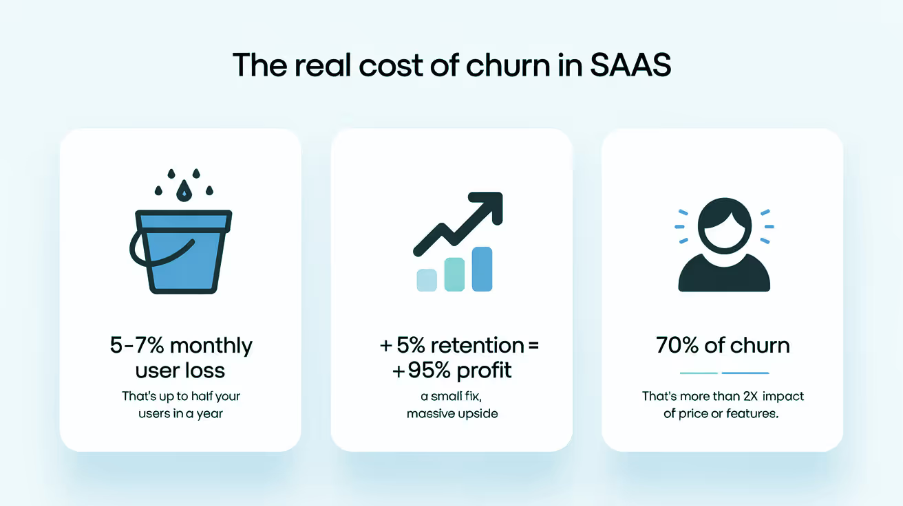
And while the finger usually points to pricing, competition, or lack of features, the root cause is often far more subtle — and closer to home. Because 70% of churn doesn’t happen when a better tool comes along.
It happens when a user doesn’t understand how yours works. Or doesn’t feel it’s working for them. And at that point, it’s not a product flaw — it’s a UX failure.
UX is what shapes a user’s emotional journey with your product.
It’s the difference between feeling empowered versus overwhelmed.
Curious versus confused.
Committed versus checked out.
And when those emotions lean the wrong way, churn becomes inevitable — even if the product itself is brilliant.
So what are the hidden UX pitfalls silently nudging users out the door?
Here are a few common culprits we see across SaaS platforms:
- Overengineered onboarding that confuses users before they’ve even found value
- Unclear value proposition that makes people forget why they signed up
- Inconsistent UI patterns that break mental flow and increase cognitive load
- Lack of feedback that leaves users wondering if they’re doing it wrong
- Missing microinteractions that fail to guide, delight, or build confidence
And the effects aren’t abstract...
Where UX Breaks — and Users Slip Away
Most teams spot churn in their metrics — but by then, it’s already too late. The real unraveling happens earlier, in the subtle frictions users experience but rarely report.
They don’t send feedback.
They don’t rage-click.
They just stop coming back.
Here are the three places we most often see UX quietly undermine SaaS retention:
1. Onboarding That Explains the Product — Not the Payoff
Most onboarding flows make a crucial mistake: they focus on walking users through what the product is, not what the product does for them.
You see this in tooltips pointing to menus or features — “Click here to create a dashboard” — rather than leading users toward an actual win, like “Cut chargebacks by 90% in your first month.”

It’s the difference between being taught how a camera works, versus seeing the photo it can capture.
When onboarding lacks outcome orientation, users finish the setup without ever experiencing the value. They know what the tool can do, but not why it matters. So when that initial dopamine fades, there’s nothing anchoring them to stay.
SaaS teams often assume users will connect the dots themselves. But early users are busy. They need clarity, momentum, and a quick emotional payoff.
2. Dashboards That Showcase Everything — But Prioritize Nothing
You open the app. You’re met with dozens of charts, toggles, filters, metrics—and no idea where to look.
It’s impressive… and overwhelming.
Complexity masquerading as sophistication is one of the biggest pitfalls in SaaS design. In a rush to showcase capabilities, teams often forget that clarity is a feature.
Users don’t log in to admire dashboards. They log in to get something done. And if the first screen doesn’t direct their attention toward a clear next step, most won’t dig deeper.
They’ll bounce.
What’s even more deceptive? These dashboards often test well in stakeholder demos. But in the real world, they paralyze everyday users who simply want to complete a task and move on with their day.
3. No Sense of Progress = No Reason to Return
There’s a psychological principle called the “Zeigarnik Effect” — we remember uncompleted tasks more than completed ones. That sense of open loops keeps people engaged… if they know a loop exists in the first place.
But when users can’t tell if they’re making progress — whether it’s in setup, learning, or outcomes — they don’t feel motivated to return.
This is a subtle but powerful driver of churn. You might think, “our product doesn’t need gamification”— but that’s not the point. Humans need to feel momentum. A journey. A before-and-after.
When a product gives no signal that something is being achieved, no feedback that the user’s time investment is worthwhile, it quickly becomes forgettable.
And forgettable is fatal in the subscription world.
How to Spot UX-Driven Churn Before It Spikes
You don’t need to wait for a cancellation email to know something’s off.
By the time a user clicks “unsubscribe,” the real problem started weeks ago — often with subtle friction they couldn’t quite name.
The good news? Churn doesn’t happen overnight.
The bad news? Most teams don’t spot the signs until it’s already in the numbers.
Here’s how to surface those quiet signals — early enough to do something about them:
→ Behavioral Analytics
Analytics won’t tell you what a user feels, but they’ll show you where that feeling starts to shift.
When users drop off mid-flow—especially during onboarding, feature adoption, or checkout—it’s often not due to lack of need. It’s confusion, overwhelm, or doubt.
Watch for:
- High abandonment in early journeys – A user signs up but never completes setup? That’s not just disinterest. It may mean your first-run experience didn’t prove its value fast enough.
- Dead zones – Features you think are valuable may sit untouched. That’s not because users don’t need them — it’s often because they don’t know they’re there, or they don’t understand them.
- Long time-on-task – Some flows aren’t difficult — they’re just unclear. If it takes a user 4 minutes to do something that should take 30 seconds, that’s not productivity. That’s friction.
The trick? Don’t just track success. Track struggle.
→ Customer Interviews & Heatmaps
Users won’t always tell you what’s broken. But their behavior will.
- Heatmaps are often more honest than surveys. You’ll see rage-clicks where frustration peaks, cold zones where users avoid entire sections, and hesitations that suggest doubt — even when everything looks “fine.”
- Customer interviews, when done right, aren’t just about collecting quotes. They reveal mismatches between intent and outcome. Ask: “What were you trying to do on this screen?” If their answer doesn’t match the design’s purpose, that’s a disconnect worth fixing.
It’s not just what users say — it’s what they struggle to say. And more often than not, it’s in the gaps between those two where churn takes root.
→ User Experience Audits
A UX audit isn’t about aesthetics. It’s about alignment — between user expectation and what your interface actually delivers.
Even the best-designed SaaS platforms accumulate clutter over time. What made sense in v1 might be out of place in v3. Without regular evaluation, subtle inconsistencies start to pile up:
- A button behaves differently on two screens
- Labels use different language for the same action
- Some flows use modal confirmations, others redirect
These details may seem small. But they erode trust. And once trust fades, users hesitate.
A good audit goes beyond visuals. It uncovers the psychological missteps — where the mental model of the user no longer matches the structure of the product.
At Eloqwnt, we often start with a churn-focused UX analysis, even when the brief is something else — like a visual refresh or a new feature rollout. Why? Because the clues are almost always hiding in plain sight. And the sooner we surface them, the faster we can turn a leaky funnel into a loyal base.
What Great SaaS UX Actually Looks Like
Retention doesn’t start with a feature — it starts with a feeling.
A sense of clarity. Ease. Momentum.
When UX feels effortless, users move forward without thinking twice. They find value early, build confidence quickly, and stay not because they have to — but because they want to.
And in the most successful SaaS products, this isn’t just good practice. It’s a retention engine.
Here’s what we consistently see in products that keep users coming back — not out of habit, but because they want to:
➤ 1. Lifecycle-aware UX
Most platforms design for Day 1. Few design for Day 30, or Day 90.
Retention begins with understanding: What does a power user need that a new user doesn’t? And how should the interface evolve to reflect that?
This is lifecycle-aware UX — interfaces that change based on the user’s stage:
- New users get orientation, support, and guardrails.
- Active users get shortcuts, deeper controls, and fewer interruptions.
- Power users get automation, customization, and scalability.
Think of it like progressive disclosure — but mapped to user maturity, not just interface complexity.
➤ 2. Habit loop integration
Habit-forming UX isn’t about manipulation — it’s about aligning with existing user behavior loops.
The model (from Nir Eyal’s Hooked) is simple:
Trigger → Action → Variable Reward → Investment
Great SaaS UX embeds this by:
- Sending timely prompts (triggers) that are actually useful
- Making core actions effortless and rewarding
- Offering feedback or outcomes that vary slightly (variable reward)
The key isn’t just building “stickiness.” It’s helping users build routines — and see your product as part of their daily rhythm.
➤ 3. Contextualized friction (a.k.a. smart guardrails)
Friction isn’t always the enemy. In fact, well-placed friction can drive retention — especially when it protects users from costly mistakes.
Think:
• A double-check modal before sending a mass campaign
• A pre-filled suggestion to prevent a data format error
• A soft-block that explains consequences before a high-impact action
This aligns with UX friction theory, which divides friction into:
- Good friction: Protects users and builds confidence.
- Bad friction: Wastes time and creates anxiety.
The goal? Don’t eliminate all friction. Just design the right kind — in the right places.
➤ 4. Visibility of future value
One reason users churn? They don’t know what’s coming.
High-retention UX makes future value visible. Not just what the product does now, but what it will unlock next.
Examples:
- A “next milestone” preview on the dashboard.
- Unlockable features or tiers shown as blurred (but visible).
- Educational nudges: “Here’s what else you’ll be able to do soon.”
This taps into goal-gradient theory — users accelerate behavior as they approach a visible reward. If your UX never shows what’s ahead, you’re leaving motivation on the table.
➤ 5. Retention-first onboarding
Most onboarding is built to teach. But the best onboarding is built to retain.
That means:
- Letting users succeed at a meaningful task immediately
- Giving them one “win” before showing more features
- Avoiding cognitive overload or over-personalization upfront
This is called success-driven onboarding — a shift from teaching about the product to helping users do something right away.
The Design Formula for Reducing Churn
You’ve seen the signals. You’ve mapped the blind spots. So what now?
This is where strategy turns into action — where UX design doesn’t just look good, but works hard to earn retention. And while we’ve touched on many of these levers already, here’s how they come together in a practical, systematic roadmap:
1. Map user intent to interface flow
Forget feature-led design. Your real job is to design for motivation. Start with why they came — not what you built.
What outcome are they chasing?
What problem are they hoping to solve?
Your interface should revolve around that intent, not the internal logic of your product.
If a user signs up to streamline team performance, don’t greet them with a blank dashboard or a sea of tools. Drop them straight into momentum — something that feels like progress.
For example: instead of listing all your features, guide them through setting up their first performance tracker in under two minutes — so they don’t just explore the product, they experience its value.
2. Fix the first five minutes
The first few minutes set the tone for everything else. This is where trust is earned — or quietly lost.
If a user can’t find value right away, no tooltip will save the relationship. That first “aha” needs to happen fast, clearly, and without effort. The goal isn’t to teach your product. It’s to make the product prove itself.
Ask yourself: What’s the smallest possible moment that delivers the biggest sense of progress? Then design everything else to get users there faster.

For Quantum, that meant skipping the tech jargon — and letting users experience commodity forecasting instantly. No setup, no deep dive — just real input, real output, real impact.
3. Make every interaction feel rewarding
Design isn’t just about what users can do — it’s about how they feel while doing it. Microinteractions matter more than we think. Thoughtful motion, responsive states, and subtle cues can transform a static interface into one that feels alive, intuitive, and human.
We explored this more in our article on motion in SaaS — and why so many brands are still missing the opportunity. It’s worth a read if you’re serious about creating an interface that feels as good as it functions.
These tiny signals — a snappy loading state, a success animation, even a well-timed error — quietly reassure users: “You’re doing it right. Keep going.” They build rhythm. They build trust.
Think of it as UX body language: the unspoken cues that shape how your product feels, moment by moment.
4. Start testing before the cracks show
Don’t wait for churn to spike — by then, the damage is already done. The real insight comes earlier, when you’re curious enough to look before things break.
Watch how real users move. Listen for hesitation. Notice what they skip or abandon.
User interviews, journey replays, and time-to-task heatmaps won’t always shout, but they’ll whisper what needs fixing.
→ Real tip: Before launch, run 5 unmoderated usability tests on a tool like Maze or Useberry. Ask users to complete just one key task — and observe in silence. Confusion will show itself fast.
The sooner you catch the friction, the easier it is to design it out.
Final thought
Here’s something we don’t talk about enough: good UX doesn’t just make things usable. It makes people believe — in the product, the team behind it, and in themselves as confident users.
Because what your interface really does — beyond navigation and microcopy — is build a quiet contract:
“We respect your time. We understand your needs. We’ve thought this through.”
That’s what earns trust.
That’s what keeps churn from creeping in unnoticed.
That’s what turns curious visitors into committed users.
When people feel seen, they stick around. When your product feels inevitable, they don’t go looking for alternatives.
If you’re done with churn and ready to build something people actually want to use — let’s talk →
At Eloqwnt, we help SaaS brands earn trust and keep users coming back — and we’d be excited to help you do the same!