The Silent Revenue Killer: Why Your Product UI is Creating Churn (And How to Fix It)

You signed up for a gym membership. Your customers just wanted to get in shape.
But 15% churn kills net dollar retention. You ship features nonstop. Nothing moves.
High churn is rarely just a product-to-market fit issue. More often, it’s a friction issue.
You keep delivering features, but your Net Dollar Retention (NDR) refuses to budge.
Bad UI is not an aesthetic failure, it is operational friction that adds a "complexity tax" to every user interaction, directly eroding your bottom line.
Diagnosing the “Feature Trap”
Most B/C Series companies fall into the “Feature Factory” cycle.
They believe that adding functionality will stop cancellations.
In reality, users leave not because features are missing, but because your existing interface is exhausted.
According to Nielsen Norman Group, poor usability directly leads to lost adoption and wasted LTV.
Customer churn as a signal of friction fatigue
Users don’t leave because they want to. They leave because they’re tired.
B2B buyers now demand Apple-level usability as the standard.
If your tool looks like it’s 1999, it undermines trust in the stability of your backend.
UX is the infrastructure to protect revenue
Good design is not about “making it pretty.”
Strategic UI/UX ensures that every dollar spent on CAC is protected by a product that users actually want to keep using.
The Psychology of Churn: When Friction Turns into Fatigue
Users Don’t Leave - They Burn Out
In the high-stakes world of B2B SaaS, churn is rarely a dramatic break.
It’s a slow, quiet burn. Users don't wake up craving a new SaaS tool.
They just hit "enough", when wrestling your UI burns more energy than the value it delivers.
The Concept of “Friction Fatigue”
Every confusing menu, unnecessary click acts as a micro-stressor.
We call it friction fatigue. In complex Fintech or SaaS tools, poor navigation isn’t just a “minor quirk.”
It’s a heavy tax on productivity that saps the user’s cognitive reserve until they seek relief elsewhere.
Cognitive Load as a Revenue Killer
When the interface is cluttered, the brain works overtime to filter out the noise.
This high cognitive load creates a biological resistance to using the tool.
If your product feels like a puzzle rather than a solution, your Net Retention will suffer.
To protect your LTV, you must transform your UI from an obstacle course to a seamless path to the “finished result.”
The “Trust Stack”: Why Ugly Means Untrustworthy
In B2B SaaS, your interface is the only part of your code that a customer actually sees.
And people are instinctive judges.
Users subconsciously judge the integrity of your backend by the polish of your frontend.
If your UI looks outdated or seems “broken,” their brains immediately signal that the engine under the hood is probably unstable as well.
To understand how visual authority signals technical excellence, you can check out our projects and case studies, where we demonstrate the transition from a “startup-grade” UI to institutional-grade systems.
Trust Architecture
According to the “Trust Architecture,” trustworthiness is a multi-layered stack.
It starts with compliance and security, moves through functionality, and ends with brand authority.
Without this top layer of visual polish, your entire technical stack remains invisible and untrustworthy to the market.
Broken Window UX Theory
Imagine an abandoned New York City in the 80s: a single broken window left unrepaired signals that “no one cares.”
Inconsistent templates and alignment issues are more than just “minor errors.”
These are “broken windows” that indicate a lack of operational discipline.
For a Series B/C founder, a flawed UI is a huge leak in your trust stack that stops the sales cycle.
From MVP to Maturity: Design System Solutions
Step 1: Audit Nonconformance
Have you ever realized your product has five different “Send” buttons?
This is a fragmentation of the user’s reality.
The Result: Every variation causes a split-second hesitation.
The Cost: Friction leads to cognitive fatigue and silent churn.
Step 2: Standardize the Pattern
The golden rule of retention is simple: “Don’t make me think.” Standardized patterns make the interface invisible.
This allows users to focus on their tasks, not on learning your UI.
Step 3: Scale the Product, Not the Chaos
Implement a Design System to scale the product without scaling the chaos.
At this stage, we implement Eloqwnt’s 'Brand Operating System' - a proven method for maintaining absolute UI consistency even across rapid feature shipping.
Before you launch your next feature, take a moment to audit your current design system and make sure your infrastructure is built to last, not just scale.
- Systematic Shift: Swaps creative guesswork for engineering rules.
- Growth without Debt: Expand features without increasing the cognitive load.
- Retention Defense: A disciplined system stops the "leaky bucket" of users.
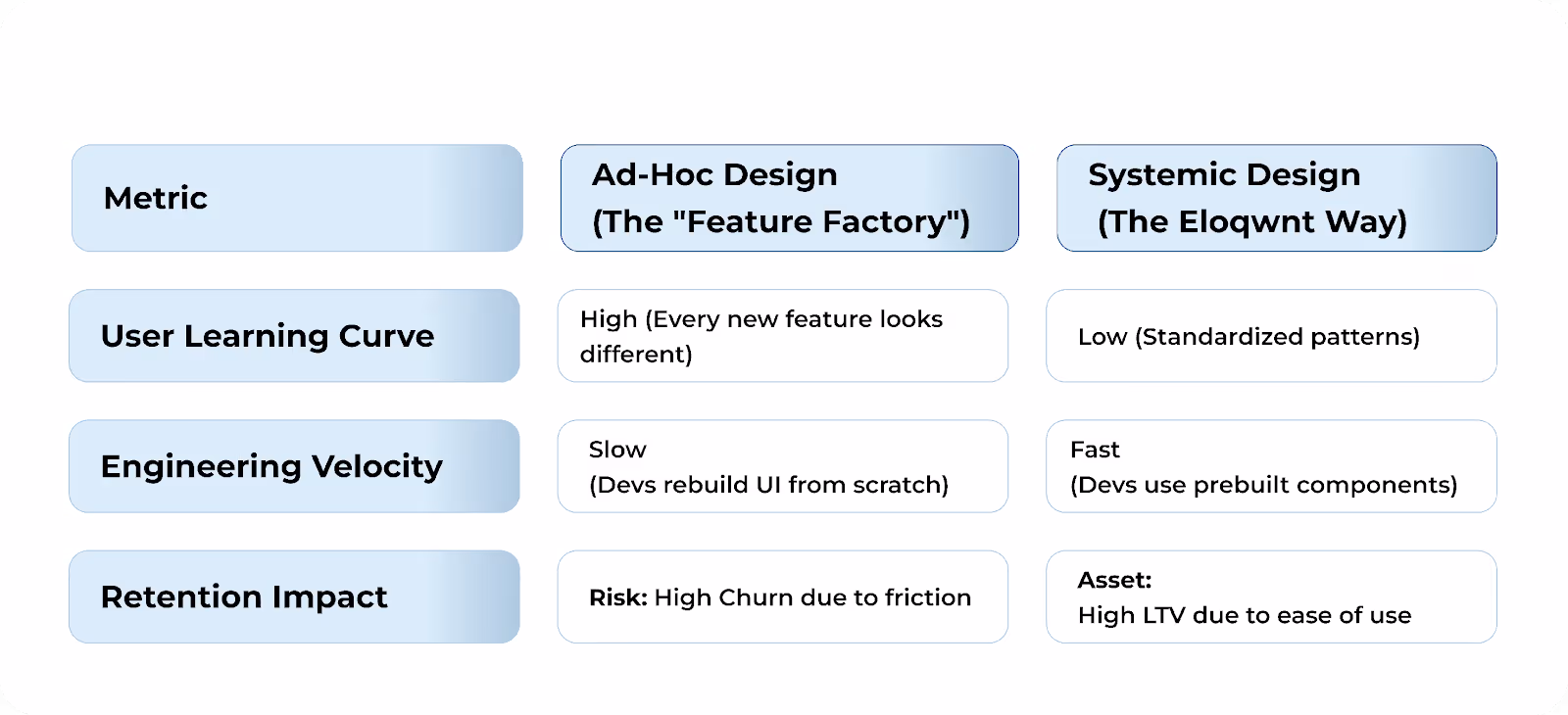
ROI Comparison: Patchwork vs. System
Design systems are your engineering team’s secret weapon.
Stop wasting development cycles on UI roulette.
Build once, ship forever. Customer churn decreases and LTV increases.
Your product actually becomes easier to use as it evolves.
Frequently Asked Questions
But isn't UI just about making the product look pretty?
No. In B2B, “good” is a subjective luxury, and “understandable” is a survival measure.
We design for clarity and speed, which are objective factors in your EBITDA.
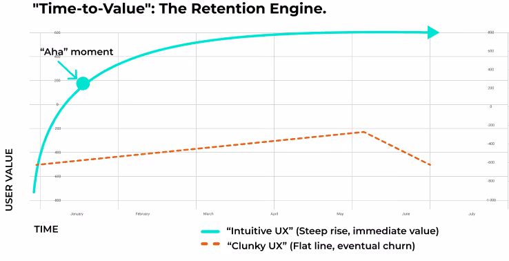
When a user reaches their “Aha!” moment in three clicks instead of ten, it’s not art, it’s the infrastructure of retention.
We transform your product from a manual task into a seamless habit with high LTV.
Final Thoughts: From Aesthetic Redesign to Retention Infrastructure
Most leaders wait for a "redesign" when they should be building a retention strategy.
A redesign is a temporary facelift, a UX system is a cold-blooded restructuring of your balance sheet.
Stop viewing your interface as a creative project and start treating it as a capital expenditure asset.
Is your product ready to defend its market position?
Schedule a UX Audit with Eloqwnt to turn your product into a retention engine.