

5 Landing Page Mistakes That Are Costing You Conversions (And How to Fix Them)

It’s one of the most frustrating moments in marketing.
You’ve got the campaign, the product, the traffic. People are landing on your page. Everything looks sharp — great images, nice layout, the copy sounds confident…
But nothing’s happening.
No signups. No clicks. No movement.
This is the silent killer of performance — not a lack of quality, but a lack of clarity. Because most landing pages don’t fail at design.
→ They fail at direction.
→ They don’t meet the user where they are.
→ They try to say too much, or not enough.
→ They look the part, but don’t guide action.
And the worst part? You often don’t see it until weeks of testing, tweaking, and budget waste have already passed.
So where does it go wrong?
Through our work with dozens of brands – from early-stage startups to national platforms – we’ve seen the same five issues pop up again and again. They’re not always obvious. But they’re the reason your bounce rate is high, your form fills are low, and your audience walks away without doing anything.
In this article, we’re breaking down the five most common landing page mistakes – with fresh insight, clear examples, and strategic ways to fix each one.
Because if your page isn’t converting, it’s not just a design problem.
It’s a communication problem.
Signs Your Landing Page Is Falling Short
Before we jump into the most common mistakes, here’s something worth pausing on: the early signs your landing page is falling short.
Because most landing pages don’t fail with a bang. They fail quietly.
Everything looks fine on the surface. But something’s not clicking — and you can’t quite put your finger on it.
If you’re still not clear on what a landing page is actually supposed to do, start here: What is a Landing Page, and How Does it Boost Your Conversion Rate?
But if your page is live, running traffic, and still underperforming? Take 60 seconds and check for these subtle — but costly — red flags:
Sign #1: Your CPC is rising, but conversions aren’t
You’re running ads.
You’re driving traffic.
But the math isn’t mathing.
Cost-per-click keeps inching up. Conversions? Still flat.
That gap is more than just an ad problem — it’s usually a landing issue. Something in the experience isn’t sticking. People arrive curious, but leave unconvinced.
And here’s the worst part: you might not notice it right away.
The traffic’s coming in and the page looks clean. But your funnel quietly starts leaking momentum — and money.
Sign #2: Your bounce rate is high — and engagement barely exists
You’re getting traffic, but almost no one sticks around.
Most visitors leave within the first 5–7 seconds. Heatmaps show barely any scroll depth. And your bounce rate hovers around 70% — sometimes higher — even with ongoing updates.
There’s little interaction. Few clicks. No real signs of curiosity.
Design-wise, it all seems polished and put together, but the numbers tell a quieter story: people are landing, hesitating…and disappearing before anything meaningful can happen.
It’s subtle, but it’s one of the clearest signals that something on the page just isn’t holding.
Sign #3: You’re stuck in a loop of testing, but nothing’s working
You’ve tried every micro-optimization you can think of:
- Button colors
- CTA phrasing
- Headline swaps
- Image order
- Section spacing and layout shifts
But nothing sticks.
You keep shipping new variants — one more test, one more tweak — waiting for that elusive version that finally lifts performance. But each round brings the same result: a slight bump, maybe… followed by another plateau.
Analytics dashboards fill with charts, but there’s no story of progress.
You’ve got activity, but no improvement. Movement, but no momentum.
It starts to feel like you’re adjusting dials on a machine that isn’t even turned on.
And that, in itself, is a sign — not of failure, but of a page that’s missing something fundamental.
If any of these felt familiar, you’re not alone.
These are the same early signs we’ve helped brands spot — long before a full redesign — while fixing underperforming landing pages across different platforms and industries.
And that’s exactly what we’re here to address.
So let’s dig deeper and start where most teams fall hardest (and fastest): your message.
Mistake №1: Unclear Message Right Where It Matters Most
Most visitors give your landing page 3–5 seconds before deciding whether to stay or leave.
That’s it.
Which means your message has to do two things fast:
- Say what you do
- Say why it matters
The problem? Most landing pages don’t do either.
Instead of clarity, users get poetic taglines like:
“Reimagine the future.”
“Built for bold thinkers.”
“Empowering innovation through possibility.”
It might sound ambitious — but it leaves people guessing.
What does this company actually offer?
Is this page meant for me?
Why should I care — right now?
They scroll, hoping to connect the dots. But if they don’t get answers quickly, they bounce.
What this looks like in real life:
- Your hero headline is abstract, trying to sound clever instead of being clear.
- There’s no immediate signal of who this is for — industry, role, or use case.
- The real value is buried halfway down the page, or phrased too vaguely.
- People leave without doing anything — not because they weren’t interested, but because they didn’t understand.
This usually happens for one of two reasons:
1. The team isn’t aligned on what the message should lead with: product features, customer outcomes, or a broader vision?
2. Or the page was written by too many hands — and lost its edge in the process.
Either way, the result is the same:
↓ Bounce rates creep up
↓ Engagement stays low
↓ You miss your first — and only — chance to hook the right people
And that’s not just a messaging issue. It’s a momentum killer.
Mistake №2 : Visual Hierarchy That Doesn’t Guide the Eye
Even well-written content can underperform when it’s presented in a confusing structure. We’ve seen beautiful landing pages that simply fail to convert because the user doesn’t know where to look — or worse, what to do next.
Great landing pages act like a good tour guide. They point. They pace. They lead.
But when every element is shouting at once — oversized headlines, animated buttons, dense copy, conflicting colors — users tune out.
Common signals that visual hierarchy is broken:
• All sections look equally important
• CTAs blend into the design rather than stand out
• The layout feels busy, overwhelming, or too long
• Key info is buried inside massive text blocks or misplaced modules
And when visual flow is off, clarity drops — fast. Even strong content can’t save a page that feels chaotic.
Side note: In our Landing Page Trends for 2025, we break down why ultra-simple, minimalist layouts with clear visual flow are outperforming “clever” designs (of course, we’re not against creativity — just not when it comes at the cost of user clarity).
Mistake №3: A CTA That Doesn’t Earn the Click
Here’s something we see constantly: a landing page with a single CTA button that says “Get Started” or “Learn More” — with zero context.
The CTA is the climax of the page. But too often, it lands like a cold pitch.
Users haven’t been primed to act. They don’t know what comes next. Or worse, they don’t trust you yet.
What usually goes wrong here:
• The CTA shows up too early — before you’ve built context
• The language is too generic (or worse, pushy)
• There’s no visual build-up — no cues, no payoff
• The user doesn’t know what clicking actually does
CTAs don’t just need to exist. They need to convert. That means they have to feel logical, low-friction, and clear.
Mistake №4: No Emotional Hook – Just Facts and Features
It’s a tempting assumption: “If we clearly explain what we do, people will convert.”
But the truth? People don’t make decisions based on clarity alone.
They act when something clicks emotionally — trust, curiosity, urgency, even a sense of belonging. If your landing page doesn’t tap into that emotional layer, you risk becoming forgettable.
We see it constantly:
Pages that are technically correct… but emotionally flat.
They list product features. They mention pricing. They compare plans.
But they never make the visitor feel anything — no stakes, no story, no spark.
Instead of inviting users into a journey, these pages read like a technical spec sheet.
What this looks like in practice:
- There’s no narrative thread — just a list of features.
- The copy describes what it is, but not what it unlocks.
- There’s no before-and-after — no moment where the user imagines real change.
- It all feels safe, sterile, and overly transactional.
Even the best product in the world can feel cold if it doesn’t speak to the person reading.
And what’s the cost?
- You don’t stand out — because features aren’t memorable.
- You don’t build urgency — because there’s no emotional tension.
- You don’t build trust — because the user doesn’t see themselves in the story.
Why? Because people don’t just buy products — they buy meaning, identity, relief, transformation (read more on this here).
Mistake №5: Trust Signals Are Missing (or Misplaced)
Even when your page looks great, visitors still hesitate.
They want to believe — but first, they want proof.
Who else has used this?
Did it actually work?
Can I trust what I’m seeing?
That’s where trust signals come in — testimonials, customer logos, real results, recognitions. But here’s the catch: it’s not just whether you have them. It’s where they show up, how they’re written, and how believable they feel.
Too often, we see trust signals treated like an afterthought:
- Testimonials tucked away at the bottom — long after users have bounced
- Client logos floating with no context or story
- Case study quotes that sound vague or scripted
- Mentions of “proven success” with no links, no numbers, no receipts
The result? A nice-looking page that still feels risky. Because without visible, credible proof — you’re asking users to take a leap of faith.
And most won’t.
The Fix: 5 Landing Page Moves That Transform Performance
Understanding the mistakes is just step one. Here’s how we’ve helped brands correct course — with examples that show what happens when you lead with clarity and design for momentum:
1. Clarify Your Core Message
If your message doesn’t land, nothing else matters.
Fixing unclear messaging isn’t about rewriting the headline ten times. It’s about uncovering what your audience actually needs to hear — and saying it in the clearest, boldest, most you way possible.
Start by answering three questions:
- Who is this page for?
- What specific problem are they trying to solve?
- What happens if they trust you?
When we worked with Hey.md, for instance, the original copy tried to sound “modern” — but it danced around the point. Instead of leading with emotional clarity, it buried the value under soft, abstract language.
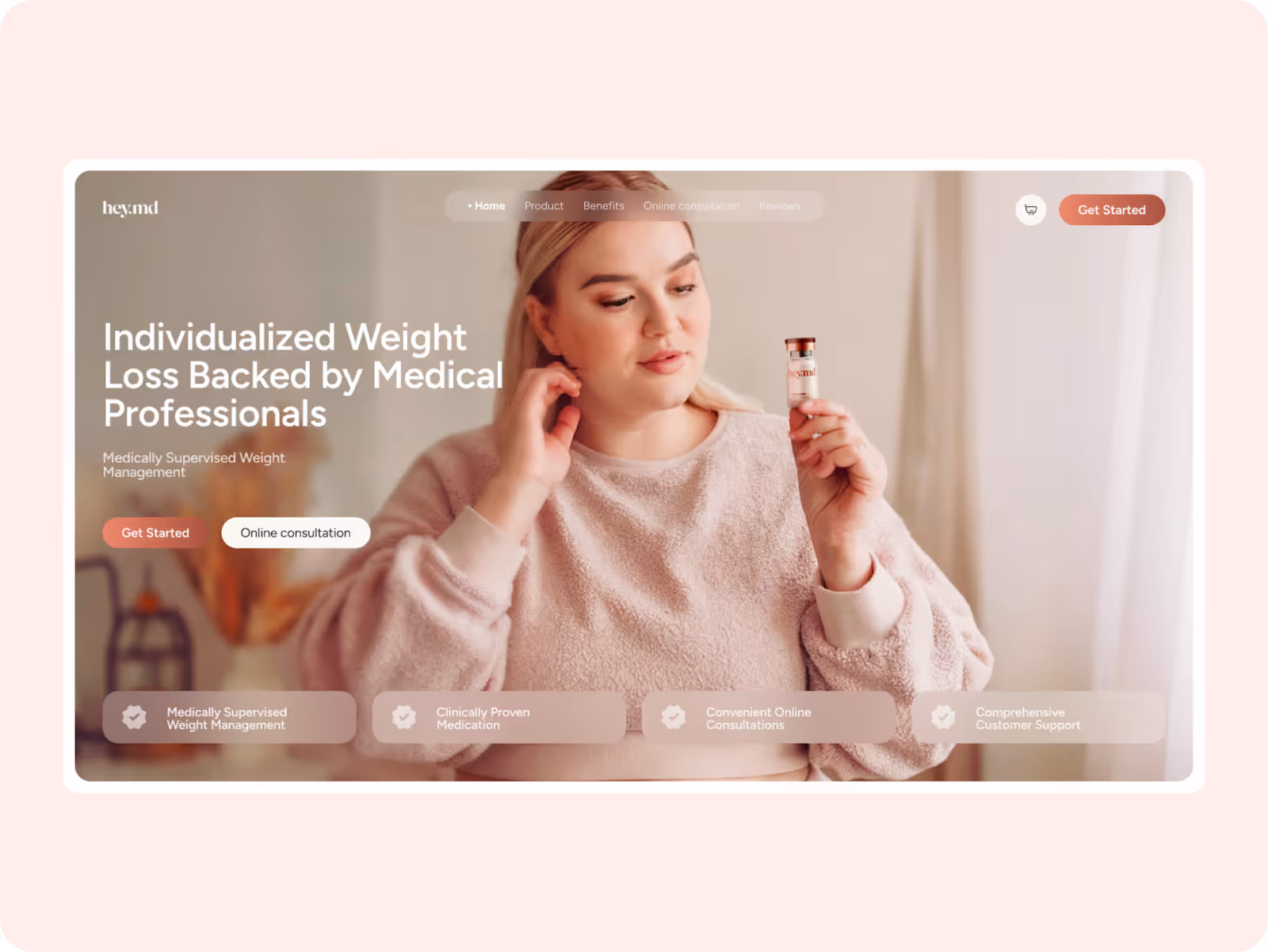
So we refocused it.
By anchoring the message in a direct, trust-building promise (“Individualized Weight Loss Backed by Medical Professionals”) and pairing it with clear CTAs and tangible benefits, we turned passive interest into active trust — and made sure the message didn’t just land, but stuck.
Tip: If your value prop takes more than one sentence to explain, it’s not ready. Sharpen it until a complete stranger can read it and say, “That’s for me.”
2. Use Visual Hierarchy to Guide – Not Compete
People don’t read websites word for word. They scan.
Which means your job isn’t just to make things look good — it’s to make them feel effortless to navigate.
When your layout reinforces the message instead of competing with it, everything clicks into place. The user doesn’t have to work to understand. They follow the flow naturally — from one idea to the next — without friction or confusion.
And when that happens, trust builds with every scroll.
With DocInPoc, visual hierarchy was a game-changer. We structured the layout to create calm and clarity — leading with a bold value statement, layering in soft proof through familiar visuals and reassuring badges, then guiding users toward action with a clean, progressive scroll.
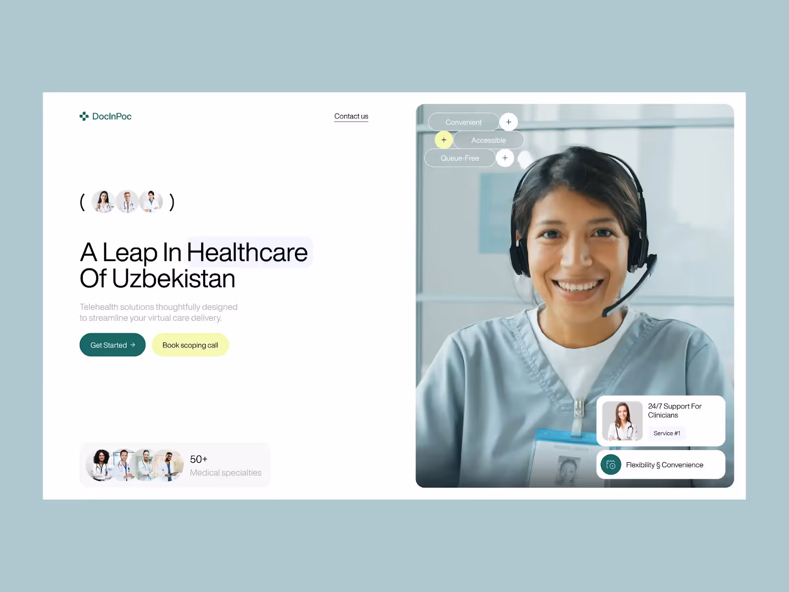
Each scroll followed a rhythm:
• A clear hook → Visual reassurance → Tangible benefits → Seamless CTA
• No guesswork. No friction.
Because design isn’t just decoration — it’s narrative structure.
If a user can’t predict what’s coming next and feel good about it, they’ll bounce long before they ever reach your CTA.
Ask yourself: What’s the most important thing on this screen? Is that where the eye naturally goes?
If not — start there.
3. Build Emotional Narrative, Not Just Feature Blocks
You’re not just showcasing a product. You’re entering someone’s moment of uncertainty, urgency, or desire — and offering a way through it.
That takes more than specs. It takes story.
An emotional narrative doesn’t mean paragraphs of dramatic copy. It means shaping your page to reflect a real journey. When a user arrives, they should recognize their own problem — and begin to imagine the relief that comes from solving it.
Here’s how to build that kind of emotional movement:
- Start with empathy. Reflect the user’s challenge in simple, honest language — the kind that says “we get it.”
- Frame the transformation. Help them visualize the shift from problem to possibility. (Think: “Before you found us…” → “Here’s what life looks like now.”)
- Support it with proof. Use testimonials that speak to the outcome, not just the process. Quotes that hint at confidence, ease, or momentum — not just satisfaction.
- Use evocative visuals. Photography and layout should reinforce the emotional tone, not just show off the interface.
If your landing page reads like a spec sheet, you’re missing the moment.
Because facts don’t spark action — feelings do. When your page creates that emotional lift, users don’t just stay longer… they connect, trust, and convert.
And remember: It’s not emotion or logic. It’s emotion first — then logic.
4. Make the CTA Earn Its Moment (And Pay It Off)
Most CTAs assume the user is already convinced.
But trust isn’t automatic — it’s built step by step.
If your landing page tells a clear story, builds momentum, and delivers relevance — the CTA should feel like the natural next step, not a leap of faith.
There are two simple ways to make that happen:
- Contextualize the CTA – Give it meaning. A payoff line before the button can guide intent. For example: “Over 90% of clients reduced chargebacks in their first month.” That line makes the button feel like a promise, not a push.
- Match your tone – If your brand sounds human and trustworthy above the fold, don’t break that flow with a cold or generic CTA. Keep the voice consistent and aligned.
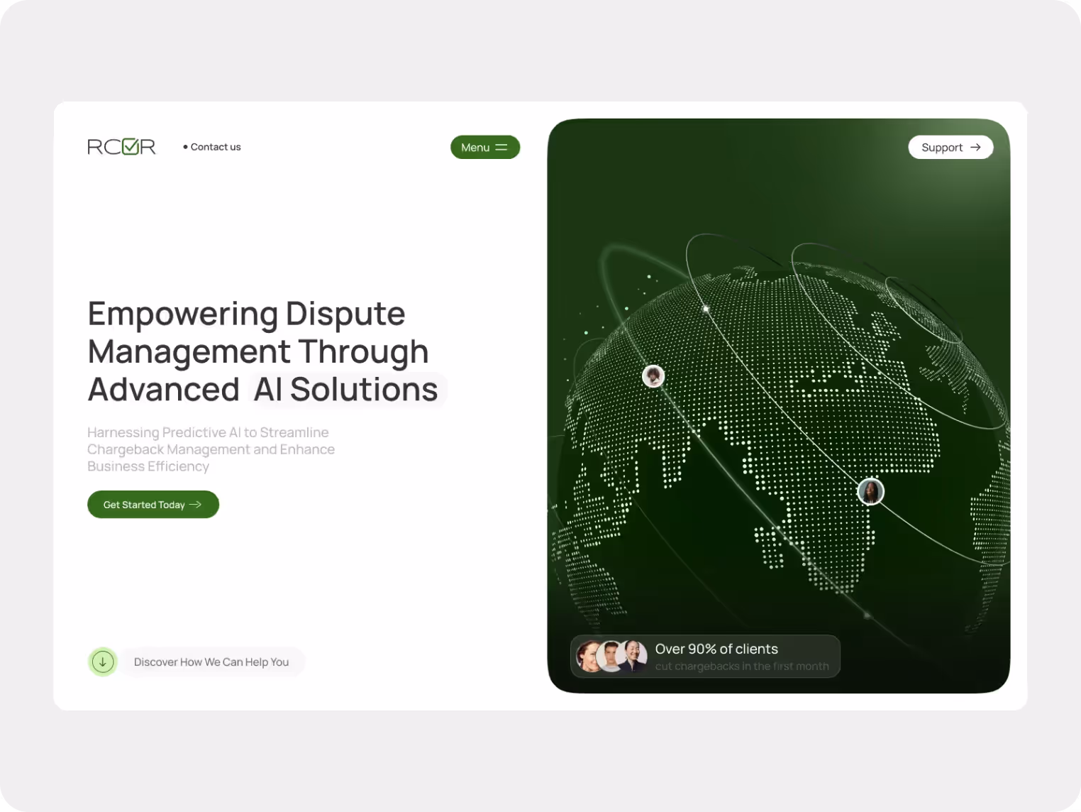
When we worked on RCVR’s page, we anchored the call to action with real-world reassurance — including client results and bold, benefit-led subtext. Instead of relying on “Get Started,” we surrounded the CTA with subtle proof and high-trust visuals, which helped turn a simple click into a confident decision.
So, don't just place CTAs.
Set them up. Then back them up.
5. Bring Proof Higher Up — And Make It Real
So by now, you already know social proof is essential. But here’s something you shouldn’t overlook:
Good landing pages don’t save proof for the bottom. They integrate it directly into the flow — exactly where it matters most.
• Right under the headline: a client quote that reinforces the value
• Mid-scroll: a customer stat or “why they chose us” block
• Next to the CTA: a short testimonial or trust badge that lowers friction
And one more thing — make it specific.
Generic praise like “Super professional team!” gets ignored.
But something like: “60+ successfully completed projects — from early-stage startups to national healthcare providers” builds real trust.
It’s measurable, relevant, and actually says something.
The Takeaway
If there’s one takeaway from all of this, it’s simple:Great landing pages don’t just look the part. They lead.
They lead the eye.
They lead the story.
They lead the user from “maybe” to “I’m in.”
And when something’s not working, it’s rarely about starting from scratch. It’s about knowing where the disconnect is — and fixing it with intention.
That’s what turns a flat page into a high-performing one. Not louder headlines. Not shinier buttons. But clarity, structure, and a strategy that respects how people actually decide.
So if your landing page isn’t landing, don’t just design harder – design smarter.
And let every section do what it’s meant to do: Move people forward — with purpose.
Need a hand making that happen?
We do this every day — with brands big and small, across every industry.
Let’s make your landing page work harder (so you don’t have to).

.avif)


