

Boost SaaS MRR Without More Customer Acquisition Spend | Design Strategies That Work
.avif)
Beyond Spending More → Designing Smarter
When SaaS teams talk growth, the first instinct is almost always the same: spend more to get more.
More ads, more demos, more users pouring into the funnel.
But here’s the quiet reality: the real ceiling on your MRR often isn’t the top of the funnel — it’s the leaks hiding inside it.
We’ve seen it too many times:
- A dashboard that makes sense to the product team, but confuses new users.
- An upgrade prompt that feels generic, not compelling.
- A brand experience that looks dated, making prospects hesitate before clicking “subscribe.”
These aren’t just aesthetic issues. They’re silent churn machines.
At Eloqwnt, we’ve helped SaaS brands see something transformative: design isn’t just about looking better — it’s about performing better.
When you make your product clearer, faster, and easier to love, users stay. They upgrade. They recommend you to others.
And that’s growth you don’t have to keep buying again next month.
In this article, we’ll unpack:
- Why design-led improvements often beat acquisition spend for sustainable MRR growth
- The hidden places in your product and brand where churn quietly starts
- How to map design decisions directly to metrics like CLV, churn, and ARPU
- And why the biggest payoff rarely comes from a homepage facelift — but from design systems that make your entire product feel easier, faster, and more trustworthy
If you want to see how brand strategy also translates into ROI, take a look at The ROI of a Modern Visual Brand Identity — where we break down real numbers, not just creative optimism.
Because in SaaS, growth doesn’t always mean spending more.
Sometimes, it means designing smarter.
What MRR Really Means?
(for SaaS Teams Trying to Grow)
Monthly Recurring Revenue (MRR) is often described as the lifeblood of any SaaS business: predictable income you can rely on month after month, usually from subscriptions, seats, or usage fees.
But here’s where it gets interesting:
• MRR isn’t a fixed line — it rises from upsells, expansions, and new sign‑ups, and it shrinks from churn and downgrades.
• Many teams obsess over adding new customers, chasing growth through ever‑higher acquisition spend. Yet they overlook two quieter, equally powerful levers:
1. keeping the users you already have for longer
2. helping those users see enough value to move up to higher tiers
At its heart, MRR reflects real user behavior: how long people stick around, how much they pay over time, and how quickly they might leave.
That’s why MRR isn’t just a marketing or sales metric — it’s deeply shaped by how your product feels to use every day, how clearly your value comes through, and how seamlessly users can grow with you.
And this is where design quietly becomes more than decoration: it becomes one of the smartest, most underused drivers of sustainable MRR growth.
Where SaaS MRR Quietly Slips Away: Hidden Churn Triggers
Not every customer cancels with a loud complaint or a clear warning. More often, churn starts silently — long before the cancellation button is clicked. And if you’re only tracking exit surveys or last‑minute save offers, you’ll miss the real, earlier triggers.
At Eloqwnt, we’ve seen these quiet points where design — or the lack of it — makes users hesitate, disengage, and eventually drift away. Let’s unpack a few of the most common (and costly) ones:
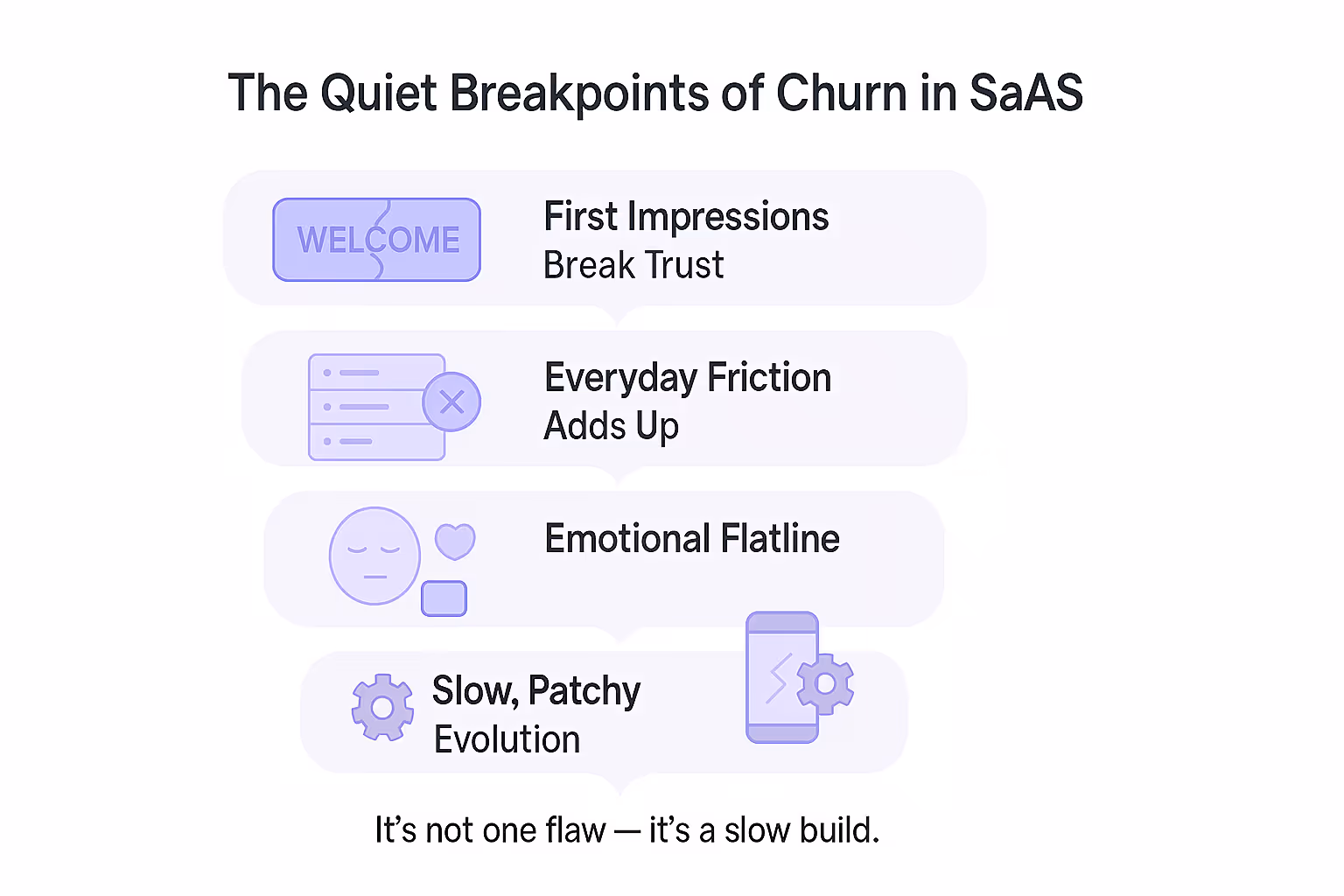
1. First Impressions Break Trust
The first login, the onboarding flow, the welcome email — these aren’t just “nice to have.”
They’re where new users make a snap judgment: Does this feel like it was built for me?
If the interface looks dated, the copy feels generic, or the brand voice sounds half-hearted, the answer quickly becomes: “Maybe not.”
That moment of hesitation quietly lowers activation — and when fewer users activate on day one, fewer become paying subscribers by month’s end.
A drop in MRR that starts, quite literally, at hello.
2. Everyday Friction Adds Up
One confusing button isn’t fatal. But dozens of small design gaps?
They quietly chip away at trust and patience:
- Unclear dashboards that hide key info
- Inconsistent icons or color schemes
- Slow loading states and awkward transitions
- Broken empty states that look unfinished
- Tooltips or help text that sound robotic
- Flows that force extra clicks to do simple things
- Mobile views that cut off critical content
Each moment alone feels minor. But over weeks and months, they pile up until your product starts to feel like “too much effort.”
3. Emotional Flatline
Even the smartest product can’t win hearts if it feels forgettable.
When visuals look like a generic template and messaging sounds like everyone else, users don’t build an emotional tie — just transactional tolerance.
No brand spark means no loyalty: the moment a cheaper or shinier competitor shows up, switching feels effortless.
Design isn’t just to “look pretty” — it’s what makes your product feel credible, memorable, and made for them.
Without it, retention turns into a price fight you’re bound to lose.
4. Slow, Patchy Evolution
SaaS lives on speed: new features, new pages, new segments.
But if updates look bolted on, mobile flows break pattern, or it takes weeks to align new designs, users notice.
It doesn’t just look sloppy — it quietly signals, “Will this tool keep up as I grow?”
Doubt rarely shouts. It drifts: slower upgrades, skipped renewals, silent churn.
And that quiet drift slowly chips away at your MRR, long before dashboards catch it.
Why Design Often Beats Spending More on Customer Acquisition
It’s tempting to think: growth = buy more ads.
New eyeballs, more clicks, bigger budget — simple, right?
But there’s a quieter truth most SaaS teams learn the hard way: acquisition spend is a race you rarely win for long.
Ad costs climb, competitors copy your messaging, and your CAC edges up month after month.
Design, on the other hand? It doesn’t shout louder — it makes every user who does arrive far more likely to stay, upgrade, and tell others. In other words: it fixes the leaks before you pour in more water.
Here’s how that looks in practice — and why design‑led growth often beats buying your way forward:
1. First impressions convert
That first landing page visit.
The first signup flow.
The first “aha” inside your dashboard.
These moments decide everything.
If your design feels dated, the copy sounds generic, or the flow is clunky, users bounce before you’ve even had a chance to convince them.
But when visuals feel modern, copy speaks their language, and the path feels obvious, sign‑up rates quietly climb — without touching your ad budget.
Small lift, big effect: even going from 2% to 2.3% conversion on 20,000 monthly visitors adds 60 extra customers — every month, for free.
2. Lower churn lightens the load
Every churned user has to be replaced just to stand still. And acquiring replacements isn’t cheap.
But design quietly keeps people around: clearer dashboards mean fewer “where do I click?” frustrations; consistent brand voice builds familiarity; smoother onboarding helps them see value sooner.
Drop churn by even 1%, and the saved revenue often beats what you’d spend chasing replacements.
3. Higher CLV makes every user worth more
Design isn’t only about preventing exits — it’s about encouraging deeper engagement.
Highlighting advanced features, making upgrades visible yet natural, and guiding power users toward paid tiers all add revenue per customer.
Higher CLV changes your math completely: now each user is worth more, so you can afford smarter, more focused acquisition — instead of a scattergun approach.
4. Looking premium protects your price
A polished, consistent identity makes your brand feel “worth it.”
When users see a product that looks and feels thoughtfully designed — clean interfaces, cohesive visuals, confident messaging — they’re quicker to believe it’s a higher‑quality solution.
That trust matters. It means you’re less forced to win business by dropping prices. Instead of undercutting competitors, you can hold or even raise rates — keeping gross margins healthy.
And it adds up fast: even a modest premium — say, charging just $5 more per month — becomes significant when multiplied across hundreds or thousands of active users. Over time, that difference compounds into real, sustainable MRR growth.
→ All together: Acquisition spend pushes numbers once – design keeps them up, month after month.
Better UX and branding don’t just “look nice” — they change user behavior in ways ads can’t: lowering churn, lifting CLV, and defending price.
And over a year? Those quiet gains often outperform the flashiest paid campaign.
Because in SaaS, retention is revenue.
And design is what makes users stay.
Mapping Design to Real Metrics
It’s easy to say “design matters.”
Harder to show exactly where it matters on your dashboard.
But here’s the truth: every pixel, every loading state, every piece of copy has a ripple effect that eventually hits your P&L.
The trick isn’t to guess — it’s to trace the line from creative choice → user behavior → measurable outcome.
That’s when design stops being subjective — and starts speaking the language leadership understands:
- CLV (Customer Lifetime Value)
- Churn rate
- CAC (Customer Acquisition Cost)
- ARPU (Average Revenue Per User)
And this isn’t just theory. In Saas, it’s how design ties straight to the numbers that matter next:
Better onboarding → Higher CLV
Think back to onboarding: it’s not just about teaching features — it’s about shaping habits from day one.
When your SaaS product guides new users to value quickly and seamlessly, three things quietly happen on your dashboard:
- Fewer day‑one drop‑offs: instead of losing, say, 25% of sign‑ups before first use, you might only lose 18%.
- Faster time‑to‑value: users hit their first meaningful result sooner — often within minutes, not days.
- Higher upgrade rates: users who “get it” early are far more likely to move to paid tiers or unlock add‑ons.
Across even a modest user base, these gains can stretch average Customer Lifetime Value (CLV) by 5–10% — a lift that compounds every month.
Clear UX → Lower churn
When navigation feels predictable, error messages are human, and flows guide users without guesswork:
- Fewer users drop off mid-task
- Support tickets decline (revealing fewer friction points)
- And monthly churn shrinks, because people feel in control rather than confused
Imagine reducing churn from 4% to 3.8%: it sounds tiny, but across 10,000 users at $30 each, that’s over $6,000 in saved revenue every month — compounding every quarter.
Small UX refinements can do what discounts or retargeting campaigns can’t: stop churn before it starts.
Consistency → Lower CAC
A scattered brand feels risky, a cohesive one feels reliable — and reliability sells itself.
When your ads echo your website’s tone, your landing page matches your product’s interface, and everything carries the same visual clarity:
- Prospects recognize you before they click
- Landing pages convert more visitors into demos
- And sales calls start further down the funnel, because trust is already seeded
Result? Your demo-to-signup ratio climbs, click-through rates edge up, and sales cycles shorten — all shaving dollars off your Customer Acquisition Cost (CAC).
Premium feel → Higher ARPU
When it comes to creating a premium look, many teams still see design as a “nice-to-have.” That’s why we wrote a whole piece on why design is a strategic investment, not a luxury.
Because here’s what really happens: sharper UI, more confident messaging, and a cohesive experience make higher tiers feel not just acceptable, but expected.
That’s where ARPU (Average Revenue Per User) quietly climbs — even a small $4 lift per user can mean six figures in annual recurring revenue, unlocked not by discounts, but by trust built through design.
So it’s not abstract:
Design shifts → change how users feel → change what they do → show up on metrics like CLV, churn, CAC, and ARPU.
That’s how design-led strategy turns from “a nice facelift” into a real, measurable growth engine.
Design Systems That Grow MR
Most redesigns chase the visible win: sleeker visuals, sharper homepage, cleaner UI.
But the biggest payoff often happens backstage. When you build a cohesive design system, your team stops reinventing the wheel.
Instead:
- New features roll out faster, because layout and components are ready to go.
- Campaigns stay on-brand without endless back‑and‑forth.
- The product feels consistently “you” — even as it evolves.
That quiet consistency compounds: fewer bottlenecks → faster launches → steadier MRR growth.
Not because you spent more — but because you designed smarter.
If you’re wondering where your design could quietly unlock real, measurable ROI — let’s map it out together.
At Eloqwnt, we’ve helped SaaS teams turn subtle design moves into concrete gains: lower churn, higher ARPU, and faster launches.
We’d love to explore what the same could do for you!


