

The Role of Color in Building Brand Trust: Expert Tips & Tactics
Ever landed on a website and felt instantly uneasy – without knowing why? Or conversely, felt an immediate sense of reliability just from a logo’s palette? That’s not by accident. That’s color psychology in action.
Color is one of the most powerful brand signals. It accounts for up to 90% of a person’s first impression of a product. And in a world where trust is currency, your brand colors can quietly but effectively tip the scale in your favor – or send customers running.
At Eloqwnt, we’ve helped brands across industries – from healthcare to fintech – craft color systems that don’t just look good but build credibility. Let’s unpack how you can do the same.
1. Why Color = Trust in Branding Psychology
Colors speak directly to the emotional brain.
Studies show that people make subconscious judgments about a product within 90 seconds – and up to 90% of that assessment is based on color alone (Institute for Color Research).
Each color family evokes different emotional associations:
• Blue: Trust, stability, professionalism (used heavily in fintech and healthcare)
• Green: Growth, balance, nature (popular with wellness and eco brands)
• Black/Grey: Sophistication, authority, neutrality (favored by luxury and corporate brands)
• Red: Urgency, excitement, boldness (used in retail and fast-paced industries)
• Purple: Creativity, wisdom, uniqueness (great for tech and beauty brands)
But here’s the catch: it’s not just about picking a color that matches a feeling. It’s about matching the emotion to your audience and offering.
2. Brand Color Consistency Builds Recognition (and That Builds Trust)
Your brand is not a logo – it’s a system. And consistency is what makes that system stick.
Think of Coca-Cola’s red, Spotify’s green, or LinkedIn’s blue – you don’t need the full logo to recognize the brand. That’s the power of consistent color use across every customer touchpoint.
When users see the same color palette on your website, packaging, emails, and social posts, it builds a subconscious sense of dependability. Consistency equals professionalism – and professionalism builds trust.

Pro tip: Don’t just choose colors – systemize them. Build a color playbook that covers everything: exact hex codes, how gradients should flow, what colors pair well (and which clash), and how contrast works in both light and dark modes.
When your brand’s colors show up the same everywhere, trust starts to grow – without you saying a word.
3. Strategic Color Pairings Can Guide Behavior
It’s not just what colors you use – but how you combine them.
Color pairing is key to directing attention, setting hierarchy, and guiding users through your content or product interface.
• Use contrasting colors for CTAs to make buttons pop (but not too aggressively).
• Choose neutral tones for background to let brand elements shine.
• Reserve accent colors for moments of delight, feedback, or animation.
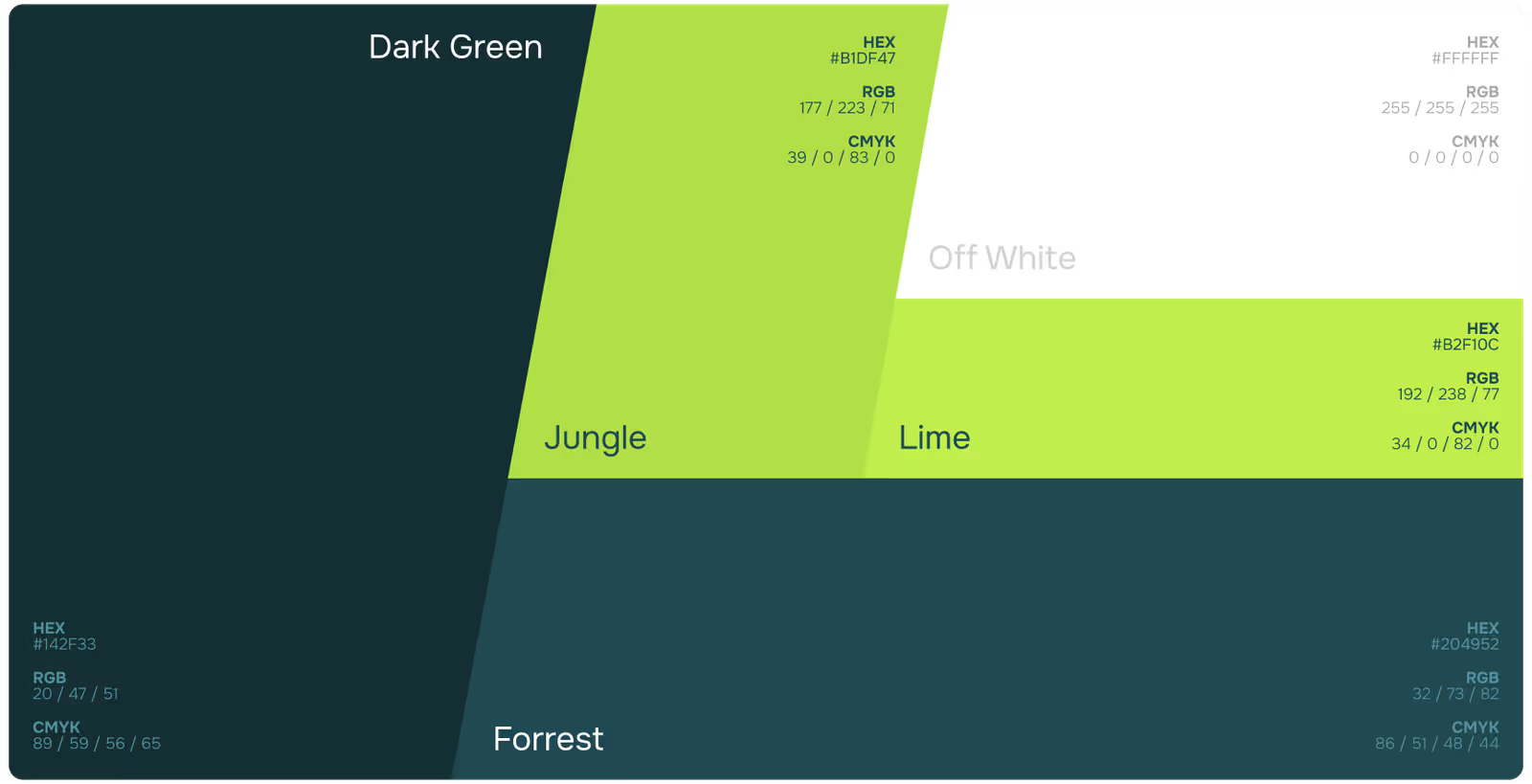
At Eloqwnt, we often create modular color systems where primary palettes build recognition and secondary palettes support functionality and UX clarity.

4. Industry Matters: Tailoring Color to Audience Expectations
Different industries have different trust triggers.
• Healthcare: Calm, clean tones like soft blues, whites, and pastels help reduce anxiety and signal hygiene.
• Fintech: Deep blues and charcoal greys evoke security and authority.
• E-commerce: More flexibility – brands here use energetic combos (red + black, pastel + neon) to stand out, but should still ensure clarity and accessibility.
Always test your palette with your actual users. Trust is built when design choices resonate, not just when they “look cool.”
5. Building an Inclusive, Accessible Color System
Trust isn’t universal unless it’s inclusive.
Designing with accessibility in mind – like ensuring color contrast ratios for readability – shows users you care about their experience.
Use tools like the WebAIM Contrast Checker to ensure your text and backgrounds meet WCAG standards. Consider how your palette appears in grayscale or to those with color blindness.
When your design welcomes everyone, trust grows beyond expectation.
The Bottom Line
Your brand’s colors are more than decoration. They’re psychological cues. Emotional anchors. Visual trust builders.
So the next time you pick a color, don’t just ask if it’s “on trend.” Ask what it’s saying about you – and to whom.
Because when done right, color isn’t just part of your brand identity – it’s the reason people trust you.
And if you need a helping hand building that kind of trust through color, we’re here to design it with purpose – from palette to platform, and everything in between!



The right partner at the right moment changes everything.
Tell us about your next stage.


