What Is Negative Space? How to Use It in Design Like a Pro (With Real Examples)

Introduction
Most brands make the same mistake: they try to say everything at once. More colors. More shapes. More detail competing for attention.
The eye gets busy, but the mind doesn’t remember.
What people actually notice is the pause. The quiet moment that draws the eye. The space that gives design its clarity and impact.
Negative space holds that power. It can shape a logo into a story, guide a website like a roadmap, and turn a single photograph into an icon.
At Eloqwnt, we’ve seen how this “nothingness” can become a brand’s sharpest tool. Done right, negative space isn’t minimalism for its own sake — it’s strategy disguised as simplicity. And in this article, we’ll unpack the psychology, the best examples (including our own), and why leaving room may be the smartest move your brand ever makes.
What Is Negative Space?
In design, negative space is what you don’t put on the page — the open areas around and between the main elements. It’s the breathing room that lets the subject stand out, the quiet contrast that makes a message legible, and the underlying structure that guides the eye. Far from being “empty,” negative space is one of the most powerful tools in visual communication.
Think of it as the silence in a conversation — the pause that lets words land with weight. Or the margin in a book that allows your eyes to rest so the story flows effortlessly. Without these spaces, even the strongest visuals collapse into noise.
To simplify:
- Positive space = the subject (a logo, a block of text, a photo object).
- Negative space = the areas around it, shaping how we see, feel, and interpret the subject.
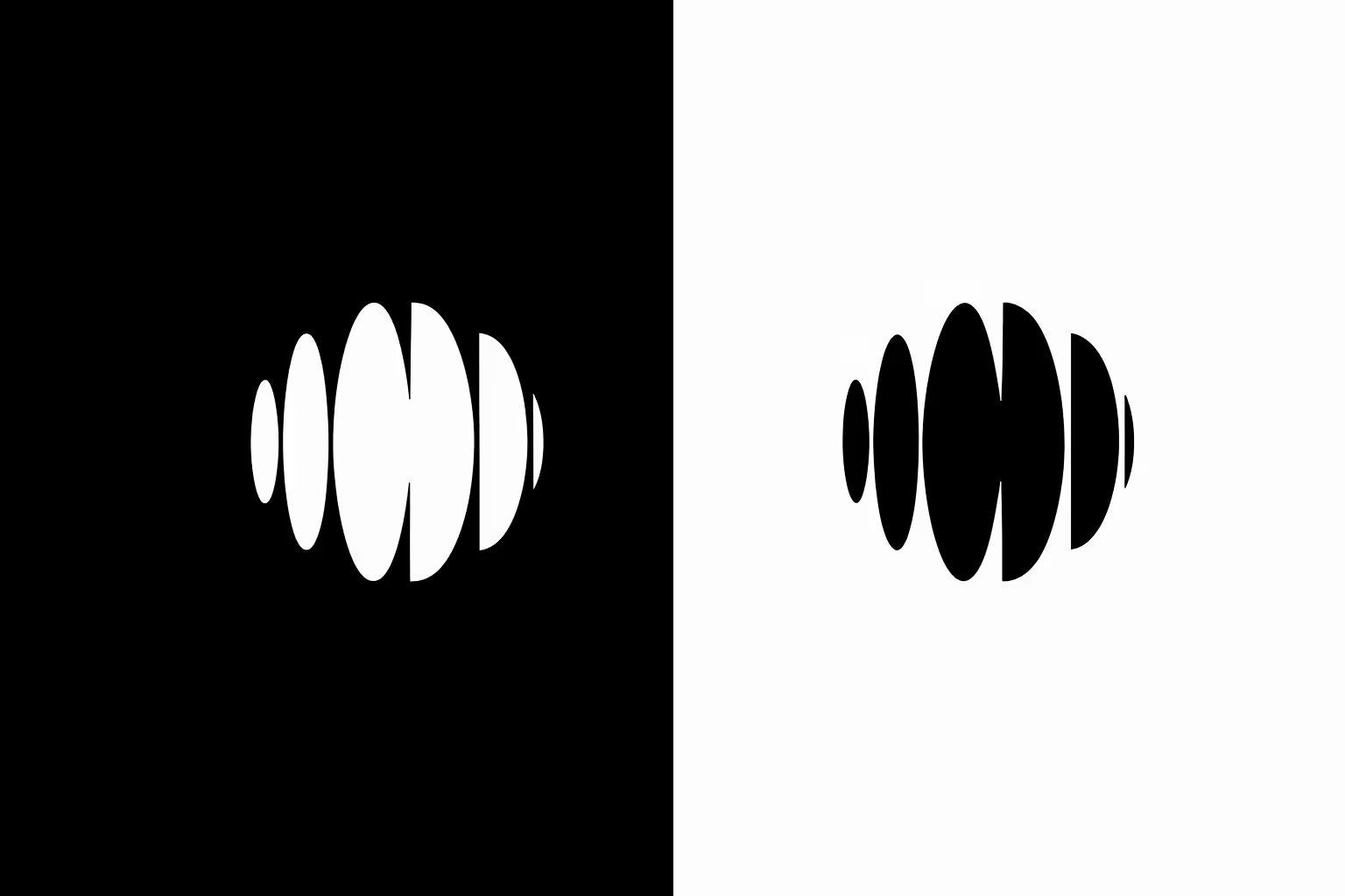
This illustration brings the concept to life. The form is our own logo, but what you really notice isn’t just the shapes themselves — it’s the space that defines them.
Positive space gives us the subject, while negative space frames it, guiding how we see, feel, and interpret it. On the left, white forms stand bold against black – on the right, the same shapes invert, shifting entirely in character. The lesson is simple yet powerful: design isn’t only about what you add, but also about the space you leave.
So the real magic happens when negative space is used intentionally. Not as a leftover “background,” but as a design choice that builds meaning, creates balance, and leads attention exactly where it’s meant to go.
The Psychology Behind Negative Space — and Why It Matters
You’ve probably heard the claim: “the brain processes visuals 60,000 times faster than text.” It’s a stat that gets thrown around in marketing decks, but here’s the truth — it isn’t scientifically backed. Most likely, it originated from a 1980s 3M brochure, and researchers have never been able to verify it.
But while the number may be questionable, the principle is not. Our brains are wired to process visuals faster and remember them more vividly than words. In fact:
→ The picture superiority effect shows that people consistently recall images better than text.
→ Gestalt psychology proves that the mind looks for patterns, grouping shapes and spaces into meaningful wholes.
→ Cognitive load research highlights that too much visual clutter overwhelms attention, while simplicity sharpens focus.
This is exactly where negative space works its magic. It reduces noise, creates clarity, and leverages how the brain naturally filters information. Done well, it sets off a chain reaction:
Clarity → Attention → Emotion → Memory → Strategy
Each step builds on the last, turning “less” into a psychological advantage — and, ultimately, a brand strategy.
Here’s the explanation of each step in the chain:
1. Clarity in Design
The brain can only process so much at once. Psychologists say our working memory maxes out at 3–4 items before it feels overloaded.
Negative space cuts through that clutter:
- It reduces noise.
- Highlights the essentials.
- Creates designs people can understand instantly.
Clarity is the first psychological win — without it, nothing else sticks.
2. Focus Through Guidance
Once the noise is gone, space becomes a guide. Our eyes naturally follow open areas, treating them like visual pathways.
→ On websites, clear spacing improves attention and comprehension by up to 20%.
→ In logos, it reveals hidden layers — think FedEx’s arrow or WWF’s panda. “”
→ In layouts, it creates rhythm, leading the viewer step by step.
It’s the invisible hand of design — unseen, but always in control.
3. Emotion in Space
Design stirs emotion before it communicates meaning. Long before a word is read, space sets the tone. Generous layouts feel calm, confident, and premium. Crowded visuals, by contrast, suggest urgency, cheapness, even stress.
The pattern is striking:
- Luxury brands let products breathe, speaking with quiet authority.
- Discount brands cram every corner, equating noise with value.
Space doesn’t just hold the message — it is the message, shaping feelings instantly, before logic has a chance to catch up.
4. Memory Through Simplicity
The brain remembers what it can process easily. Psychologists call this the fluency effect: the smoother the experience, the stickier the memory.
Negative space is a shortcut to this fluency.
Spacious design → Faster recognition → Longer recall.
That’s why some of the world’s most iconic marks — Apple’s bitten fruit, NBC’s peacock, FedEx’s arrow — are remembered instantly. They’re not complex puzzles, they’re visual ideas distilled to their essence, with space doing half the storytelling.
So when the brain has less to untangle, it rewards the design with long-term memory.
5. Strategy in Action
At Eloqwnt, we treat space with the same weight as typography, color, or imagery — because it works on the deepest level of brand experience.
- In branding, it sharpens logos into symbols that last decades.
- In digital, it guides users seamlessly, creating paths they follow without conscious effort.
- In identity systems, it builds trust and authority, proving that restraint is often more persuasive than noise.
The paradox is simple: what looks like “nothing” is often the most strategic move of all. Negative space becomes the invisible framework, the unspoken language, the quiet force that makes a brand unforgettable.
5 Practical Ways to Use Negative Space in Design
Once you see what negative space can do, the next step is putting it to work. It’s about guiding how people read, feel, and interact with your brand — making layouts feel clear, visuals pop, and messaging land effortlessly.
Here’s how we apply it across different mediums:
1. Logos
Negative space in logos is one of those design choices people often notice only after it clicks — and that’s the beauty of it. A clever cut-out, a hidden mark, or simply clean breathing room can make a logo timeless rather than trendy.
The goal is to make the logo both recognizable and memorable, without overcomplicating it. Negative space gives the eye a rest while embedding meaning.
How we approach it at Eloqwnt:
1. We strip logos down to what’s essential — anything that doesn’t add clarity gets cut.
2. We explore how spacing can create dual meanings (think FedEx’s arrow) or add subtle storytelling.
3. We test legibility across scales: from giant billboards to a tiny app icon, the negative space has to hold up.
Example of Negative Space in a Logo
In the UzOman rebrand, we precisely set a safe zone around the letterform logo (the circular “O” and concentric circles) so it never felt cramped when placed on business cards, signage, or digital screens. The circular devices and alignment guides show how much space to leave so the logo holds its integrity.
Why It Works:
- People notice and remember the mark faster because of the clear space.
- The design scales across formats without losing strength.
- The logo feels timeless — refined, not trend-driven.
2. Web Design
Negative space online is less about minimalism and more about usability. It’s the invisible structure that guides attention and makes digital experiences intuitive.
The goal is to make websites feel effortless — easy to scan, easy to navigate, and easy to trust.
How we approach it at Eloqwnt:
1. We design layouts with rhythm, balancing copy and visuals so users don’t feel crowded.
2. We use spacing to direct flow toward key CTAs, letting the eye move naturally rather than being forced.
3. We simulate real browsing patterns across devices to fine-tune margins, padding, and white space.
Example of Negative Space in Web Design
For AyaRx, we used negative space to frame content and guide the user’s eye. Each feature card was given room to breathe, making information easy to absorb step by step. Clean margins, airy typography, and balanced spacing between visuals and copy established a clear rhythm that feels natural across the site.

Why it works:
- Users instantly know where to look, reducing cognitive load.
- Content feels digestible, with features presented one at a time.
- The spacious rhythm conveys professionalism and calm — crucial for a health-tech brand.
3. Packaging
On shelves, space is a luxury. Most brands cram in claims, features, and graphics — but the ones that stand out are often the quietest. Negative space here communicates confidence.
The goal is to create packaging that looks premium, trustworthy, and easy to understand at a glance.
How we approach it at Eloqwnt:
1. We prioritize clarity: one strong focal point (logo, claim, or symbol) surrounded by generous space.
2. We use contrast between space and content to make the brand voice pop.
3. We test designs in shelf simulations to see how they compete visually in crowded environments.
Example of Negative Space in Packaging
For Get Talky, we applied negative space to let the logo, product name, and key visuals breathe on the thermos and shopper bag. Instead of crowding every surface, each element has room to stand out, giving the packaging a premium, approachable feel that immediately communicates the brand’s playful yet trustworthy personality.
![Example of negative space in Get Talky packaging: thermos and shopper bag with generous spacing, bold typography, and clean layout on a white background.]](https://cdn.prod.website-files.com/673a535e55337a9ba48cdebb/68e79f3d1e866f065aefb293_get-talky-packaging-negative-space..avif)
Why this works:
- Shoppers immediately notice the logo and key visuals, even from a distance.
- Generous spacing highlights the brand voice without clutter.
- The design feels confident, modern, and easy to understand at a glance.
4. Print Materials
On printed collateral, space is just as important as the content itself. Flyers, brochures, and business cards often try to fit in too much — but the brands that feel effortless are the ones that give their elements room to breathe. Negative space here communicates professionalism and clarity.
The goal is to create print materials that feel premium, readable, and visually balanced at a glance.
How we approach it at Eloqwnt:
1. We prioritize hierarchy: key messages, headlines, and visuals are given generous space to stand out.
2. We balance text and imagery so every element feels intentional and readable.
3. We test layouts at real scale to ensure they are legible and impactful in hand and in context.
Example of Negative Space in Print Materials
For Innrev.ai’s print materials, we applied negative space to create a clean, modern, and professional look. The layout gives the logo and key messaging room to breathe, making every element feel intentional and easy to read.
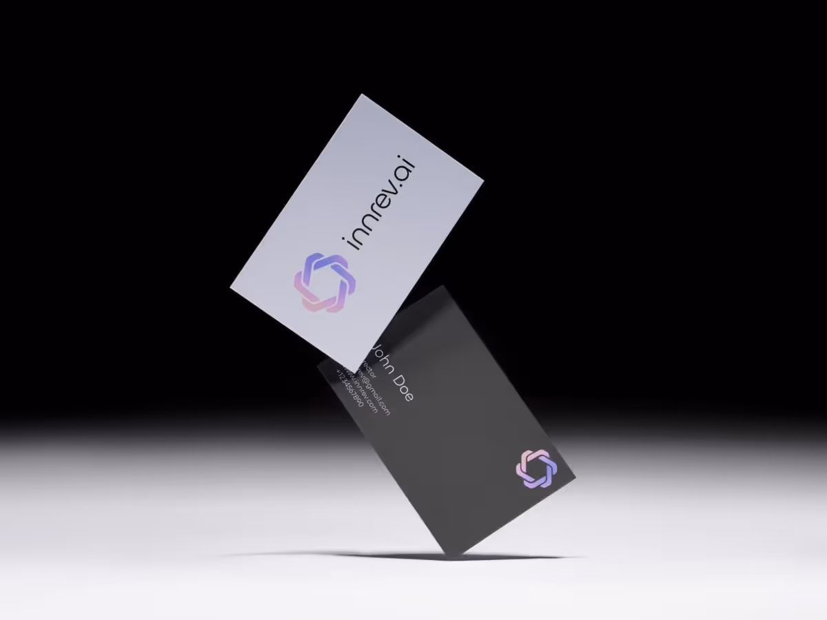
Why this works:
- The logo and messaging stand out immediately.
- Layout guides the eye naturally for effortless scanning.
- Minimal spacing reinforces a polished, professional brand feel.Digital & Social Media
5. Digital & Social Media
Online, attention disappears in seconds. Scroll-stopping content needs room to breathe so your message isn’t lost in the noise. Negative space in social posts draws the eye to what matters, letting visuals and text stand out without feeling cluttered.
The goal is to create digital content that feels fresh, approachable, and instantly recognizable in feeds.
How we approach it at Eloqwnt:
- We prioritize clarity: one focal element per post (logo, message, or visual) surrounded by generous space.
- We use contrast and spacing to make the brand voice stand out in crowded feeds.
- We test visuals at real scale to ensure they are engaging across different devices and platforms.
Example of Negative Space in Digital & Social Media
For ZK Link, we applied negative space across Instagram posts to let visuals and key messaging breathe. Each post is clean and bold, giving the brand a modern, professional, and approachable presence that immediately captures attention in fast-scrolling feeds.
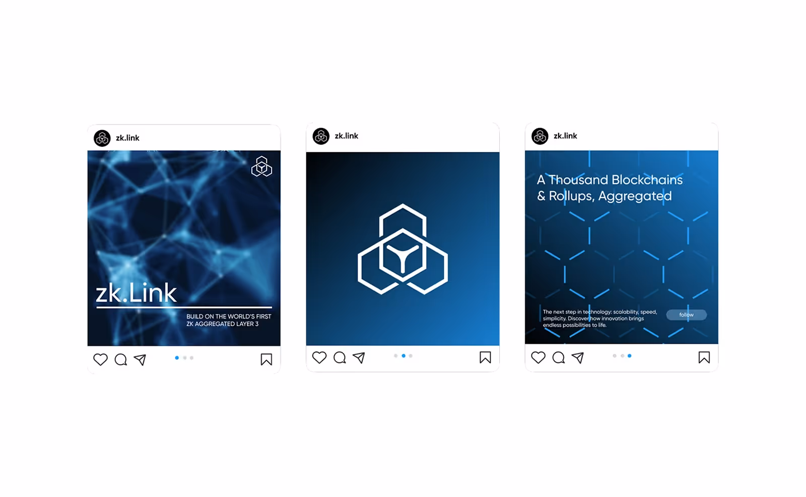
Why this works:
- Key messaging and visuals are instantly noticeable.
- Negative space keeps the posts clean, readable, and visually appealing.
- The design reinforces a confident, modern brand personality across social platforms.
Common Mistakes to Avoid in Negative Space
Negative space seems simple, but it’s easy to misjudge. Even experienced designers sometimes end up with crowded or uneven layouts.
Here are the mistakes that can trip up your design – and how to avoid them:
1. Crowding Elements → Trying to fit everything into a small area can overwhelm the viewer. Key messages get lost, visuals compete, and the layout feels heavy rather than inviting.
How to Avoid:
- Prioritize what truly matters and give it room to stand out.
- Space elements generously so each visual can breathe.
- Remove unnecessary details that distract from the core message.
2. Ignoring Hierarchy → When all elements feel equally important, the eye doesn’t know where to start. Critical messages get missed, and the layout feels chaotic rather than intentional.
How to Avoid:
- Use spacing to guide the viewer’s attention naturally.
- Highlight the most important elements with prominence and isolation.
- Maintain a clear flow between headings, visuals, and supporting content.
3. Inconsistent Spacing → Uneven margins or padding break the visual rhythm, making the design appear sloppy or disconnected.
How to Avoid:
- Keep margins and padding consistent throughout the layout.
- Align elements to a grid or guide for balance.
- Check spacing across devices and formats.
4. Overcomplicating Layouts → Too many shapes or patterns distract from the main message, making the design feel busy and unfocused.
How to Avoid:
- Remove unnecessary elements.
- Surround key visuals with space to stand out.
- Use negative space to create focus and clarity.
5. Neglecting Context → A design may look perfect in isolation but feel cramped in real-world applications like packaging, screens, or print materials.
How to Avoid:
- Test layouts in real scenarios.
- Adjust spacing based on medium-specific needs.
- Ensure readability, balance, and visual appeal across all uses.
Frequently Asked Questions
What does negative space mean?
Negative space refers to the empty or unmarked areas within a design. It’s the space around and between elements that creates balance, clarity, and structure. Far from being “blank,” it guides the eye, makes content easier to read, and helps important details stand out.
What is the positive space?
Positive space is the part of a design that contains the actual content — like text, images, or graphics. It’s what people immediately notice and interact with. Positive space carries the message, while the surrounding areas give it definition and support.
What is positive space vs negative space?
Positive space is made up of the elements themselves, while negative space is everything that surrounds them. Together, they create a complete composition. Positive space provides the message, and negative space ensures that message is clear, accessible, and visually balanced.
What are common negative space mistakes?
Designers sometimes overcrowd layouts, leaving no room for elements to breathe. Others forget hierarchy, so everything competes for attention instead of guiding the viewer’s eye. Inconsistent margins or padding can make the design look messy, while adding unnecessary decoration often distracts from the core message.
Where is the negative space?
Negative space exists all around the content — it’s the margins of a page, the gaps between lines of text, the space between images, or even the padding around a button on a screen. It’s present in every design, shaping how the viewer experiences the information, even if it’s not immediately noticed.
If you want your brand to harness negative space with this kind of clarity — whether in your logo, web design, or packaging — our team is here to help.
→ Explore Eloqwnt’s services to see how we bring design strategy to life.
→ Browse our curated Superdesign templates if you’re looking for ready-to-use design systems.
→ Or simply contact us to craft a brand presence that feels simple, modern, and unmistakably you.
We’d love to turn your ideas into impact!